Fuji 400 (1st roll)
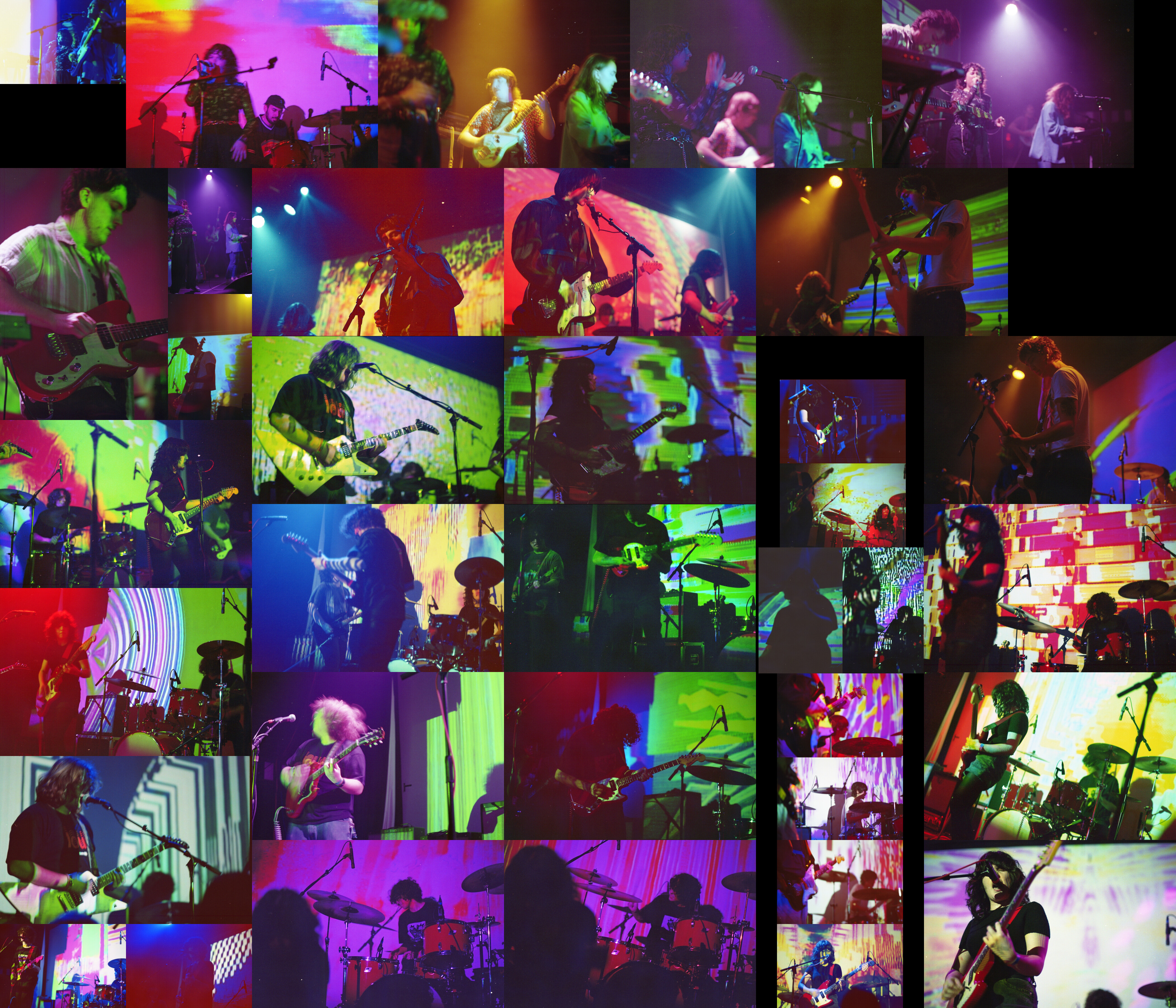
For the second to last roll of the year we’re continuing from where the previous roll left off. This roll covers the rest of the night, starting with HOT///CAKES, moving on to Sad Cell, and finishing off with Grocery Bag. As is hopefully obvious, I really like how this roll turned out. It’s a nice blend of a lot of things I was trying to do this year with some a/b split pictures, some 3 piece compositions, and a bit of skewed angles.
Also, it should be pretty clear how different this roll looks when compared to the previous one. It’s significantly more saturated, especially on the green/magenta directions. This roll is Fuji 400 which, to me, has somewhat similar characteristsics to Fuji 200 which I suppose makes sense.
In terms of talking about this roll, I want to talk about 2 specific pictures. The first is the 3rd one in the top row. The second is in the bottom right corner, one up from the corner.
For the first picture, this is one I remember being very specific in trying to get. The way the light highlights the guitarist was so specific and I wanted to see how the highlighting via light would work in the resulting picture. Honestly, this picture didn’t turn out quite how I expected it to. But I don’t hate it at all. I’m almost certain I didn’t intend it to have this sort of fuzzy look. But it actually works really well here. Looking more closely at it, I don’t think this is caused by focus as much as it is by camera shake or shutter speed. The reason why I say that is the bits of doubling caused by either a slow shutter speed in comparison to the action or camera shake. I like it though. It reminds me of that Big Bill picture from a couple rolls ago I talked about. It creates that kind of dreamy, hazy, radiant sort of effect that is really interesting and hard to replicate in a different way. I definitely want to see if this is something I can reproduce in the future as it’s just such a distinct effect that I’ve now come across a couple of times.
This second picture is maybe not the “best” picture of Grocery Bag I took but it probably has the most character of them. Obviously some of that is due to the picture being taken on a skewed angle. But additionally, it’s the combination of lighting and a/b split composition. The lighting is almost blown out in places but clear where it matters. This is in contrast to say the picture above it which is maybe a bit dark where it matters but relatively clear where it doesn’t. In fact, it’s worth comparing these two pictures in particular since besides a few things, they’re very similar. Both are a/b split type pictures with the close subject on the left and the far on the right. However, that’s kinda where the similarities end. As stated, there’s the lighting and skew differences. But also the focus is inverted.
It’s interesting how differently these pictures read even with quite subtle differences. The top reads maybe a bit more aggressive with its red focused color palette and generally darker demeanor. The bottom also reads aggressive though that’s through the skewed angle. My eye tends to be more gravitated to the lower picture due to its more robust lighting on the subjects. This isn’t to say that the top picture is worse, but it’s more muted in a way. More effort is necessary to interact with its subjects than the bottom picture. I think both work and both give off the same general vibe but one is more effective than the other at doing so.
I really enjoyed all the shows even if I didn’t talk much about Sad Cell. It was a nice return to Austin from some time away for Thanksgiving. I’ve got one more roll post for the year then I’ve gotta spend some time on the 36 and that a/b split post I’ve been meaning to write up.