Captain James Cook statue
Explanation
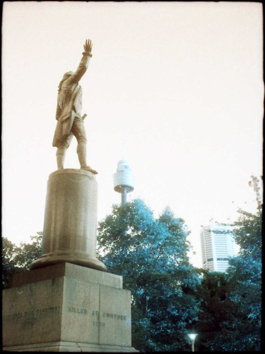
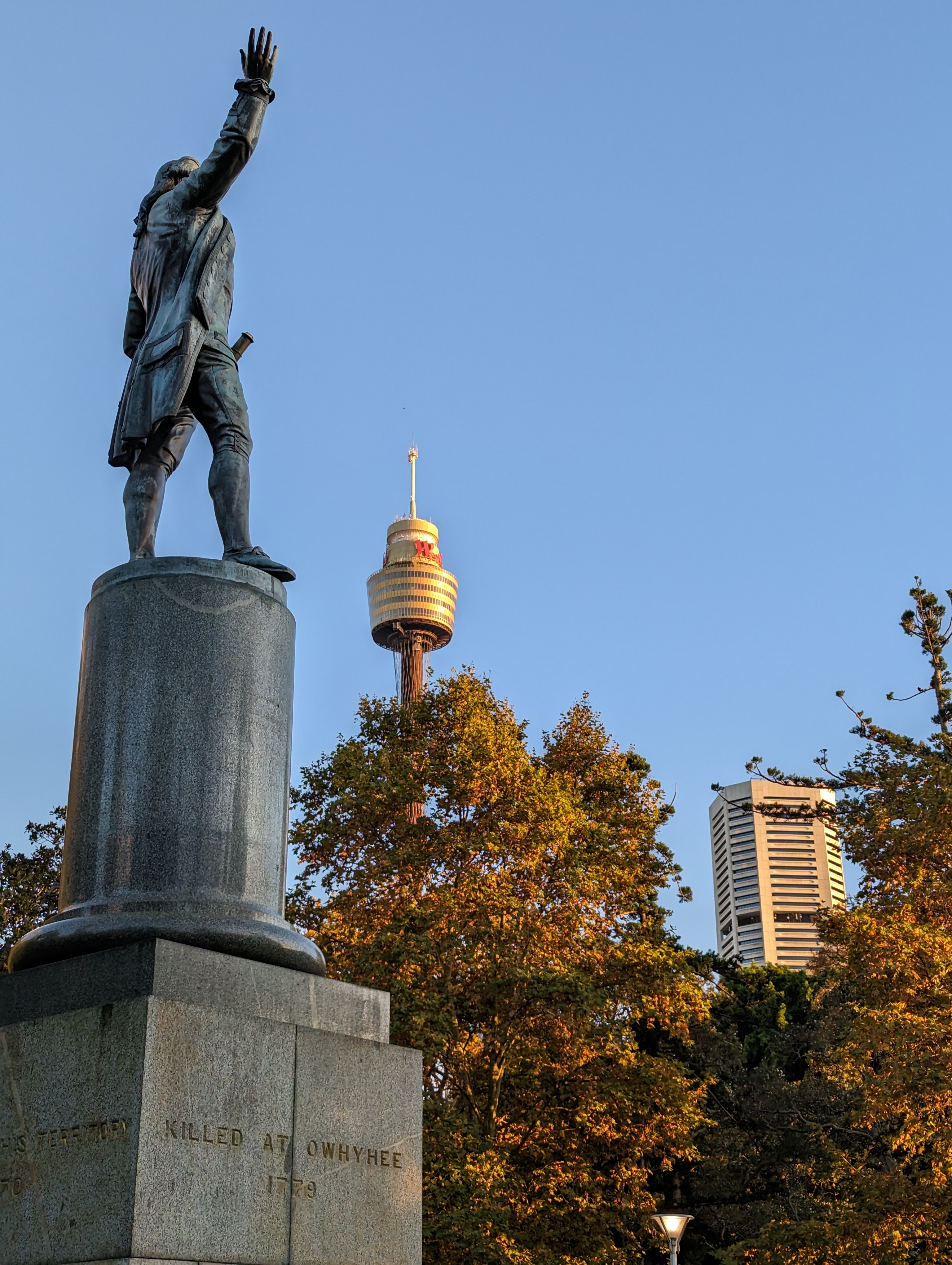
Like the previous post, this one is a side by side film and digital post. Instead of Cinestill 50d taken with the Minolta X-370, this film picture was taken on Lomography Lomochrome Turquoise with my half frame Canon Demi S.Similar to the previous post, the film picture is first and the digital, taken with a Pixel 7, is second. Unlike the previous post, these are much more similar pictures in terms of framing and effective focal length. As a result, they're a bit more immediately comparable.
Before talking about the pictures too much, let's go over the content and general structure of the pictures. The statue here is of Captain James Cook known most for his voyages across the Pacific, notably to Australia and New Zealand. In the first picture, you can just barely make out "Discovered this territory 1770". Obviously, this comes from a deeply Western colonialist viewpoint as people had already lived in Australia for tens of thousands of years beforehand. During my stay in Sydney it was really interesting to note the similarities and differences between it (and Australia) and the United States. Of course there are the similarities related to colonialization and the conquering of indigenous land and peoples. That said, unlike the US, Sydney seems to be paying at least lip service to the indigenous peoples instead of outright ignoring and continuing to systematically disenfranchise them. I'm not gonna speak more about that or Australian history here except that I did want to bring up one small note about Sydney. One interesting note that I learned about in a small museum in the Rocks was that Sydney had an outbreak of the bubonic plague (also known as the black plague) in 1900, continuing through to the 1920s. This compares with a very similar outbreak that occurred in San Francisco from 1900 to 1904. It's likely that both were due to shipping in relation to an 1894 outbreak in Hong Kong. I just thought it was an interesting tie between the US and Australia that I wasn't fully aware of until then.
Anyways, back to the structure of the pictures. Up at the front is the James Cook statue, arm outstretched. This statue is in yet another Hyde Park, named I assume for the one in London. To the back of the picture is the Sydney Tower Eye and another building that I can't identify and don't care to spend time trying to identify. Honestly that's about it. In both pictures, the statue takes up roughly the left third of the frame with each of the other buildings in another of the thirds.
Now let's get to differences. The most obvious is the lighting. The film picture is very clearly "overexposed". By that, I mean that the sky is not neutrally exposed and the overall picture is very bright or "high key". The digital picture is significantly more accurate in terms of how it looks in comparison to the real world.
Besides lighting though, the colors are the next point of difference. The film picture is shot on Lomochrome Turquoise which is another of those oddly colored film stocks. It tends to turn oranges green and greens a turquoise-y emerald color. The bronze statue, rusted and green with age is in some ways restored to a bronzish silvery color, the leaves turned an odd turquoise that if you didn't have the other picture might not even look that weird. But in reality those leaves, lit by the early morning sun and towards the end of fall, this picture was taken around 7 or 8 AM as I was catching an early flight, were quite golden in color.
Now that I've covered the main similarities and differences, which one do I like more? Again, I'm gonna go with the film one. Unlike the previous post, it's not because I feel like the film picture is more real. Instead it's more surreal.
There's an implicit surreality to modern computational photography. Or perhaps it's better to say that there's an element of hyperreality. What I mean by that is that especially with phone based photography, the phones themselves do a lot of processing and computation to create the "best" pictures possible with the limited physical capabilities of the cameras. As a result, there's a sheen of hyper sharpness and perfection that in some ways unnerves me. While it's still entirely possible to take bad pictures with a phone, there's also a lot less capacity for real surprises too. The surreality of pictures taken with phones is hidden and taken for granted. It's implicit and given even if you're unaware.
In contrast, this film picture is very explicitly surreal. The sky is totally blown out. The colors don't reflect reality even remotely. The edges of the frame crowd inwards, a reflection of the half frame irregularity. The text is readable but faded and there's an air of age to the picture even though it was taken at the same time as the digital one.
That said, if these weren't my pictures, would I respond the same way? I honestly don't know. One thing I haven't mentioned is that pretty much this entire roll of Lomochrome Turquoise is metered like this with the sky totally blown out. It wasn't on purpose, I must've either metered incorrectly or the extended range of the film interacted poorly with how I metered. Maybe it has something to do with going through X-ray machines. Hard to say honestly. But what I will say is that I appreciate that it happened. Unlike digital where everything happens and looks the way you expect it, film can sometimes just surprise you. You'll get it back and just go, huh. I'll talk about it more in the roll post, but this roll really made me reassess my photography and how narrow it's been. Quite frankly, if I only shot in digital, this would never happen. If you're like me, you either delete your failures or just never look at them again. They don't have a permanence or a weight. Everything blends into one continuous roll and there's no delineation.
That's it for this post. This is the last Sydney related post but I've got one more before I get to rolls.