Manly Spit Walk
Explanation
Continuing my Sydney picture series is this set of 4 pictures I took during the Manly to Spit Bridge walk. I chose to start at Manly because there was a bakery I wanted to try out there and it seemed like a nice place to chill and get some snacks and stuff for the walk.Overall, the walk is really nice. It took me about 4 hours though I was going pretty slowly and stopped a lot along the way to take pictures or read or otherwise just chill out.
But that's neither here nor there really. These pictures are grouped into two pairs. The first pair were taken from the same spot overlooking a bit of coast and the second are just paired together for their general vibe and structure which I'll get into.
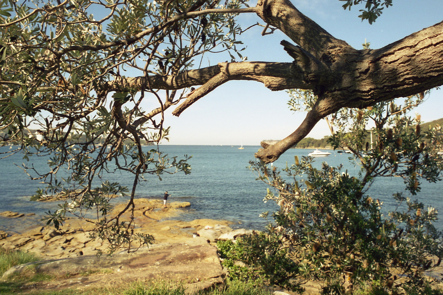
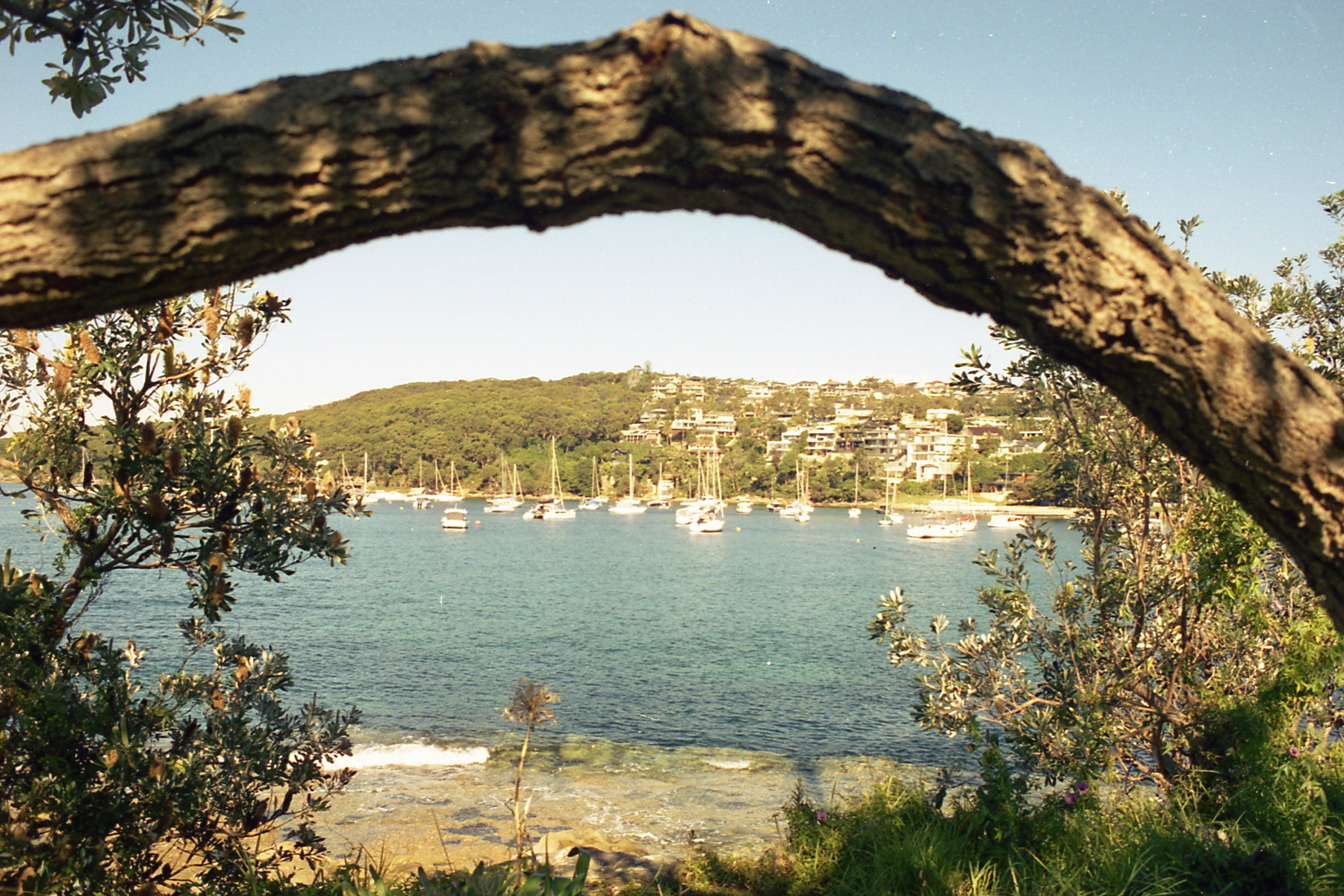
To start with the first pair, I took these from a bench I saw and just wanted to take a bit of a break. I saw the fisherman, actually there's a pair of fishermen though only one's in the first picture, and decided to see how I wanted to set the picture up. In both pictures I really wanted to use the tree branch to frame the picture. It creates the effect of magnifying the center area without needing it to be particularly in focus. Even though the man isn't particularly large in the frame, it's still really clear what action he's doing and how he interacts with the rest of the frame and I really do enjoy that. The second picture does a similar thing with the docked boats. While they aren't super sharp, there's a clear understanding between them and the rest of the frame. What I will say is that I think that both pictures are maybe a stop or two brighter than I'd like. I think in both cases, they'd be better suited a touch darker. The sky washes out a bit as is and there's a bit of detail loss that I'm not entirely happy with.
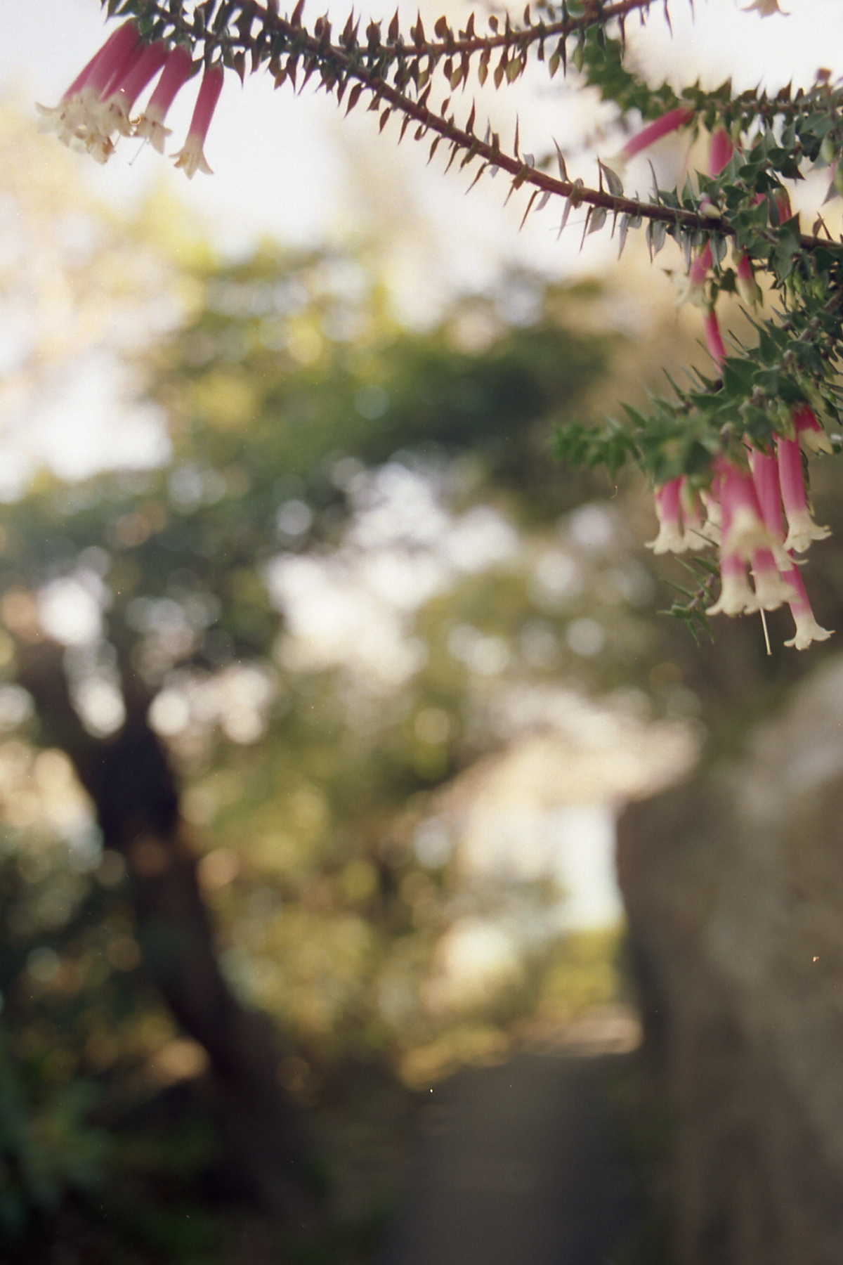
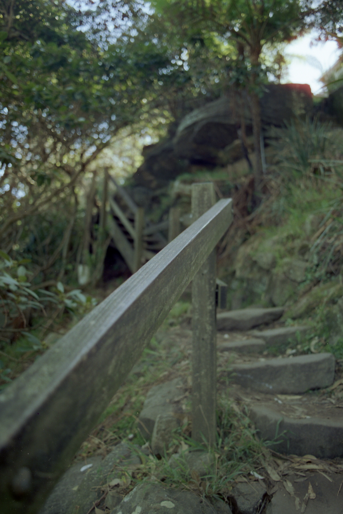
For this second pair, they follow a very similar and honestly quite simplistic structure. Both are structured with a close in focus foreground object and a background that is mostly out of focus. However, where they differ is perhaps more interesting than where they're similar.
While I can't be certain because I didn't mark it down, I think the first picture is shot with a 50mm lens and the second with a 28mm lens. I know I brought both and was switching a bit but was generally using the 28mm throughout this roll, which I'll speak about in the future. Part of why I think the second picture was shot with 28 is because it feels longer. The stairs feel stretched out in a way that feels more than if it were shot normal (50mm). The first picture however, feels pretty normal to me, there doesn't appear to be any sort of stretching. That said, it's a bit more difficult to tell with the type of scene it is. It's entirely possible both were shot with 28.
If we're talking about the feel or vibe of the two pictures, the first I would maybe classify as dreamy. The soft and generally bright lighting and really soft bokeh is both pleasing and relaxing. It's feels cozy and natural with the flowers up top. The second picture on the other hand feels maybe a bit menacing or unnerving. This comes partially from the colors being a lot more muted and dark. But also I think there's a bit of an archetype towards a close in focus stairway that evokes a bit of a horror theme and vibe. Like the first scene before a cutaway.
One thing I want to note in the second picture is the top right. Obviously, it's brighter than the rest of the picture, but also there's an interesting effect there that I haven't personally seen yet in my photos. What I'm talking about is that reddish glow or shadow around the light. This is commonly called halation and is seen in certain kinds of film including, as I found out after this got developed, this film. There are a few more pictures on this roll where this is obvious and it's an interesting effect that is more well known with film, though again is not true for all film stocks. In recent years, some people have been looking to replicate this effect on digital cameras, mostly for video and it's a cool and interesting thing to notice and think about. One notable example is the director Rian Johnson and his work on the Knives Out movies. I don't think it's necessarily important to this picture in particular but I wanted to note it for the next post where it'll maybe matter more.
Anyway, that's it for this post. I'm keeping it a bit short because I don't honestly have that much to say. These are pretty simple pictures and while I do like them, I don't really have a whole lot to say about them. There are definitely things to think about and get better at in all of them, but ultimately I think I might've made the same decisions when faced with the same scenes in the future.