Portra 800 (2nd roll)
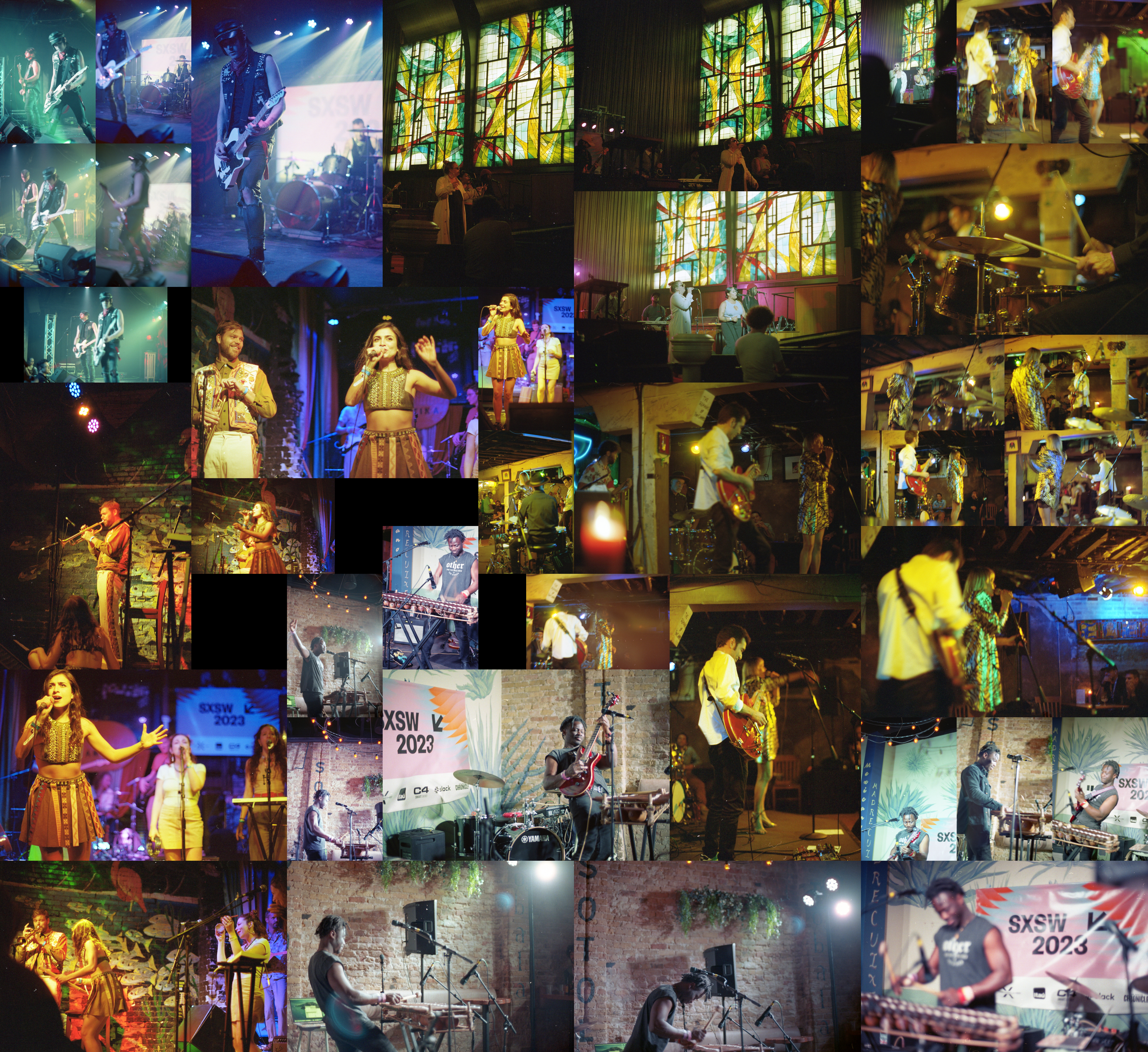
This roll takes place immediately following the previous one. The original plan was to go see Elephant Gym who was playing at Cheer Up Charlie’s outdoor. However, the line was long and we were in some questionable weather. It was really unclear whether it was going to just start pouring again or not, so I ended up coming back to Elysium to see the Swedish band Then Comes Silence. Honestly, I took a pretty passive approach during this show and am pretty disappointed in the resulting pictures. I don’t think they’re necessarily bad, they’re just not particularly exciting either. And as they were one of my lower ranked bands, I wasn’t entirely excited to see them. The show was still good, but honestly it wasn’t what I was looking for at that moment.
Before continuing, I do want to note that this night in particular was a really tough one for me to decide on scheduling wise. I had two very different directions I could’ve gone and I’m not sure if I ended up taking the one I really wanted to take. The other route would’ve had me go to Rainey Street for the night and I would’ve seen an entirely different group of bads, including potentially a second chance at Giungla. Quickly, that route probably would’ve ended up being, Foley, Giungla, Madison Baker, Moon Kissed, and Nemophila. But that’s life, you can only be in one place at a time and I decided to take the generally higher “value” route.
Anyways, continuing on I saw the Austin based Sir Woman at Central Presbyterian. I don’t really know how I feel about these pictures. I really like the stained glass and how that kind of ambient lighting can affect the space. However, it’s also a bit awkward on how to properly expose to not blow out the stained glass at the same time as getting the band in good focus. I do think I prefer the darker pictures over the brighter ones though. I think the one with the spotlight on the main singer could’ve been a stop darker and been just as clear while giving the stained glass a better color. All said, it was a tricky thing to balance in a single image and I think I could’ve done better. I probably could’ve been more aggressive with my positioning too but at the end of the day I was there to enjoy the music so I just ended up sitting in the pews and calling it a day.
On the right side of the collage is more pictures of Alexia Bomtempo. I think overall I did a poor job handling the lighting. I could’ve easily (and probably should’ve) shot one stop darker. A lot of these pictures end up with awkward motion blur from just a bit too long of a shutter and even that 1/8-1/15 of a second could’ve tightened it up without making these pictures too dark. Also just due to the venue’s lighting I don’t think that having a neutral exposure mattered, it looks overly yellow and I think a darker overall frame would be not only fine but more realistic to the venue. Before continuing, I want to call out one of these pictures in particular which is the one pretty much in the center of the collage with a candle in it. This was the last picture I took during the show. Most of the tables at the Elephant Room have candles for lighting and I realized that I could move them to get them in frame. I’m not sure that this picture completely works, but I like the idea and if/when I’m at the Elephant Room again I want to see what I can do with those candles. Overall, the picture isn’t too bad and it’s got all the members of the band lined up in a pretty interesting blocking. The only issue I really have with it is that the focus isn’t centered particularly on any of the four members, nor is it focused on the candle which makes the picture a bit wayward so that’s something to keep in mind. It was just a bit difficult to keep everything in mind at once.
To finish up the 16th, I went to Flamingo Cantina to see the French Armenian group Ladaniva. So there’s a bit of a story here. Originally Ladaniva was very high up in my list but I ended up dropping them down to the upper middle of acts I wanted to see. Clearly I was wrong and they still deserved to be towards the top. They were great and the perfect way to end a long night. Clearly, in terms of pictures I felt like I did a pretty good job too. From the trumpeter gazing happily at the main singer to the inverse, with the main singer gazing up at the trumpeter. From the one two three of the women to the admittedly should probably be a cropped image in the bottom corner, I just think a lot of these turned out well.
But no, I don’t want to only talk about the good pictures, I want to talk about one of the failures. Nestled between the two gazing pictures and N’famady Kouyaté, is a picture that just as a concept doesn’t work. The idea here was to nestle the now guitar playing trumpeter behind the main singer and get him in focus so you’d see past the main singer. This doesn’t quite work though for a few reasons I think. One, there’s a pretty distracting background that is in focus at the same time as he is. It pulls attention away from him and since she’s out of focus, it draws attention entirely. Two, his color palette blends into the background making it even harder to differentiate him. And three, he’s too close in the visual space to her. While there’s focus separation, there’s no spacial separation and it’s simply too tight to handle. If they were cut out onto a black background it might be ok, but given the previous two reasons, it simply can’t work properly. If I had taken this from a few steps to the left it probably could’ve been ok, just not this specific angle.
After that is a smattering of pictures from the N’famady Kouyaté show. These were reasonably successful and you can read about him in his post.
To wrap up this post, I want to go through the numbers. I didn’t for the past couple rolls but this roll is a bit interesting. The way this roll breaks down is 22 small pictures and 16 large. Additionally, it breaks down to 9 bad, 15 ok, 13 good, and 1 great. The great picture being the one I covered in the Alexia Bomtempo post. Generally, with rolls, the ok category is reasonably well split between small and large pictures in the collage with a weighting usually in the range of 25-35% ending up being large. This one you might notice only has 2/15 being large. I feel like this should be telling me I should be more discerning on the ok category in general. What exactly is an “ok” picture versus a good or bad? This is something I’ll continue in the next post because it’s maybe even more apparent there.
Overall though, I’m pretty satisfied with this roll. It doesn’t cover a large number of acts but I think that it’s relatively representative of the pictures I’m looking to take now and it has a clearer idea around what my photography is looking to be. The next roll may prove to be an outlier, but I’ll talk about that there.