SXSW - Steam Down
Explanation
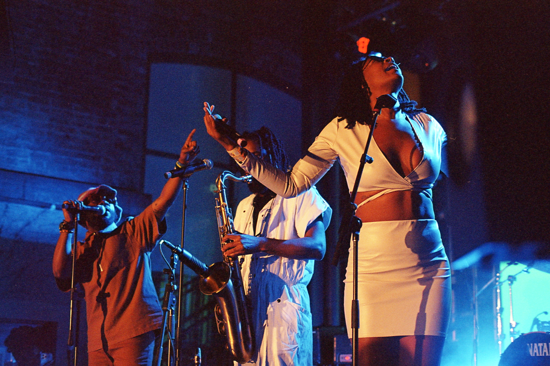
To finish up the individual posts for SXSW is this picture from the last show of Friday, March 18th. The subject of this picture is the UK based jazz collective Steam Down. As with many of the pictures I make posts for, I really do really like this one.But as always with these music posts, let's talk about Steam Down's music first. With both hip hop and afropop stylings, Steam Down has a pretty unique sound in the jazz space. At times the music can stray into that sort of jungle or breakbeat space, creating powerful and frenetic rhythms. Their music really encompasses a lot of my feelings on how reductive genres can be. While ostensibly in the jazz space, the use and inspiration from various other areas pushes it away from what many might experience as jazz. Jazz is admittedly a super broad genre, but that broadness just means it's difficult at times to categorize.
Before getting to this picture, I just want to say that I didn't come into this show expecting to take any pictures. As I said, it was the last show of the night for me and I was kind of exhausted. I also walked pretty quickly to get to the show and didn't get there as early as I normally would. As a result there was already a crowd and I didn't really try to get to the front. But as usual, I found my way there, driven almost by impulse.
Anyways, I'm gonna talk about this picture in 3 major ways. First will be about focus and grain, then lighting, and finally and most importantly, composition.
I'm not gonna spend a lot of time on focus and grain. Ultimately, it's sharp enough and sharp throughout the frame. The grain is pretty big but isn't distracting. This is a pretty unimportant paragraph.
In terms of lighting, I really like how it worked out here. The fronts are front lit with orange and the backs are backlit with a bright electric blue. The contrast between the front and back, orange and blue is really exciting. The exposure is just about right. It's just bright enough to have clear and strong detail and just dark enough to create meaningful contrast separation between the 3 subjects and everything else.
Now to get to why I really like this picture, the composition. As is obvious, this is a 3 element composition with the two singers flanking the saxophonist. I've said in the past that I sometimes have trouble organizing and orienting a 3 element composition but this one works really well and I think I know why. One issue I find with 3 element compositions is that sometimes it can be difficult to understand the flow of the picture. With 3 elements, how do you intend someone to interact and read the picture? This picture however has a really clear direction. It very clearly reads left to right. The outstretched arm and finger point and create a distinct and powerful line by which you can read the picture. This terminates in her fully outstretched in that direction, completing the line. With her right arm, she creates a contrasting line that frames out the center. To me, it's a really interesting setup that reads from left to right and then drops you back in the center to finish your experience.
With this picture and post, I'm officially done with the individual picture posts. I've got a few roll posts to do and then I'll wrap up my overall thoughts on SXSW this year, both music and pictures. I'm behind where I want to be in terms of getting these up in a reasonable timeframe but if I can get everything done before the end of April, I'll call it a success.