SXSW - Urban Heat
Explanation
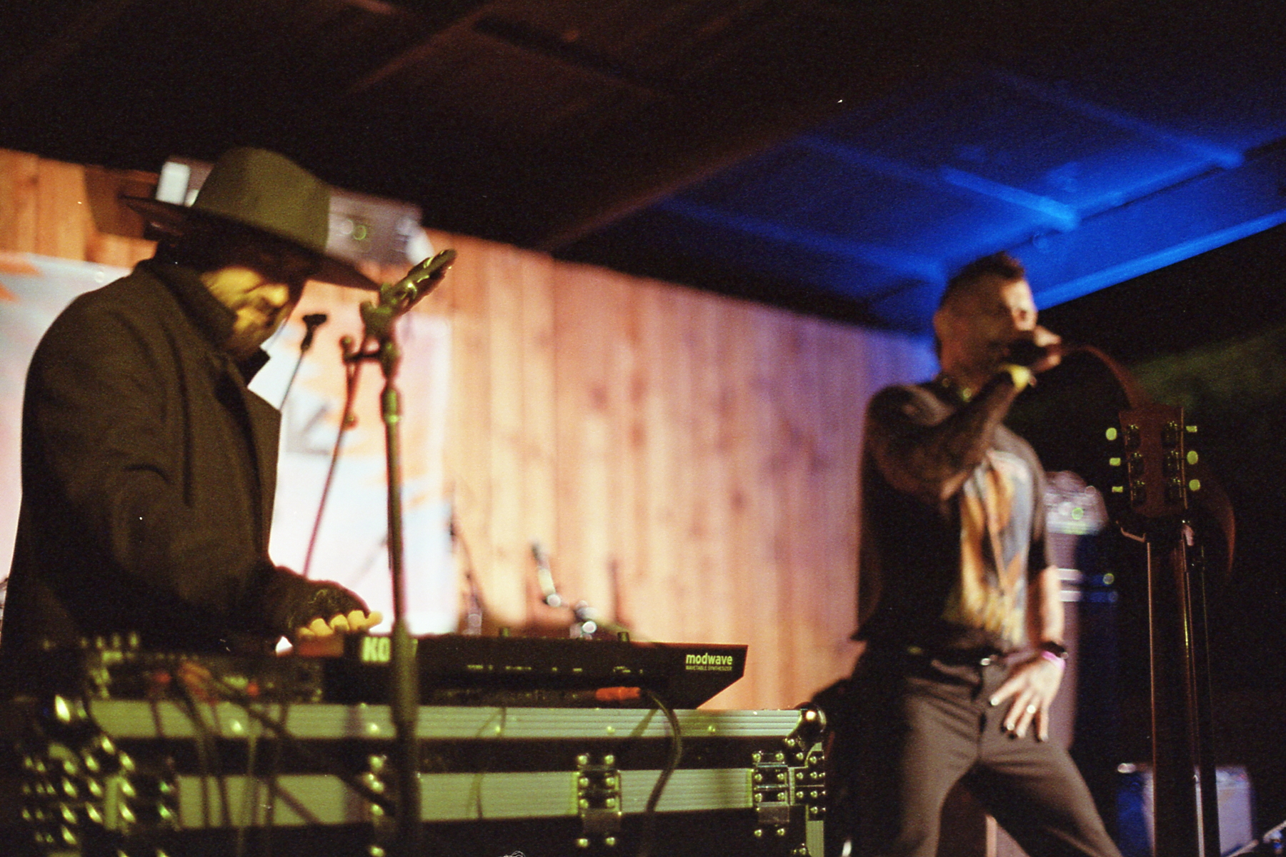
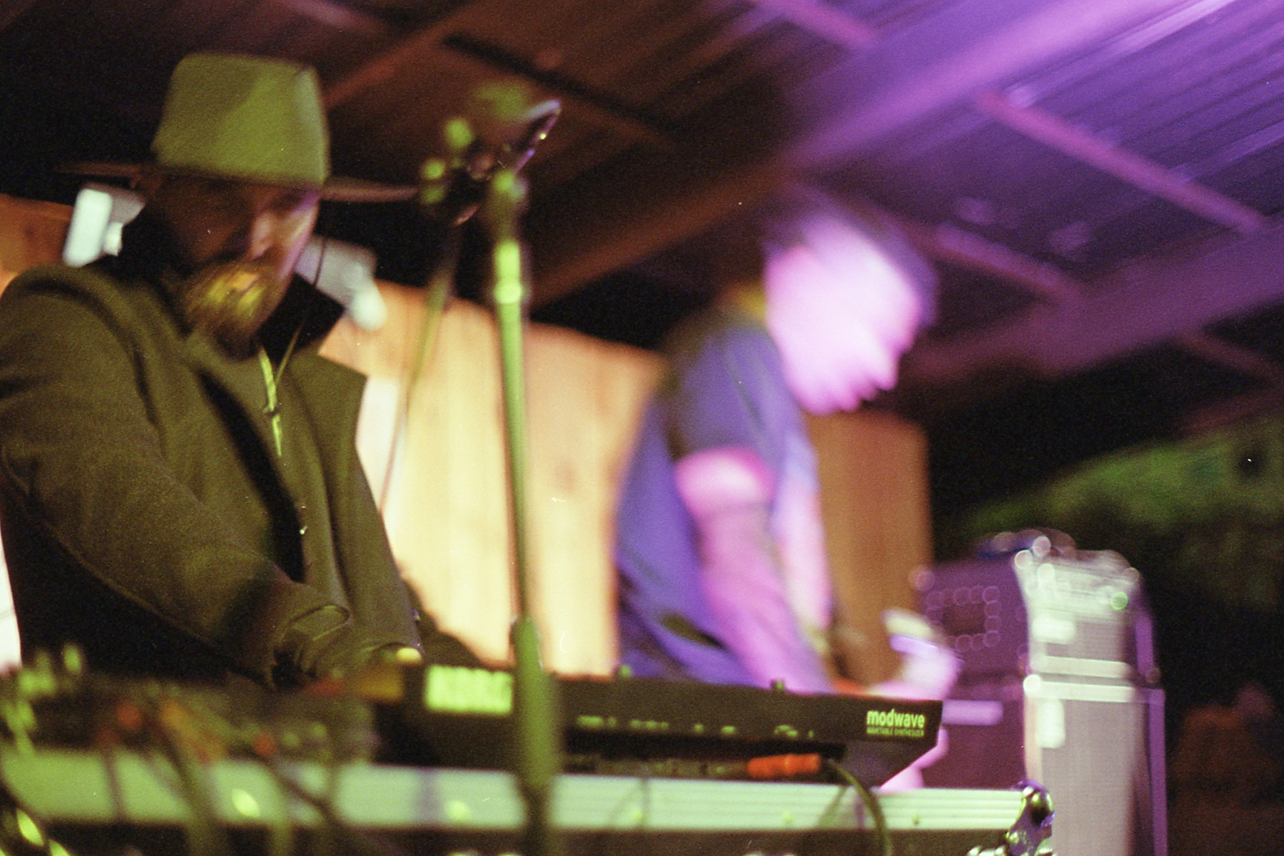
Something a bit different for this one. Here's two extremely similar pictures that I want to talk through. Since I've already talked about Urban Heat and their music before, let's get right into it.Both of these pictures are of that a/b form that I've been taking so many pictures of this year. Both of them even have the same subjects, Kevin Naquin, the electronics and keyboardist that I haven't mentioned before and Jonathan Horstmann, the frontman. Additionally, the general angle and vantage point is clearly the same. To go even further, the focus is even pretty much the same, focused most strongly in the middle of the frame, right on the "modwave" text.
How then, are these pictures so different from each other? For one, the second picture is simply closer. It's shot a good two to three feet closer than the first picture. This makes the space used by each element a fair bit bigger as the first picture was already taken from no more than 8 feet away. I'd like to take a quick tangent and explain the venue and setup a bit. These pictures were taken at The Creek and the Cave, formerly Barracuda before 2020, which is normally a standup comedy venue. This is in the patio and they had set up two really big sets of speakers one set flanking either side of the stage that were crazy loud. Now as to why this is important, the first picture was taken right around at the front of those speakers. The second picture was taken towards the back of those speakers, in the "bowl" created by the speakers and the stage, where it was so much quieter because they weren't blaring directly at me.
Another important difference is the motion being expressed by Horstmann. While Naquin is largely static in both pictures, Horstmann is clearly more animated in that second picture. In addition to the focus being softer on him, he's also more in motion. To be clear, the reason the focus is softer on him is because I'm closer to the "modwave" text which means that with the wide open aperture I'm shooting these pictures at the blurring effect is stronger. It doesn't matter if your aperture is wide open if you're focused far and everything in your frame is far.
The last and least impactful difference is the lighting. The bright purple lighting on Horstmann in the second picture further accentuates his motion and separates that part of the frame from the yellow lighting to the left. The first picture has significantly more neutral lighting so there isn't any separation between the left and right sides on that front.
Now let's get to the important question, which picture is better? As always, this is a tough question to answer. Arguably, the first picture is clearer on a focus level and the poses and interactions are more legible. That said, personally I'll go for the second picture. There's just more happening. There's more energy and there's an intimacy and vibrancy that the first picture lacks. Now let's ask another question. Would the second picture be better if it were sharper or clearer? My answer to that is no. If this picture were tack sharp, it wouldn't really have that raw and vibrant feeling. It's exactly because it isn't completely sharp through the frame that it's exciting to me. Two more individual posts then we'll wrap up with roll posts.