Multiple Exposures
Explanation
In the last post, I mentioned multiple exposures and I really wanted to talk about them here. Mechanically (chemically?), the way that film works is that when the film is exposed to light it changes. How exactly it changes is dependent on the film and its formulation. During the developing process, it loses its photosensitive behavior, making it so that it can be looked at in the light. It's at this point that it actually has the colors the way they'll end up. Up through the development process, any number of factors can affect the film and change the results.To take a multiple exposure picture, you have to think about how many exposures will be on the frame. Since exposures can generally be measured in stops and the difference from one stop to the next is a doubling/halving, to take a picture with two exposures, you'd need to take each exposure one stop faster/darker to get the resulting picture the exposure you want. The exposures are additive, which means that by adding one to the other, you end up twice as bright, or one stop, as each of the component exposures. This also means that the disjoint parts of the exposures will be half as exposed in comparison to portions of the frame that stay still. Hence the ghost-y effect.
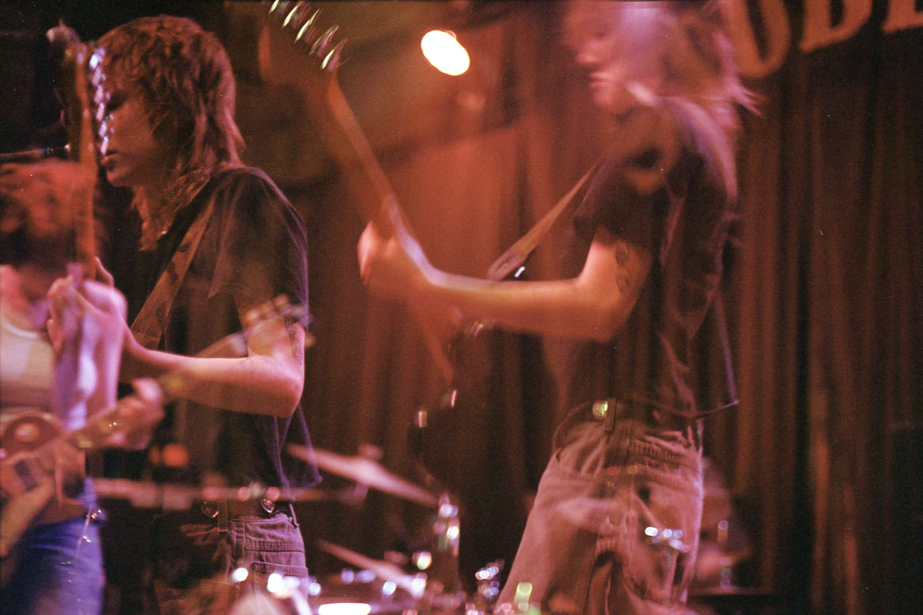
Now, let's get into these pictures. To start is a really nice picture of Die Spitz. It's actually pretty impressive that the background is static and the only real doubling is the guitarist/singer here. Purely for context, the main subject here is a guitarist/singer but also swaps with the drummer for some songs. Die Spitz is a really talented and fun band.
Anyways, I think this is a pretty great picture. It also only works because it's a multple exposure. While it's a decent picture with the main subject reared back, there's a significant amount of information added with the double exposure.
To explore this picture, let's talk about the individual exposures and go over why I don't think the picture would work as well individually. Of course, neither of them on their own are bad, but they also aren't great on their own either. The first exposure I'll talk about is the one with her up to the mic. If this were the entire picture, there would be a pretty large amount of negative space to her right. This isn't necessarily a bad thing, but I think with the other guitarist/singer in the back there's too much information on the left side and it's all too close to the left edge.
Looking at the second exposure, it again wouldn't be a bad picture on its own. It would be roughly an a/b split picture as I've been describing though it has some pretty big issues. The biggest issue is that the second guitarist/singer is still really far to the left and quite frankly it's worse here as it really pulls you out of the frame. Personally, I don't think that's the worst thing, but it's not particularly beneficial here.
When put together, it almost feels like a three piece composition. Unlike a normal three piece composition however, two of the pieces are translucent so they don't pull as strongly as they would normally. This works to not overload the two pieces on the left which would normally compete more strongly and be hard to differentiate and separate.
The other thing that the two exposures do is sell movement of the main subject. Since one is in motion and the other is stationary, there's a real sense of inertia being expressed.
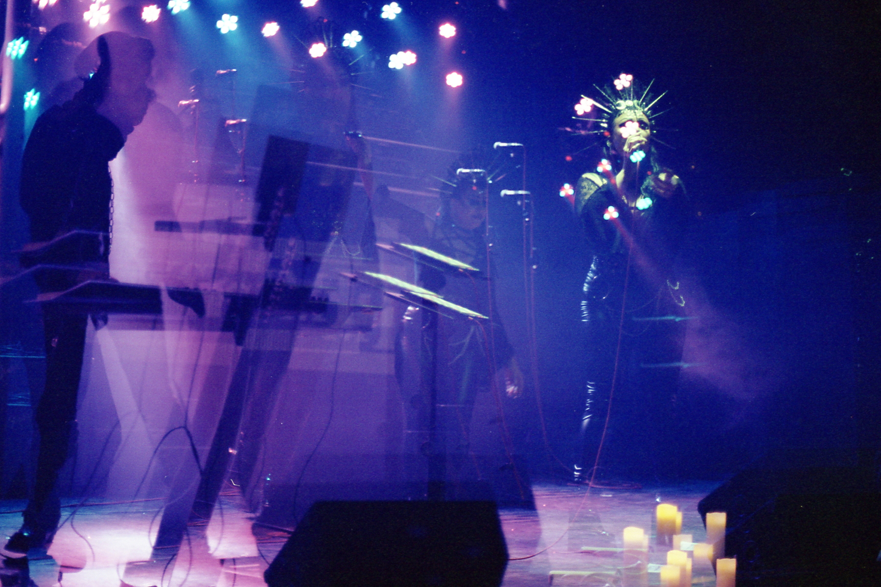
Since I already covered the second picture in the previous post, I want to move onto the next two before using that as a counterpoint to the last picture.
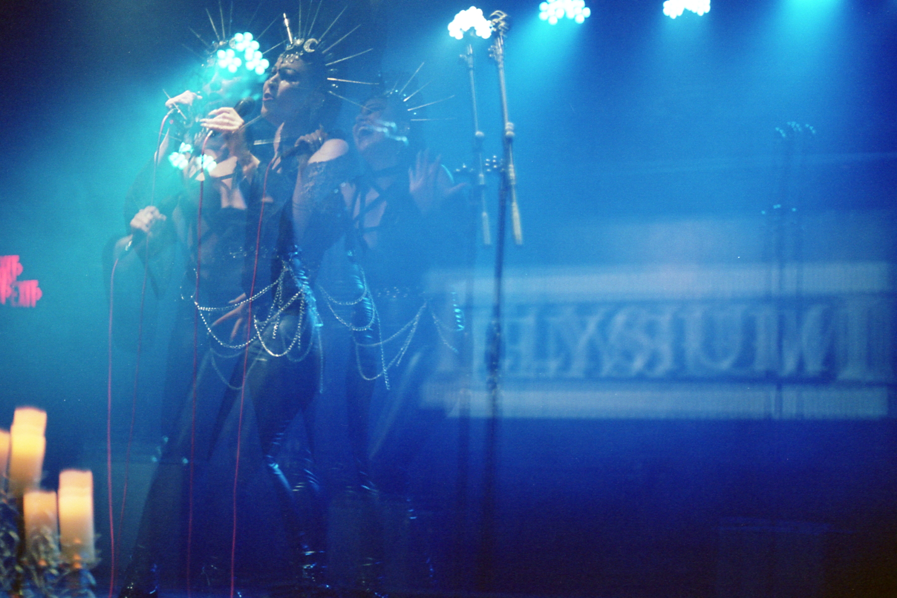
Unlike the Die Spitz picture where I said that the composition would be too strongly oriented to the left with the first exposure, all of the exposures on this picture are clustered to the left. I think this one works bettter though because they're all a bit further away from the left edge. Also, even though I was trying to make it as still as possible, the separation in the x axis works well to mediate that strong left orientation. The Elysium sign in the back also helps to give meaning to that negative space instead of having it be completely empty. While I think the picture would work if I had successfully aligned it, I don't hate how this turned out. The separation makes each facial expression more legible. There are technically four exposures here but one of them is pretty hard to see as it's hiding among the others a bit too much.
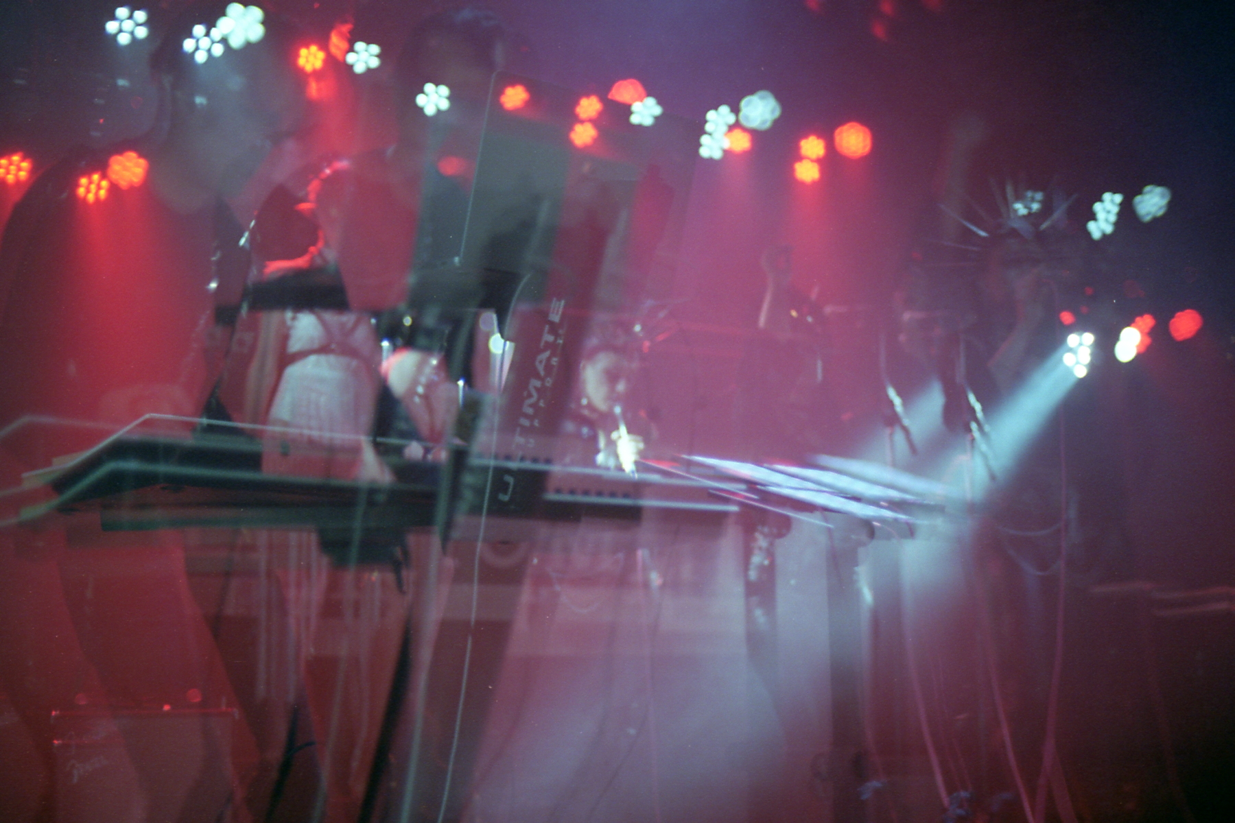
Now, let's talk about this last picture. Out of this set of 4, this is the one I don't think works. While the bones are the same as the 2nd picture, it's honestly too cluttered. Part of this is it being a triple exposure with all three being pretty unaligned. However, the second picture is pretty similar in that aspect, it also being 3 exposures that aren't super well aligned. Instead, the problem here is that there's just too much in the frame and there's no strong focal points.
Unlike the picture I talked about in the first Sin + Seraphim post which had strong lines, this one has really weak and ghostly lines. Without strong anchor points, it's hard to attach yourself to any specific point in the frame. Your eyes are constantly wandering around trying to understand. This is in contrast to the first picture which is well aligned and the only thing that pulls focus are the two exposures of the main subject. It's different from the second picture which has a clear exposure with ample negative space around it. As I mentioned for the 3rd picture, there's more than enough negative space to not feel cluttered. None of that's true for this last picture. It's just cluttered and altogether difficult to understand.
In review, multiple exposures can be really good ways to express motion or action. However, there's also a really fine line between doing so and creating a bunch of clutter. I think they work best when the frame is relatively spaced out where you don't run the risk of significant clutter if the different exposures don't align well. I definitely want to explore them further and try more different things with them in the future.