Die Spitz
Explanation
First photo post of 2023. Before I get into it, a bit of site information changes to cover. I've added tags for each post with the film stock and pull/push. Additionally I've updated all the roll posts to be numbered regardless of pull/push. This is mostly for simplicity so I don't have to keep track of multiple numbers for the same film stock but different processes.Onto the pictures. This pair of pictures were taken at Die Spitz's show at Stubb's indoor stage for Austin Free Week. As I stated in the previous post, I really wanted to look at different ways of structuring and working through this specific composition.
Unlike the examples I've given in the past which were all taken from the left side of the stage (stage right), this pair of pictures were taken from the opposite side. This is partially a function of where I ended up for the show and partially me wanting a second attempt at pictures from this vantage point. I previously shot some pictures of Die Spitz on the last roll of last year and wanted to see the show this time from the same vantage point. If I see Die Spitz again, I'll probably choose the opposite side, just to explore their show from a different angle. Note: I probably won't do any shots towards the center since their fans have a high propensity for making spontaneous mosh pits and I don't want someone to break my glasses or camera.
Let's break down these pictures more specifically. To start off, I like both of these pictures a lot, but they accomplish really different things. I'll focus on the first picture before talking about the second and follow with some closing thoughts.
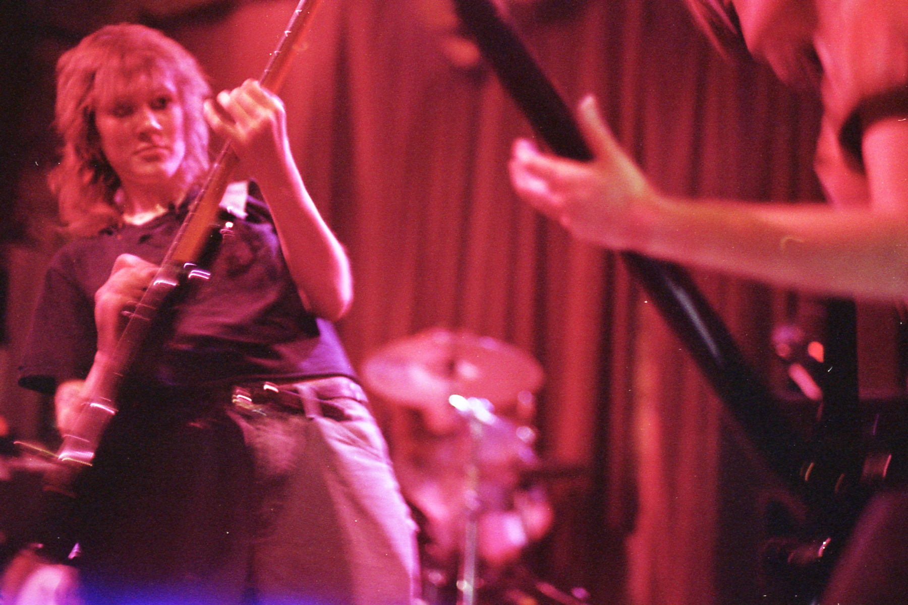
The first picture's structure is with the main subject to the left but pushed into the frame a bit. This is done through the addition of the bassist to the right who, though mostly out of frame, is still visible enough to create a focal counterpoint to the guitarist on the left. In terms of shutter speed, if I remember correctly, most of these pictures taken at Stubb's were shot at either 1/30 or 1/60. Both of those shutter speeds would give this sort or mild motion blur on a largely stopped action. A more vigorous motion would obviously blur pretty strongly at that speed which is why I aimed for a specific moment when she was arching back and slowing down her lateral movement in the frame. There's still a bit of blur on the guitar and her left hand which is nice but not overly distracting or unclear.
One thing I think this picture really succeeds at is that the composition feels full without being cluttered. The two necks of the guitar and bass really cleanly create a negative space where the drummer sits almost entirely out of focus. There isn't so much negative space as to make you linger. But there also isn't so little that things feel too tight. Personally, I'm entirely ok with the fact that the bassist is off frame. This picture isn't really about her. The interaction with the neck of the bass with the guitar is the main point while keeping enough in frame to not feel lacking.
If I'm going to nitpick, I might pull the guitarist a bit more to the right by angling a bit more parallel to the stage, just a couple degrees. She's a little bit too close to the edge of the frame. However, since she's leaning back, I feel more ok with this than in a situation where she's more upright.
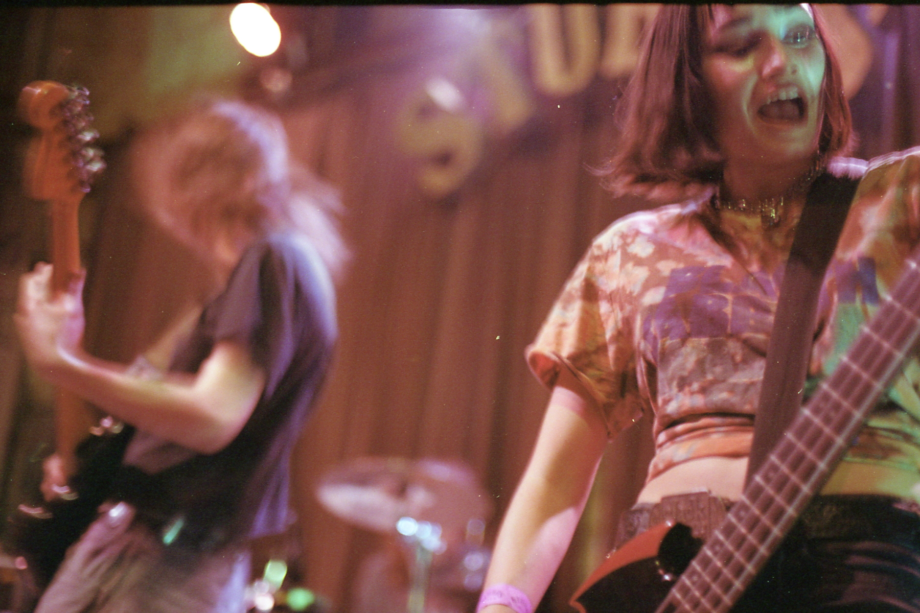
Moving onto the second picture, this one's almost an inverse of the previous one. It's taken from a bit lower of an angle to get the Stubb's signage which is a nice background touch. I would say that I wish the shutter speed were a stop faster. Unfortunately, I was already shooting wide open so if I did so the entire frame would be a stop darker and I really like the exposure here. These are the types of tradeoffs that you have to make when shooting film and ultimately I'm ok with it but it's an issue I have with the picture regardless.
In terms of structure, it's actually got a lot of the same pros and cons as the previous picture. While the right side is now the focus, both in terms of it being more in focus and also being a more dominant facet, structurally, it's still the same a/b split type picture.
Here though the composition lends itself to having two distinct subjects instead of one plus some extra information being implicitly added. I like that the guitarist is blurred and in motion. This creates a counterpoint with the largely static bassist to the right.
Once again, to the back is the drummer, completely out of focus. Their function is to again take up space so there isn't too much negative space between the two main subjects. It also creates a third spot to get information, even if there isn't as much detail to get information from.
If I were to say which of these two pictures I like more, it's definitely tough. Again, I think they accomplish slightly different things even with quite similar compositions. I think I'm leaning a bit more towards the second picture. This is mostly because there's a bit more image density while still not feeling cluttered or overwhelming. By adding some motion blur, there's an element of energy that isn't quite as obvious and apparent in the first picture. This in my opinion overcomes the fact that in terms of clarity of focus on the main subject, the first picture is better.
This post is pretty long, but I think posts might tend towards this longer length for the new year. I really want to spend more time breaking down specifics in each picture more completely. This just means these will end up being longer and more in depth.
One last thing to note is the color. In terms of trueness to reality, the second picture has more "correct" color. I'll also say that the during the scanning process, I don't have full control over the color and the scanner I'm using will auto-color in somewhat unpredictable ways. I'm not too fussed about the colors. I like shooting in color, but I'm not at all a color purist or a color realist because honestly that's a tertiary concern of mine when taking pictures. I've got quite a few more Austin Free Week related posts coming up so stay tuned.