LomoChrome Purple (1st roll)
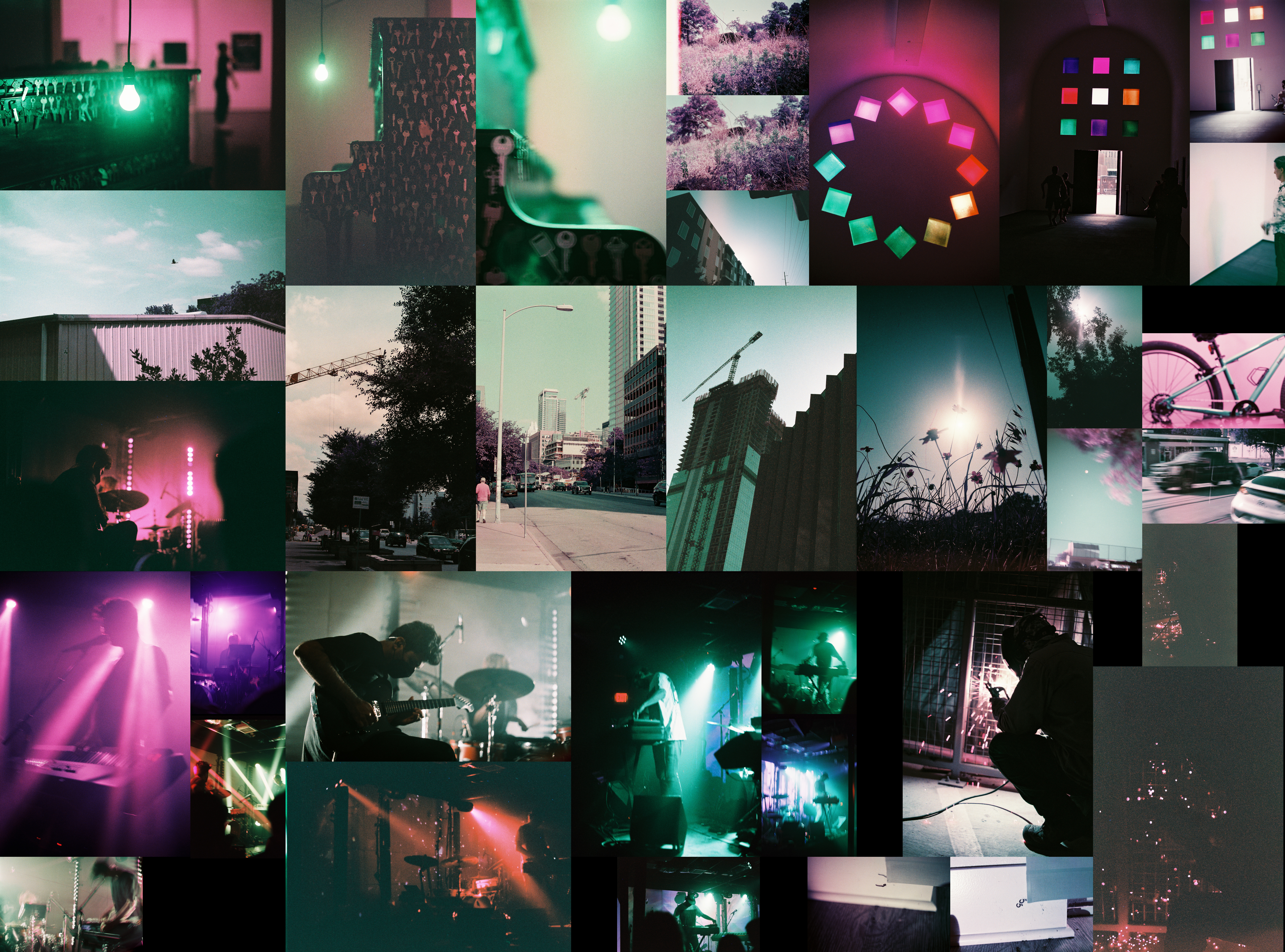
The LomoChrome Purple film is a real joy to shoot. It has very interesting properties as evidenced by the previous posts and this collage. As I mentioned before it has quite a few color changing properties. As stated on their site, LomoChrome Purple is “A color contortionist, watch as blue becomes green, green becomes purple and yellow becomes pink.” This is very obvious when looking at pictures like those of the Blanton.
It also creates a really interesting perspective shift. For example, right in the middle of the collage is a picture I took almost haphazardly while waiting for the bus. The green leaves transform into this mass of purple that I now instictively see every time I’m there. Nothing’s particularly changed, the leaves are still green, but now I can also see purple.
In a weird way, this roll of film, like the LomoChrome Metropolis, is really consistent. There’s a lot on the green/purple axis which at once feels totally foreign, but also distinctly natural. Also like the LomoChrome Metropolis, this film is also an extended range 100-400 ISO film with the same slightly odd characteristics that I detailed in that post.
What I will say is different, besides the color, though is the film grain. In general I feel like the film grain is a bit finer than on the LomoChrome Metropolis and not altogether distracting.
If we’re talking about how I felt these pictures turned out, I think all I can say is ok? It’s an interesting distribution. Like the previous rolls it’s pretty split 18 “worse”, 17 “better”. However, there are few pictures that I outright disregarded at just 7. In fact, it’s quite similar to the LomoChrome Metropolis, with a relatively small bad list, a relatively small good list, and a pretty large in the middle list. As a result, I feel like I’m honing in on a good understanding of how I am currently taking pictures.
What that really means is that I should probably look to take more risks. While that means that I’m likely going to dislike more pictures, I have more range to reach for better pictures too. As it stands, I’m dissatisfied by how similar these pictures feel. I want to reach for more and different concepts.
This isn’t to say that I’m not happy with this roll or a good number of the pictures on it. That picture I mentioned earlier with the purple leaves that I said I took somewhat haphazardly is actually a pretty nice picture. I feel that it straddles that boundary between a vintage picture, both with its film grain and almost small town main street feel, with the reality of a large modern city, cranes and skyscrapers in sight.
One thing I do feel about this roll is that it feels more compact that some of the previous ones. It’s largely dominated by the Blanton pictures across the top and the Black Taffy/Son Lux pictures at the bottom. In that way, it feels less broad than some of the previous rolls which had more different acts, ideas, or landscapes represented. Though I probably won’t get to the next roll for a few weeks, I’ve already shot it I’m just waiting for it to be developed and sit with it for a bit, I will say that that feeling will probably be similar since it will again be dominated by a couple of distinct subjects.
Overall though, I really enjoyed shooting this roll of film. I’m excited to try it out again, knowing better what the colors will look like and how to use them more effectively.