Blanton Museum of Art
Explanation
As a resident of Austin, Texas, one of my favorite places in the city is the Blanton Museum of Art. Located at the edge of the University of Texas campus facing the State Capitol, the Blanton is very much both part of the campus and a part of the city.As an art museum, it's relatively small with generally one large rotating exhibit once a quarter. While it lacks the size and breadth of a larger institution like the Art Institute in Chicago or the Metropolitan Art Museum in New York City, it more than makes up for it with its focus and accessibility. One of my qualms with large museums is the sense that it's impossible to see everything. At a large museum, it feels like your attention bounces from Chinese to Indian to Classical Greek to Contemporary American and to focus on any one thing means you lose out on something else. For an out of towner or occasional visitor, I find that incredibly stressful. With the Blanton, it's small enough to see everything in an afternoon moving at a relatively leisurely pace. Or for someone who wants to focus on just a few things, there's still plenty to occupy oneself with.
In terms of genre, the Blanton is geared more towards contemporary American art where "American" encompasses mostly works from the United States and Latin America. While there are galleries dedicated to older European art, I find that it's nice to have a well focused yet varied museum. At the time of this writing, one of the second floor contemporary art gallery areas has largely been taken over by contemporary Black American art.
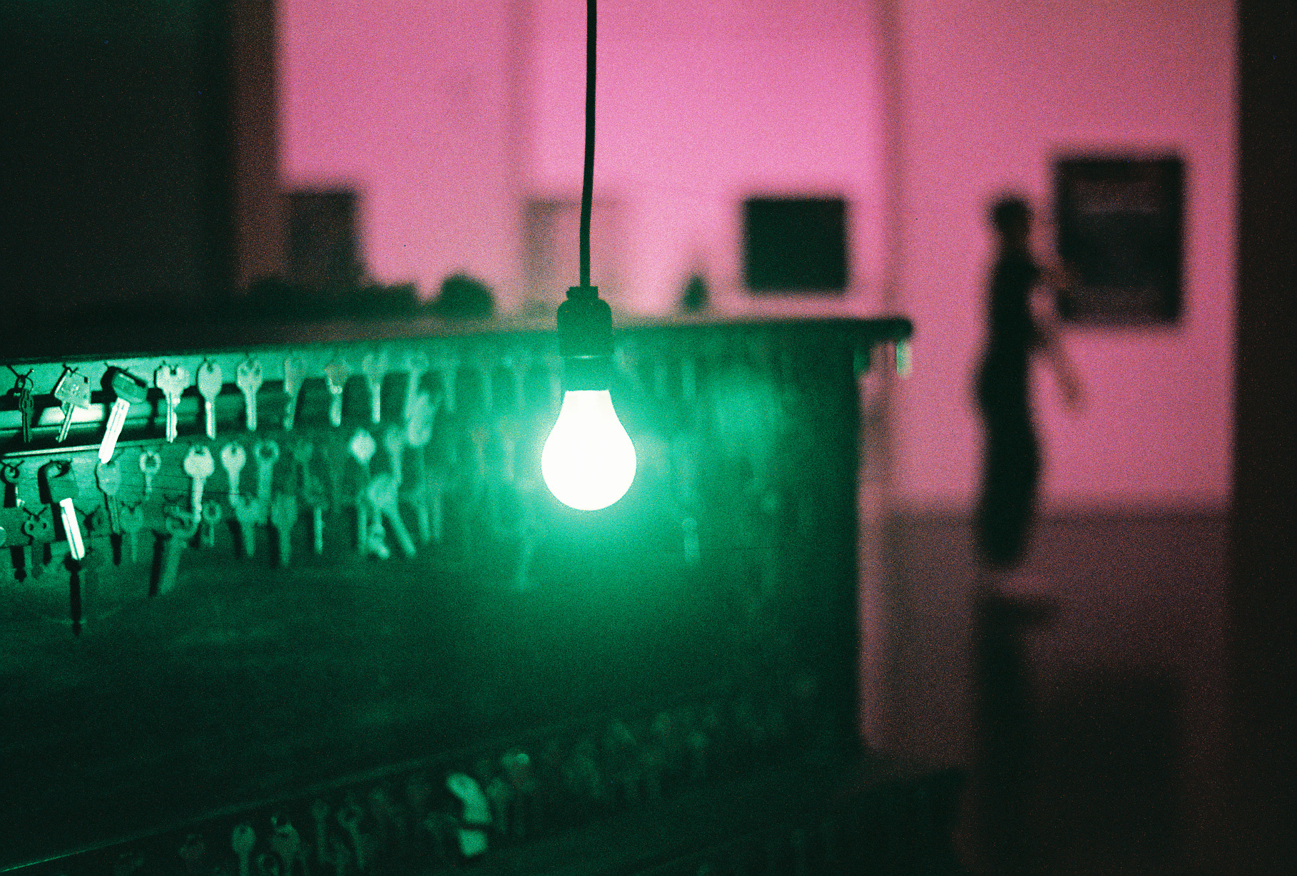
One of those pieces is the subject of the first picture displayed here. The piece in question is called Spellbound by the artist Nari Ward. The actual artwork is of a piano covered in keys and moss with a blue lightbulb hanging in front of the keys. On the back of the piano is a TV screen playing a recorded video. Now, you might ask, if the the lightbulb is blue, why does this picture have a green light? The answer to that is because I was shooting a special film by Lomography called LomoChrome Purple. One of the effects I've seen it have is changing strong blue light green. It additionally does other things which I'll cover in other pictures.
I ended up taking 3 pictures of Spellbound, all of which I think are quite interesting in their own ways. That said, the one picture I was aiming to take didn't quite pan out the way I expected. One thing I'm still trying to work out is how shallow the depth of field actually is for my lenses and I'm still not quite happy with my pictures with really shallow depth of field.
Anyways, I want talk about this picture and why I like it the most. For me, it comes down to 3 aspects. First, I really like how the combination of focus and grain come together. I think the outlines of people are really cool. They almost have that look of being behind shower curtains. While I didn't take any pictures of Oscar Muñoz's exhibit, Invisibilia, one of the pieces was of what appear to be human traces on shower curtains. Obviously, this picture's effect matching that wasn't fully intentional, but I like that that exists here, even as a sort of fortunate serendipity.
Second, I really like how the light from the lightbulb interacts with the keys. Even with a close focus creating a fair amount of bokeh, it's clear that these keys are shiny. Even though the colors don't seem realistic or proper, the material quality is still evident and that's a really nice effect.
Lastly, I like the overall composition, specifically in relation to color and space. As I referenced earlier, it's really nice having different layers of space represented. There's the piano, the close person in the first room that has a relatively clean silhouette, and a third room with just a blurry head in the back. This further intersects with the color. The first room with the piano and keys is awash with green and the back is this pink/magenta hue that contrasts really strikingly. Overall, I feel that this picture ends up way more interesting as a function of its color than an "accurate" picture would. While I didn't intend this at the time, knowing what I do now I can aim for this effect and maybe hit it in the future.
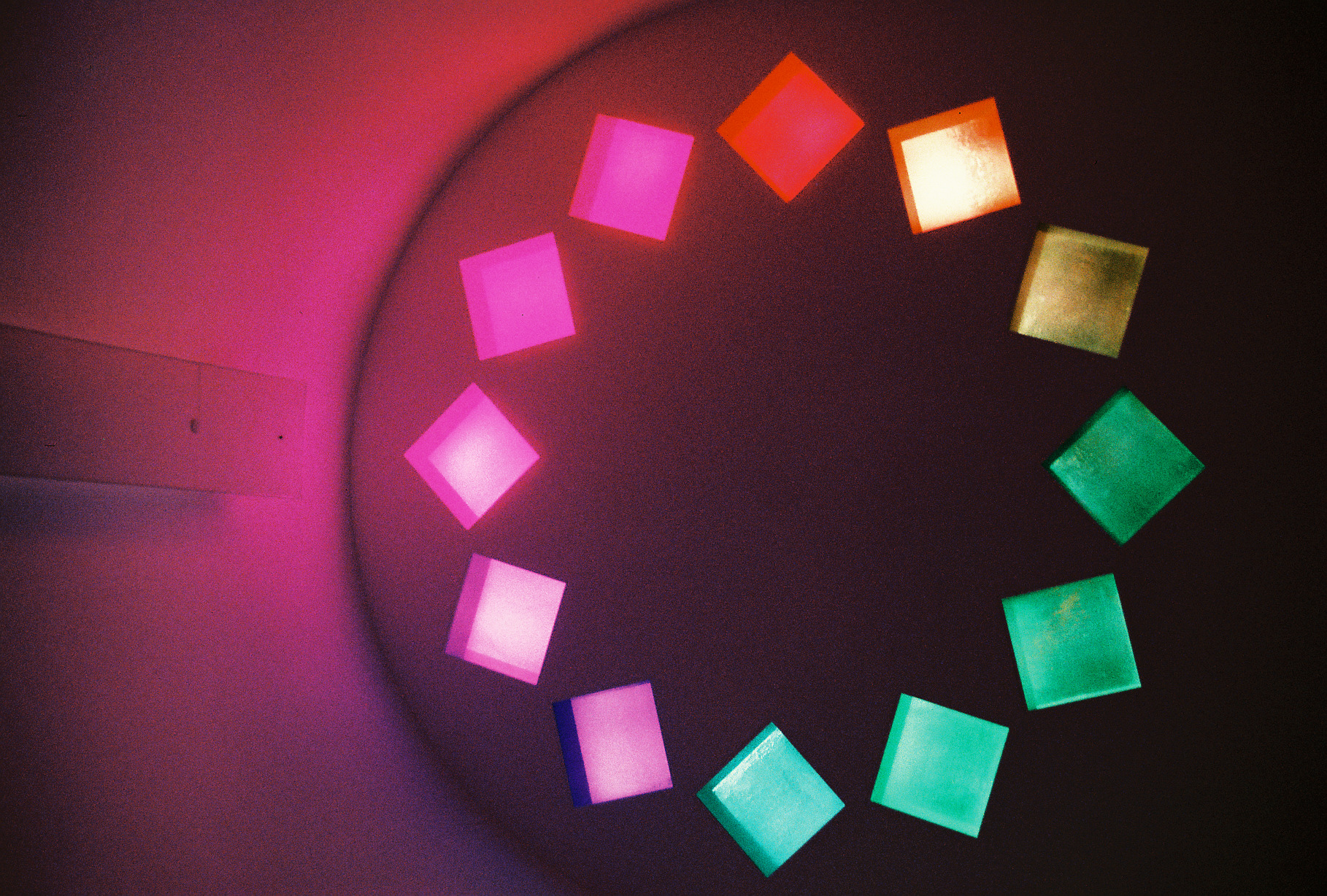
Now, before ending this post I have to talk about Ellsworth Kelly's piece, Austin. Completed in 2018, Austin is now, in some ways, the quintessential piece to describe the Blanton. Bright, vibrant, meditative, social, contemporary, inspiring. As a piece and a space, Austin is many things. The second picture is of the more commonly photographed East facing windows. Honestly, this picture bores me a bit. It's colorful and cool but the reason why it's here isn't that I find it implicitly interesting. Instead, this is a great picture to describe the effect on color that LomoChrome Purple has. Under normal conditions, these windows start at yellow up top, orange to the right, purple at the bottom, and aqua to the left, transitioning along general rainbow colors. Instead, this picture has a lot of odd effects, turning the yellow magenta, the green purple and the purple green. At some point soon, I'll post some more "accurate" pictures of Austin but suffice it to say that it's a favorite place of mine and I'll come back to it more in depth then.