The Power of Color
Explanation
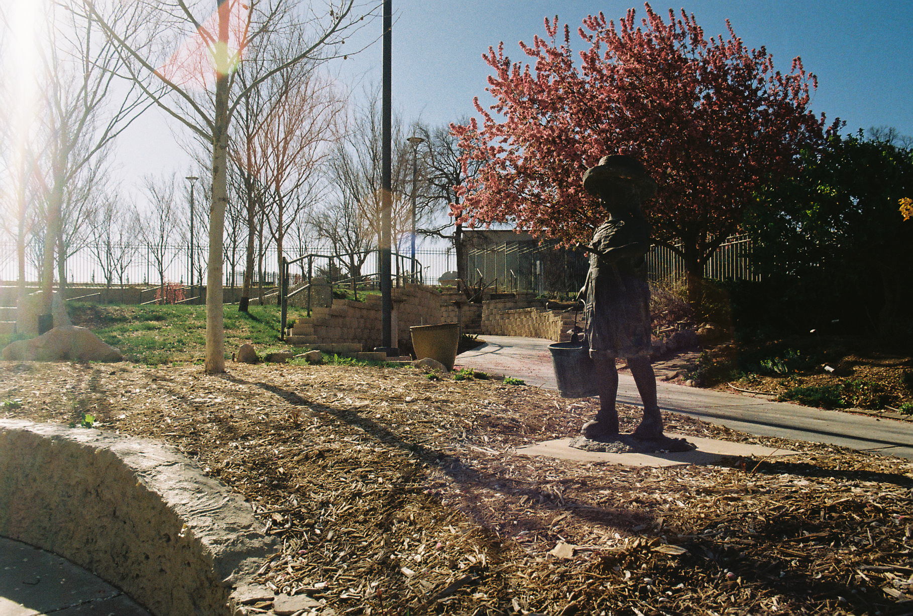
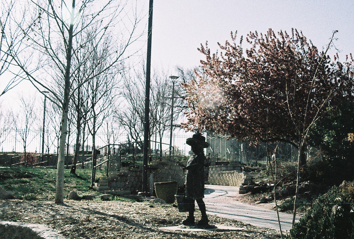
For this post I want to talk about color. Specifically how much/little color affects a picture. As usual, these pictures are not edited though I'll show an edited black and white only version of each picture at the end just for a demonstration. In each pair, the first picture was taken with Kodak Gold 200 film and the second picture was taken with Lomography LomoChrome Metropolis film.Let's start with the picture of the girl and the falling petals, if only because they're first and I've already talked about the Metropolis picture before in the previous post. Let's start with which one I like more. Honestly I like the Kodak Gold 200 picture more. It's more vibrant, the colors are punchier and more dynamic. The color contrasts between the sky and the pink petals and the ground are really spectacular. The glare on the left side is a bit strong, but it's not super distracting. Overall, the picture feels more alive.
In contrast, the picture shot with the Metropolis film has significantly less color contrast. Everything kind of blends into this sort of grayish hue. The trees look less alive. Additionally, even though this is the cropped picture from the previous post, the actual positioning and composition isn't as nice as the Kodak picture. That said, not everything is negative here. The falling petals are really nice and missing from the Kodak picture. It should be said that I was trying to wait for falling petals in the Kodak picture as well but I got impatient after waiting a good few minutes. All told, while it's clear that these pictures were taken in the same place with quite similar conditions, they come off quite differently. Even though the composition, angle, focal length, and most everything else is roughly similar, these two pictures come off quite differently almost entirely off the color.
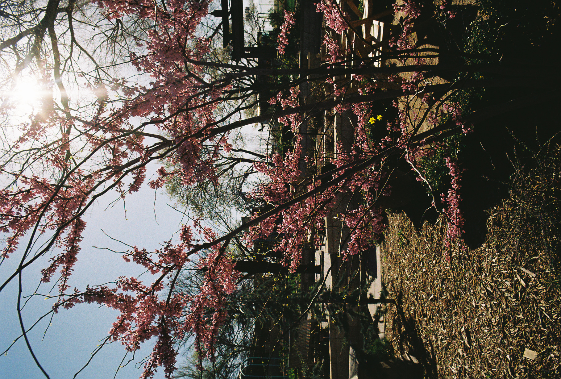
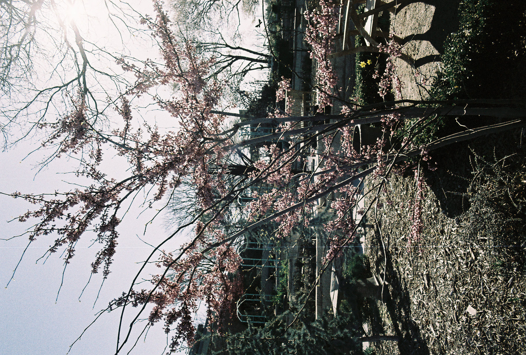
For the second pair of pictures, I'm less convinced as to which on I like more. I think they both have their own charm and it's harder to separate for me.
I think that most people are drawn to really punchy and vibrant colors which the Kodak Gold once again delivers. Again, the Kodak Gold picture feels more lively and has more color contrast. Personally, in this picture I find myself drawn to the two yellow flowers that stand out against the pink. That said, I find the picture a bit overwhelming. It's hard for me to take in the entire picture. Part of this is composition. There's simply more stuff in this picture compared to the Metropolis one. For example, I find myself drawn to the Japanese style Torii gate in the back right of the picture. Additionally, I think that the shadows aren't doing the picture any favors. While yes, the strong shadows make the pinks and yellows pop, they maybe do it too much. It feels a bit oversaturated and almost fake. One thing I've noticed about the Kodak Gold and specifically these scans is that they feel a bit too oversaturated and unnatural. In the future I'm likely going to take over the scanning of my negatives and will likely end up with less saturated pictures as a result. I'll talk about scanning later on. But considering these are the final pictures I received, I'm going to talk about these without further edits.
Moving onto the Metropolis picture for this pair, I dunno. I can't say I like it more than the Kodak Gold picture. But simultaneously I can't say I dislike it more either. They're very equivalent even though they're quite different. As before, the Metropolis is very desaturated. It's got a lot of the opposite issue of the Kodak Gold. However, I like the simplicity of the picture. It feels very clean and in some ways I like the subtle pink here more. While the shadows are still pretty strong, they don't feel so aggressive. Also, because the trees and vegetation at the time were generally more on the dead side, I feel that this picture is perhaps more indicative of the time that I visited. All in all, it's a close one. Maybe I actually prefer the Metropolis picture in this case, but it's not so obvious to me.
Before closing off, let's look at those black and whites I promised.
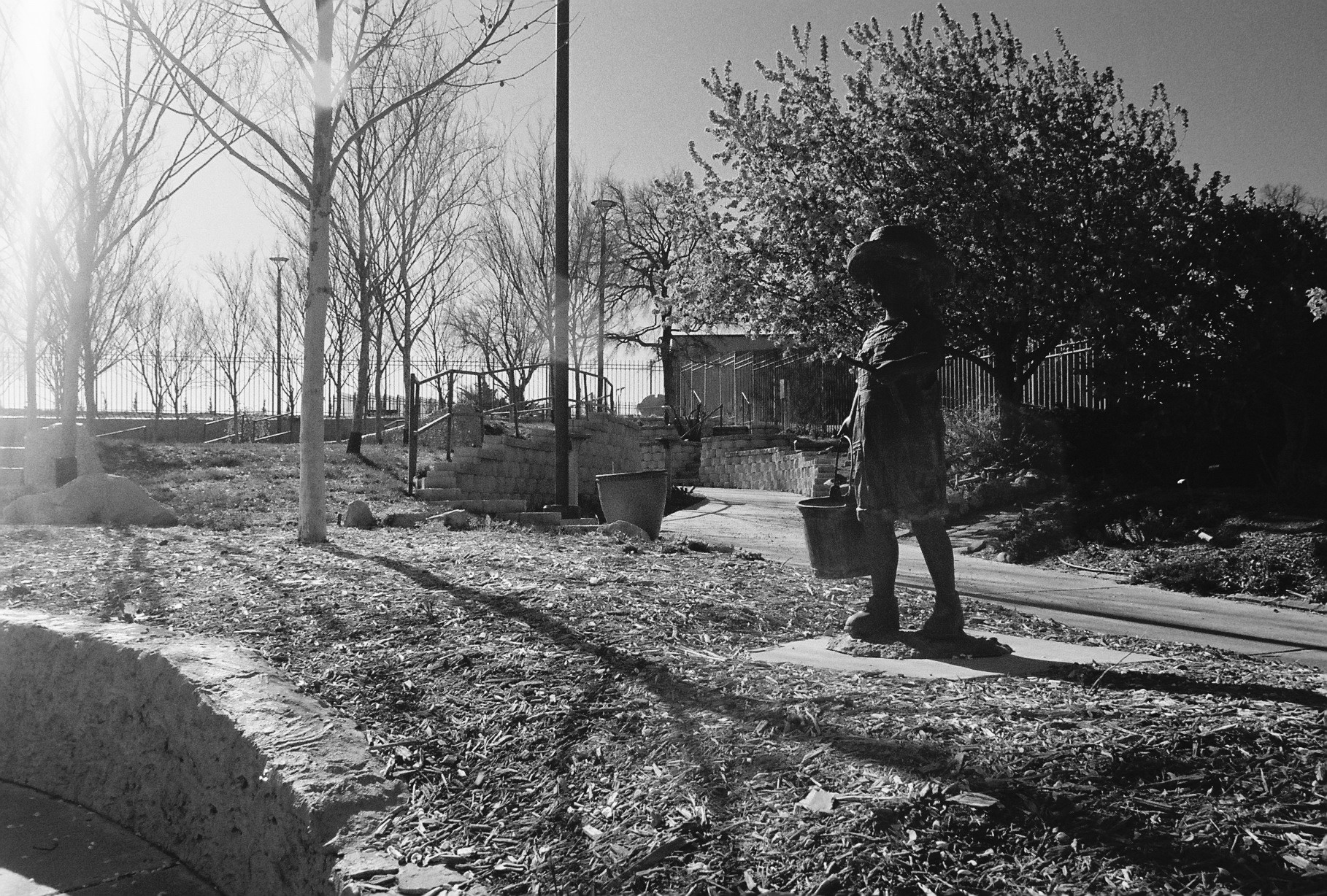
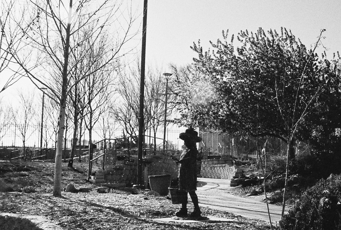
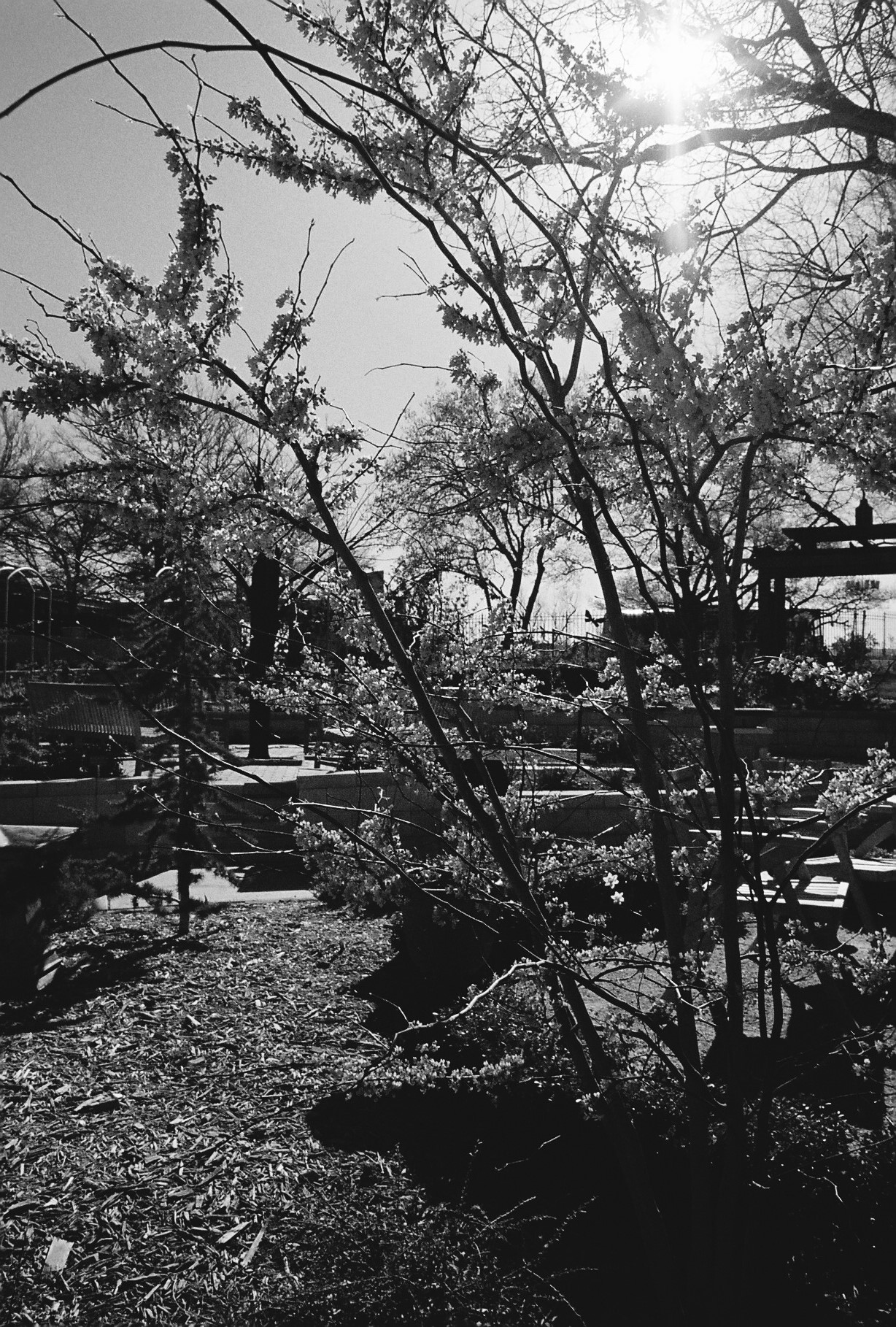
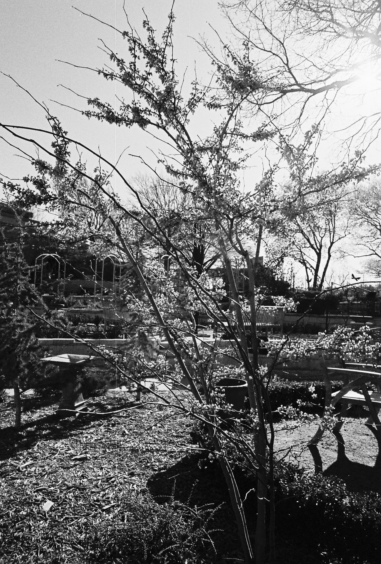
Anyways, I hope that shows off how much color can affect pictures. One of the trickiest parts of shooting film is not quite knowing how pictures will turn out. As much as the image conception can be on point, something like color is difficult to represent in how you perceive the world around you. When shooting something like the LomoChrome Metropolis, it's really important to know what the desaturation can do. It's another thing to think about that needs to be imagined around. While difficult, that's what I find fun. The more film I shoot, the more ways I can see the world around me. Eventually, I'll be able to make use of the knowledge of different film characteristics to achieve different results that I couldn't otherwise. For now, it's just a bit of luck and serendipity, which is also part of the fun.