120 Portra 400 (3rd roll)
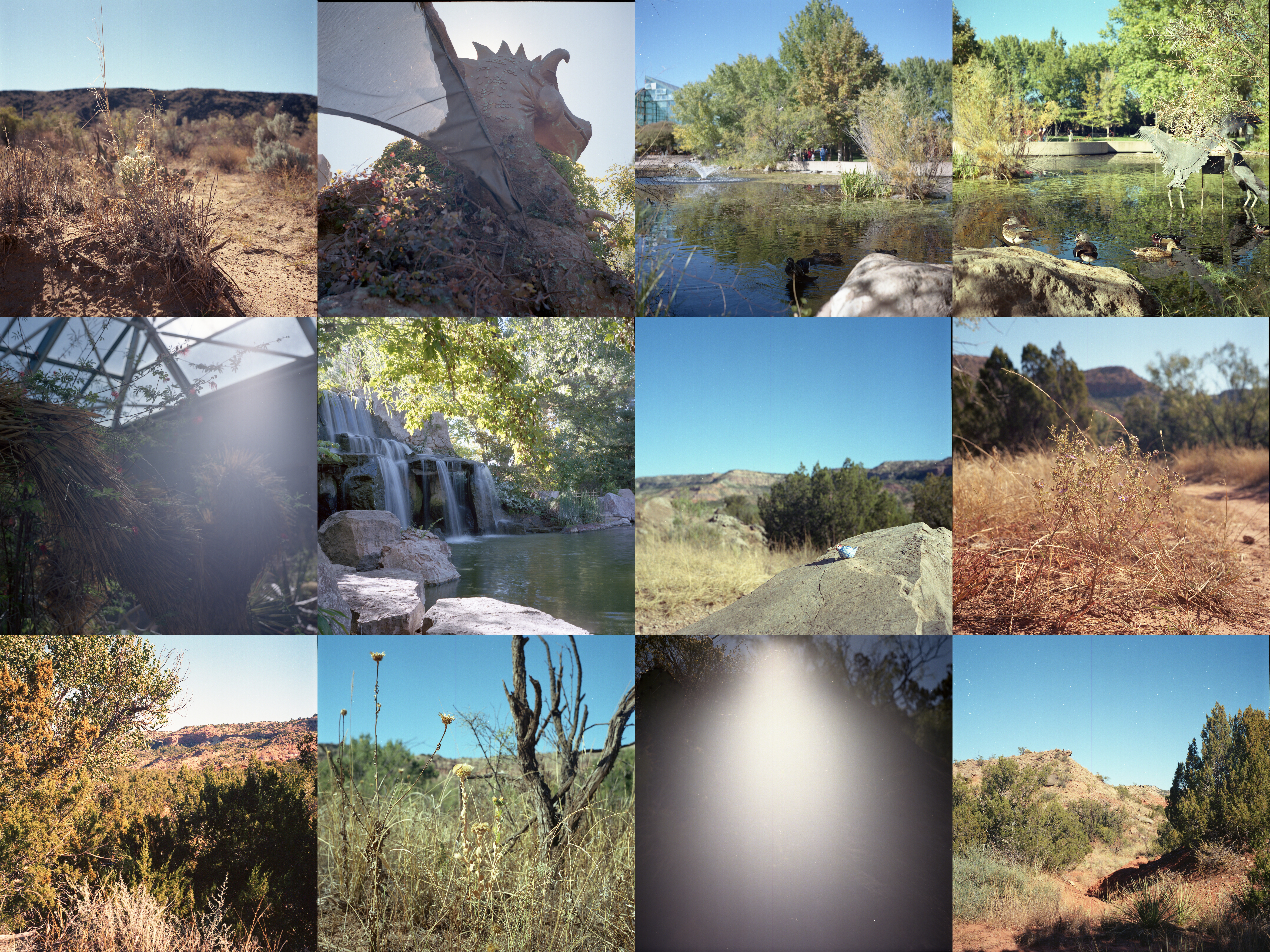
12 more pictures, another roll of medium format Portra 400. Unfortunately I’m really disappointed in this roll. While I don’t hate it completely there are a couple of very obvious problem pictures. Let’s get to it.
The first picture was taken at the Rinconada Canyon Trail which is a part of Petroglyph National Monument to the outside of Albuquerque. It’s an interesting trail with many easily viewed petroglyphs. But taking pictures of a flat wall with pictures on it is a bit boring so I decided against that. Instead I took this picture. I was hoping to get more background separation which tells me I really needed to get a bit closer. Also I probably should’ve shot a stop or two darker. I would’ve preferred much darker shadows to pull the eyes down towards the plants up front. This is kind of an issue I’ve found myself doing with outdoor photography in particular. I just don’t exaggerate my lighting enough to create the kinds of separation that are possible in certain circumstances. I don’t have as much of an issue with this in indoor settings which may be due to how I’m metering or how I’m thinking about things.
Next up is a set of pictures taken at Albuquerque’s botanical garden which is also attached to their zoo and aquarium in a big park. The next 5 pictures were all taken at the botanical garden though I did visit the aquarium. While I don’t mind the dragon statue and like the idea of the light halo, again I would’ve preferred this picture to be a step or two darker. There’s nothing wrong with it as is but I would’ve preferred the light to be more contained. As is, it’s blowing out a bit too much and I don’t think it’s super important to see the in shadow details as much. It would’ve been more exciting to have the shadows be a good bit darker and let the lit areas shine more.
The next pair of pictures is from a bench overlooking an artificial lake that obviously has some ducks in it. I don’t mind these pictures though I’m not entirely sure why the coloration is off between them. Again I assume it’s a scanner thing. Of the two I’m not sure which one I actually prefer. While I like the flapping duck in the first picture, I like the overall composition and placement of ducks across the frame more in the second picture. Ultimately, I would’ve preferred a more compact and tight frame though and one issue with shooting medium format for me is aligning the frame to cover what I want it to. Because it’s such a wide space I find it hard to create compact and narrow images.
The next picture along with the second to last picture both have some significant issues with the light blowing out the picture. This is one of those things where I feel like if I had a better sense of how to meter the first picture could’ve worked out well. I might have reoriented a bit so the sun wouldn’t blast through the frame and shoot a bit brighter. It’s a bit of a meh frame even still though and I’m not fully certain what I was aiming for. The second to last picture I can’t tell what exactly went wrong. I’d say that clearly the sun was there but I’m not sure that’s actually true. It’s possible that this is actually a problem with the roll coming a bit undone and light leaking into the roll. I say this because the outside of the frame isn’t overly lit and the orientation of the light seems wrong for sunlight. It’s definitely something I’ll have to be more careful of moving forward as I don’t want to waste a picture like this on a roll with so few exposures.
Speaking of that, I find it interesting that I think that 1 picture out of 12 being bad is a travesty but 4 or 5 out of 36 is just whatever. The brain’s ability to mark out and think about numbers is just so odd like that. 4 or 5 out of 36 is a higher proportion than 1 out of 12 but that 1 feels worse. To me, I think it’s the scarcity of the 12 that makes each one feel more important.
Anyways, the 6th picture was the last one I took at the Albuquerque botanical garden with this camera and I really like it. It’s peaceful and simple. A picture like this requires a longer exposure with a narrow aperture so I think I ended up resting it on a rock to keep it steady. I thought it would end up more blurry but it turned out just about how I would’ve expected and wanted it to.
The last 6 pictures were taken at Palo Duro Canyon on my way back from New Mexico. This first one features a little chicken I got in Santa Fe as a trinket. I like this picture. It matches one of the “tourist” pictures from last year’s Palo Duro Canyon pictures. Again, I feel like the colors are maybe a bit washed out from being a stop brighter than I wanted. But ultimately it doesn’t affect this picture much. I do think that a slightly wider aperture could’ve been nice and maybe being a bit closer to the chicken to further blur and separate it from the background would work.
Interestingly, the next picture only really works from closer up. From far away and small it’s really bland. I feel like I should’ve oriented differently to better separate the flowers from the shrubs behind it but I’m not sure there’s an orientation that would actually work there. I do like this picture though in a very simplistic way.
Honestly I’m gonna skip the next two, they’re a bit boring and the last picture on the roll is more interesting to me. I like this last picture a fair bit. Something about how the shadows interact with the rolling hills works really well and accentuates that rolling pathway. It’s something I’ll have to keep in mind when hiking on a bright day for sure.
Altogether, this roll is kinda just a bit bland. I feel like I’m not really doing justice to this camera and format. It’s one that I haven’t fully warmed up to and I want to shoot more medium format next year to see if I can figure it out a bit more.