A/B split
Explanation
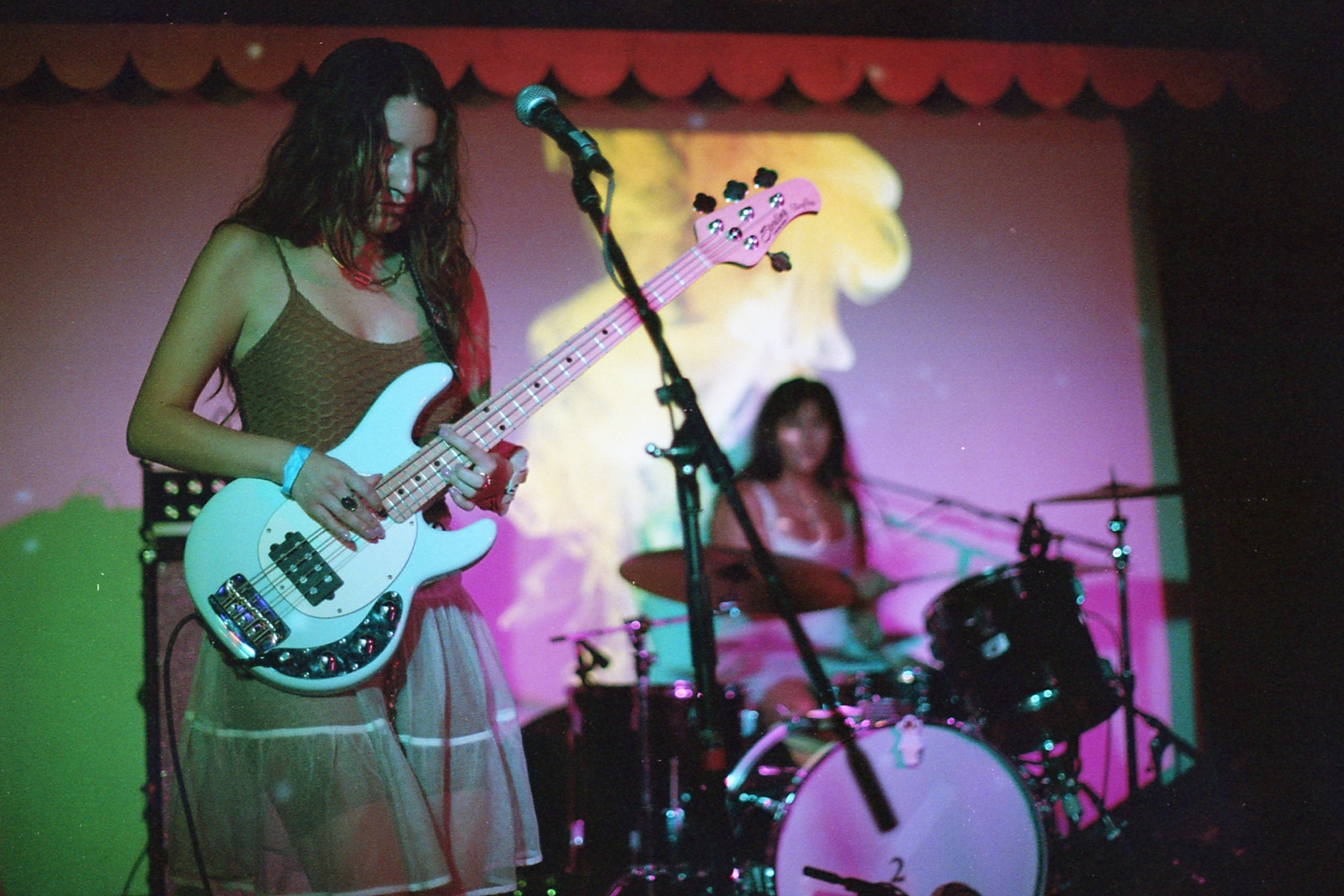
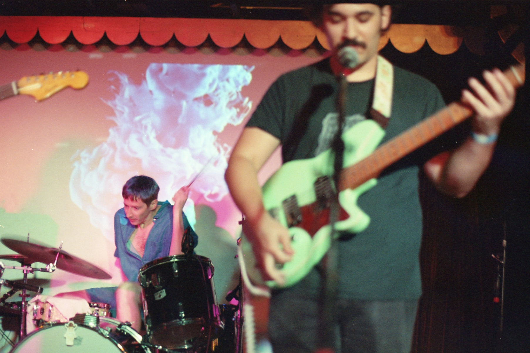
For this next pair of pictures I want to start breaking down one aspect of what I've been calling A/B split pictures. I'll have another post like this at the end of the year that's more similar to a roll post that will try to explain as many aspects as I can with the examples I've taken this year. But I really want to spend some time now putting together my thoughts in preparation of that post so I can be better equipped to analyze the different aspects of this image composition.Specifically for this pair, I have a pair that besides a couple of aspects is as similar as I can make them. This pair of pictures were taken on September 9th at a show presented by a local promoter, Howdy Gals, and a local print studio/merch making, Goody Bag called Goodyfest. By the sounds of it, it might become a yearly thing but it's hard to say. Anyways, the first picture is of Hey Cowboy while the second picture is of a band I took a couple pictures of all the way in my first roll, Queen Serene. Looking back at those pictures, it's a bit crazy how far I've come in terms of comfortability in terms of taking pictures and also how much better my ability to think through and execute on images.
But that's not what this post is about, I'm sure I'll spend some time ruminating on that in the roll post. To start with, as this isn't actually about Hey Cowboy or Queen Serene, I'm not going to talk about them as bands and it's important to note that this isn't about them as subjects. Instead, this is explicitly about these two pictures as images, how they differ but also why I view them as fundamentally the same. To do so, I want to talk through each image individually and then come to a more general approach and understanding of them and their respective strengths.
To start with, let's talk about the first picture of Hey Cowboy. I would call this the prototypical A/B split picture. It is set up as all A/B split pictures with two subjects, one to the left and one to the right. The reason I would call this prototypical is that, at least for me, it reinforces my particular reading preferences. When I say reading preferences, I mean how does my brain immediately understand and scan this picture? Specifically, this means that the left subject is both the closer and also the more in focus of the two subjects. The reason why is because as someone who primarily speaks and reads English, I tend to read things left to right. Therefore, the left subject is generally the one I am more attentive to. Furthermore, things that are closer and also things that are more in focus draw more attention. As a result I read this picture from left to right, front to back which are my in built biases towards those directions. When I say prototypical, this is what I mean. It is the strongest and possibly cleanest representation of this image if the only metric is strength of reading preference.
The second picture however is different. The close subject is now on the right and it's also out of focus. This throws a wrench into the works. What's my reading preference now? In this case, at least for me, I read it right to left, front to back. As a result, at least in this case I prefer close to both focus and position. But is that all of it? Arguably I'd also say that the close subject here is also bigger so maybe size of subject in proportion to the frame is important to this reading preference as well. In taking this picture, I was asking myself how often I'd taken this variation of the image and wanted to make sure it was represented well. In comparing these two pictures I've justified to myself why it was important to do it.
Before generalizing more, I want to hold on another point which is where does your eye end up lingering? In addition to reading preference, I want to know what part of the frame keeps me. In the first, I'd say it's up front. While I read left to right, front to back, I then return and stay on the left. It's close and it's in focus. I want to engage with what's happening there. However, in the second the focus is in the back and I find myself staying there. It's possible that part of that is the motion cue and the interaction. So again, there's more to explore there as well. In either case, it feels like where my eyes end up at the end is based on focus, regardless of reading preference. That said, is the fact that the close subject in the second picture a bit cutoff also affecting my staying there? Additionally, in both cases I do also end up on the left. Is the left the preferred lingering point for me? As I hope I'm making apparent, there are quite a few variables, even to what seems like a simple image composition.
As I mentioned in a previous post, I want to be clear that A/B split pictures not only require a left and right dimension but also a z axis direction, one subject must be closer than the other. I'll go over why that is with examples in the complete exploration post. Theoretically though, as a result of the image having a z axis, close/far, dimension it is possible to create the differences I'm seeking to express with these two pictures. It's only possible to create the kind of focus separation in these pictures by having a close and a far subject. A picture with both subjects on the same z axis plane wouldn't create the effect necessary barring some other effect that creates blurring. One other thing to say is that while I've generally not leaned too far into motion blur or action in these images, I'm not saying that A/B split pictures can't support that. It's more that the conception I'm using doesn't presuppose movement in it like other images where that might be necessary. As a result, I would call that a variation of this image and not a completely new one. The same way that the orientation of which subject is close or far or left or right, motion is another variable that can be played with that I simply haven't.
Hopefully that mess is interesting to read. I clearly spend too much time thinking about things like this so it was important for me to get some of these thoughts down. I've already begun compiling all of the A/B split pictures I've taken this year as well as simple 2 subject left and right pictures for comparison. I think it was important to pick two pictures that are very similar besides a couple of differences. In that way I can focus purely on those differences. It was important that these two pictures have relatively similar distances between subjects and relative focus difference for example. (A note here, it's a bit difficult to make relative focus difference similar when inverting focus like this pair. The second picture necessarily has the front subject more in focus that the far one in the first picture due to the physics regarding focusing close/far. I could have stepped a bit closer but that would have led to the front subject being even more cut off. That would've led to a worse picture in my opinion so I didn't do so.) I can then talk specifically about reading preference and lingering focus as I am here. I'll go over pairs that I can't do this with in the more complete post with this as a jumping off point. I also want to stress that while I see these as different pictures, I do still fundamentally view them as stemming from the same image. They are more similar to me than they are different. When organizing how to take a picture like this, the first step is creating the structure, the A/B split itself. After that it's all about determining what variation I want to use and which one I think will be most effective for the band or whatever it is in front of me.