Me Nd Adam
Explanation
To close off single posts for this set of rolls is this pair of pictures from Me Nd Adam's album release at the end of July. Going into the show I honestly didn't know what to think of Me Nd Adam. I was actually there to see the openers Foxtales and KVN. That said, I really enjoyed Me Nd Adam and came out a fan for sure.As is hopefully apparent from the pictures, Me Nd Adam fills a space that is in that sort of country Americana world with some definite rock and electronic stylings dotting their music. It's fun and vibrant, an altogether enjoyable and memorable show to be at.
Now onto the pictures. Chronologically these pictures are actually flipped, the first picture in this post happened later in the show than the second but I want to talk about them in this order to convey a sort of progression.
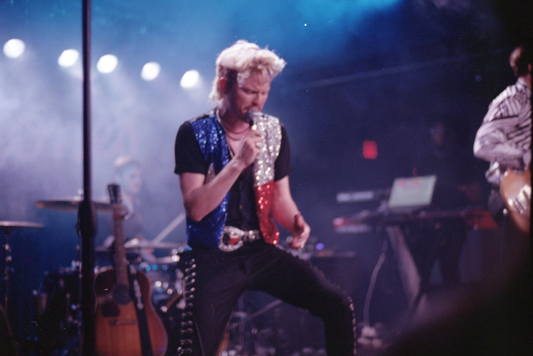
For this first picture, I really love the vibe and energy of the picture. It's a picture with a clear focal point on the main singer and frontman, Adam. The lights to the back are strong but softened by smoke. The smoke obscures the drummer. To the right, just out of frame, is the other main man, the "Me" in Me Nd Adam, Vince. Between Adam and Vince is the synth/keyboardist who's almost entirely consumed by the fuzz of the focus.
Personally, I think that this picture is really carried by the vibe. It's not a particularly sharp picture. Nor is it a particularly active or exciting picture except for the vibe. I find that the posing and the lack of sharpness works surprisingly works well here. The composition itself strongly focuses so there isn't as much of a distinct need for the sharpest image. By keeping Adam softer you can flow into the other portions of the picture while still being drawn to him. I'd say that as a vibe picture this matches that Mobley picture from last March or that Lena Luca picture from May however I don't think that's true. Yes the vibe is similar. Though I don't think this is necessarily a comparable image. With the strong white lights to the back obscured with smoke, it feels distinctly more stadium feeling even though this was shot indoors at Antone's. Additionally, both of those pictures are solely single point images. This picture has more complexity to it. The image it's based off necessarily has more going on in the background. That said, it's pushed far away in focus. Besides Vince, there's no distinctly focused areas. The softness very much gives a rounding effect. In all honesty if I were to actually meaningfully update this picture I'd crop Vince out. Because he's the only other point of real focus he pulls attention to the right. I'd be more ok with that if he were more in frame, but being so out of frame it feels unbalanced and detracts from the picture overall.
Assuming I did so, I still don't believe that this is a three point triangle composition. You could argue that Adam in the front and the drummer to the back left and keyboard and synth to the back right creates a triangle but that's more of a stretch than anything else. Besides Adam, there's simply not enough gravity to the other parts of the frame to call it a meaningfully triangle composition. It's very clearly a single point composition with some extra details. As I've said in the past, there's nothing wrong with a single point composition but it can be tricky to tell a powerful and meaningful story with one main focal point. However, I do think this works quite well. As I mentioned before, it has that sort of stadium vibe and feel to it. Yes the lighting is part of that. But also I think it's his vest. The red, white, and blue just gives off that larger than life, patriotic type feel. Additionally, I like that there are more details. It adds complexity without meaningfully distracting you as a viewer. It adds depth without necessarily forcing you to engage. It's an invitation to engage with the rest of the story but not a direct order.
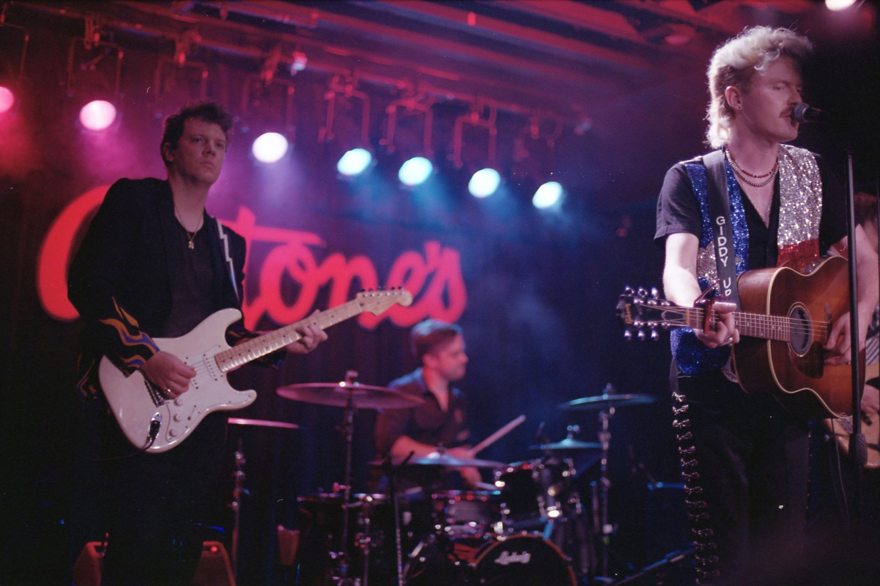
In contrast, this second picture should be more overt in how I expect and want people to engage. This is clearly a three point composition. To me it reads from front to back, Adam then guitarist then drummer and Antone's logo last. I can also see an alternative viewing going directly from left to right, guitarist, drummer, then Adam. But I feel like this isn't as powerful or obvious of a reading of this picture.
The reason I believe this is because unlike the previous picture where there's a lot of softness throughout the entire frame, this picture is quite sharp up front. It then tapers going back until the drummer is quite soft. As a result I do think that it reads more front to back than left to right.
One note that I do appreciate is the comparative sharpness of the "Giddy Up" against the Antone's logo in the back. It's minor mainly because the Antone's logo is quite large, but I feel like that further sells the sharpness/softness divide in the picture.
While I do like this composition and the spacing feels about how I'd want it I do think that Adam's a bit too far to the right of the frame. Unfortunately, that's just a reality of how the stage was set up and where I was positioned. With a stationary mic stand there, he's never moving off that spot without also moving the mic and significantly changing the construction of the image. And while the guitarist can and did move during the set, it's not like the drummer can meaningfully. As a result, this composition will only ever adjust a little bit from this placement. And quite frankly I like the spacing between each of them. The only thing is that I'd love if Adam were just a smidge to the left. If he were to obscure that first hi hat to the right I think that'd be enough.
Thinking about these two pictures, which one do I like more? It's tough. I think both actually tell really cohesive and understandable stories. The first is perhaps more iconic and more timeless in some ways. It benefits from that evocation effect in a way the second doesn't quite. However, the second feels more grounded. There's a more specific sense of place and more of a sense of the band. Ultimately they're entirely different images that serve entirely different purposes. And that's why I wanted to highlight both of them. I find that individually they're entirely complete and meaningful pictures. However they work much better together in contrast. As a pair they can tell an even more complete and nuanced story than they can on their own.
This last point is one that I don't usually think about much in the process of taking pictures. Because I'm usually focused on individual images and trying to translate them, I rarely think holistically on the collection of images I'm creating. I don't think this is a bad thing. And quite frankly one thing I am doing more of now is being more broad with the types of images I aim for at different shows or spaces. This doesn't mean I'll always land on something like this pair. When I'm reviewing this roll, I'll talk a bit about the rest of the pictures of Me Nd Adam I took and how they interact with these two. Overall I don't think it's something I'll ever really think too heavily about in the moment. I never really know how many pictures I'll devote to any one show so it's not like I can plan it out. Quite frankly I'm not sure I'd want to. While yes, I am more of a planning and meticulous type photographer, I don't want to let go of reaction. There will always be pictures I miss. But I also always want to be available for pictures and images I don't expect too.