Lena Luca
Explanation
For this post I want to talk about a pair of multiple exposures I took during a Lena Luca set at Empire Garage. Quick note, I've taken plenty of pictures at Empire Control Room which is the indoor portion of the venue, Garage is the outdoor portion of the venue. This pair of pictures were taken during a set of free shows put on by the Red River Cultural District in the summer called Hot Summer Nights. I really wanted to go to more shows and take more pictures but I was going through some stuff personally and wasn't up to it. I did make sure I went to see Lena Luca and Glass Mansions afterwards who I'll talk about in a later roll post.Anyways, I just read over the last post that included Lena Luca and I realized that I didn't really explain much about her music. Why is it that I intentionally went out of my way to see her again (disregarding that I also really wanted to see Glass Mansions)? Honestly if I'm being honest, her music isn't necessarily the most unique or interesting. But it's really fun and I appreciate the effort and variety. In the past I've talked about vibe and energy in regards with live music. And I feel like that's where Lena Luca shines. She really puts herself out there and for me it's a bit awe inspiring as I live with my own sorts of anxieties. In some ways a camera is a way to hide myself but also it's an excuse for me to go out and act in, at times, a more forceful and assertive way. The types of pictures I take often require me to be really close to the stage and orient myself in awkward or otherwise obvious ways. I know that 90% of people won't notice me but ultimately the idea of people watching me in that way still bothers me? With her often risque and at times provocative outfits, I find myself drawn to the confidence and self assuredness she exudes. That said, I do also really enjoy her music. At times wistful and at times provocative and daring, it wavers between the idea of confidence and the idea of deep insecurity.
Recently I've been trying to understand what it is I look for in music. And honestly even though I can give an answer it never feels satisfying. I tell myself that I'm looking for contrasts and the complexity and nuance that that brings. And while true, I don't feel like that's a truly realistic answer. Tying this back in, I'm not entirely sure what it is that really fully brings me into her music. As I said before, it isn't necessarily that it's the most unique or interesting. But I still find myself drawn to it. It's dancy and it's fun. But it can also be sad and almost taxing. It's tricky and maybe ultimately that's why I'm interested, because I'm not entirely sure why I am.
That's a lot of words to say very little and this is a blog about pictures so let's get to it. Clearly these two pictures are both multiple exposure pictures, the first one has two and the second has three. I really want to tackle these individually before trying to unify and discuss broader intentions. So let's get started with the first picture.
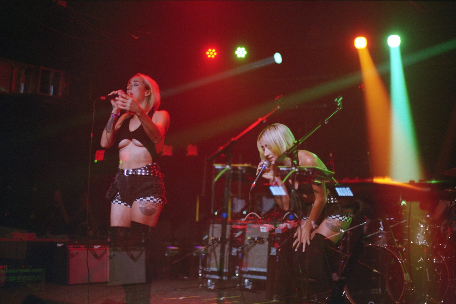
To start, I really like this picture. It's maybe one of my favorite multiple exposure pictures and may push up for one of my favorite pictures I've taken so far. I want to say that both exposures are equivalently metered but it's a bit hard to say/remember. The exposure on the right is a bit fainter which is more obvious when looking at the amps. I think the thing that I appreciate most about this picture is how distinct and expressive each individual exposure is. But additionally I really appreciate that they fit together and express a combined narrative. It feels like she's moving across the stage. Compositionally, this picture is not quite what I would call an a/b split picture. Now that I've taken so many of these and so many "kinda sorta" versions I want to spend some time really nailing down what I mean and why this isn't. But suffice it to say I don't view this as an a/b split because both exposures are given equal weighting. As I said before, I think this is correct here. It sells the idea of traversal without making either one the focus. To me it reads from right to left but it works equally well from left to right. Now I'm not entirely sure why I read it from right to left. If I'm gonna guess I would guess it's the poses. The right pose is more compact and the left pose is more released. As such I think I view the right being first. And if I'm remembering correctly that's what happened. So maybe my memory is creating a bias to the direction I read the picture, it's hard to say.
Now if I'm reading this picture right, because I don't actually remember, the two exposures were taken from the same vantage point but angled across the stage differently. The parts largely line up but are offset, not in a different position way but a different angle way. It's really silly to think that this wasn't an initial thought of mine with multiple exposures but after the Elise Trouw show I really wanted to explore more with it and this pair of pictures in particular were my first attempt at doing so. That said, looking at it again I feel like both angle and vantage are slightly different. The left picture seems more parallel with the stage both in angle and position. I can't remember so it's hard to say for sure. Before moving to the second picture, I always want to ask myself especially with pictures I find really strong, are there more things I can improve and think through? I think I'm pretty satisfied with this picture. It's hard for me to think through more things. Even on a nitpicking level it's a really interesting picture that is dense but also simple. I like that both exposures have her quite in focus. I like that the lighting happens to work out well, perhaps that's something to be more mindful of? Ultimately I'm having a hard time really finding faults that aren't going to fundamentally change the image idea.
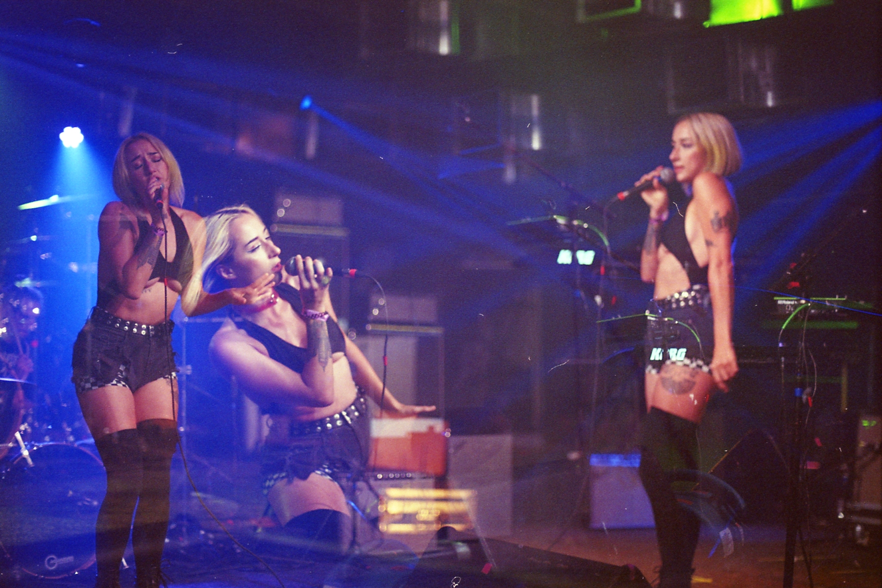
Now for the second picture and this one's a bit weird. Simultaneously I both really like and dislike this picture. I think it's because unlike the first one I do see faults but the concept and general execution are pretty good. Clearly the idea is to create a three piece composition with the middle portion in between the other two. And here's the first nitpick/break down. The middle exposure overlaps with the left one. Now that I'm expressing this, it seems a bit rude. I don't really think this is a huge deal and it could be argued even that it's more dynamic and creates more negative space. But ultimately my brain still views it as a flaw.
Thinking even more about this picture I realize that unlike the first one, the focus is different across these exposures. However unlike the last point, I'm not so sure I hate this. It's a bit unclear, but it feels as if the left exposure is the sharpest and the right most is definitely the fuzziest. What bothers me is that for whatever reason I'm again reading this from right to left. Like why am I viewing the fuzziest and rightmost exposure first? The only conclusion I can think of is that it's separated from the other two and as a result is drawing focus even though it really shouldn't. The middle exposure is the closest and the left has the benefit of being on the left and being the sharpest. But the right still draws my attention first and I imagine that's because it is separated. I suppose this just reinforces why the first point is a cause of my unease with this picture. Because if I ignore that and try to view this picture outside of that flaw I do actually like it a lot. The interactions are fun and it feels like there's a lot of character being shown. Sometimes I do wonder how much I'm just thinking these things and no one else would care. But ultimately why does it matter necessarily what other people think of these pictures? I've maintained that these pictures are for me and for my continued understanding and idea growth. The Instagram account is for the artists I take pictures of and really no one else. If other people like the pictures, cool. But even if no one were to look, the Instagram isn't even for me really.
Before closing, I want to cover a couple of less important points. I really like the red and green lighting of the first picture. To me it's more pleasing and interesting than the straight blue of the second picture. Also, while the second picture has more implied movement and character, I feel like the first picture does a better job of selling a stage movement than the second picture. It feels a bit more collage-y than a cohesive single frame. With that said, it may just be the composition and placement. The second picture places the left and right exposures further to the edges to give space in the middle. Maybe that is what is ultimately making the picture feel less cohesive. The first picture pretty evenly sets the exposures such that the picture has roughly equal distances between the exposures and the edges. As a result it might flow better because of that uniformity.
With all that said, where do I stand with multiple exposures and these pictures in particular? Ultimately I'm having a lot of fun thinking through and trying to express myself with this technique and idea. But I'm also cooking up something weirder. It's likely to be a disaster but we'll see whenever I finish it. I'll leave it there. I'm writing this in October and I really want to catch up so that's what I'm gonna do. Stay tuned.