120 Portra 400 (1st roll)
For this next post I am beginning the covering of another format. This time though instead of being smaller, it’s bigger. For a while now I’ve really wanted to get into medium format just to understand how it feels and what it’s good for. To support that curiosity I picked up a Yashica Mat 124G TLR (twin lens reflex) camera and got going. This is the first roll from it with pictures taken on June 17th and 18th.
I think for medium format I’ll only do roll posts. This is because when shooting 120 film at 6x6 square there are only 12 pictures per roll. Since the number of pictures is so few, it’s probably better to just talk about each picture and go for it. Before continuing, I want to note that there are three tags here, 120, 6x6, and medium-format, which are synonymous at the moment. 120 is the film used here which is medium-format. Technically, medium-format is wider and includes 220 film so I want to leave it open to me shooting on 220 which is double length rolls of 120 so 24 6x6 pictures instead of 12. 220 film is pretty rare so I doubt I’ll shoot any but along the 6x6 line, I do want to pick up another medium format camera in the future which might predicate a separation of format along that line.
Before getting to the pictures, let’s talk about the camera a bit and some of the complications of shooting with it. A TLR camera has two lenses, the top one is the focusing lens and the bottom one is the taking lens. What that means is that when you’re looking through the viewfinder, you’re looking at a representation seen through the top lens while the end image is taken with the bottom lens. Thankfully, unlike with many half frame cameras you can look and focus through the top down viewfinder. However the image you see through the viewfinder is reversed which is its own kind of confusing. And of course you need to compensate for the fact that the image you’re seeing through the viewfinder is offset from the actual image you’ll get. That said, taking pictures with the camera is really fun and pretty intuitive after you get used to it. There are two dials, one on each side of the front face, to handle aperture and shutter speed. Focus is controlled via a dial on the left side and the shutter is a button on the bottom right of the camera. Loading film is also pretty easy, honestly easier than for 35mm. Overall a cool and fun camera to take pictures with.
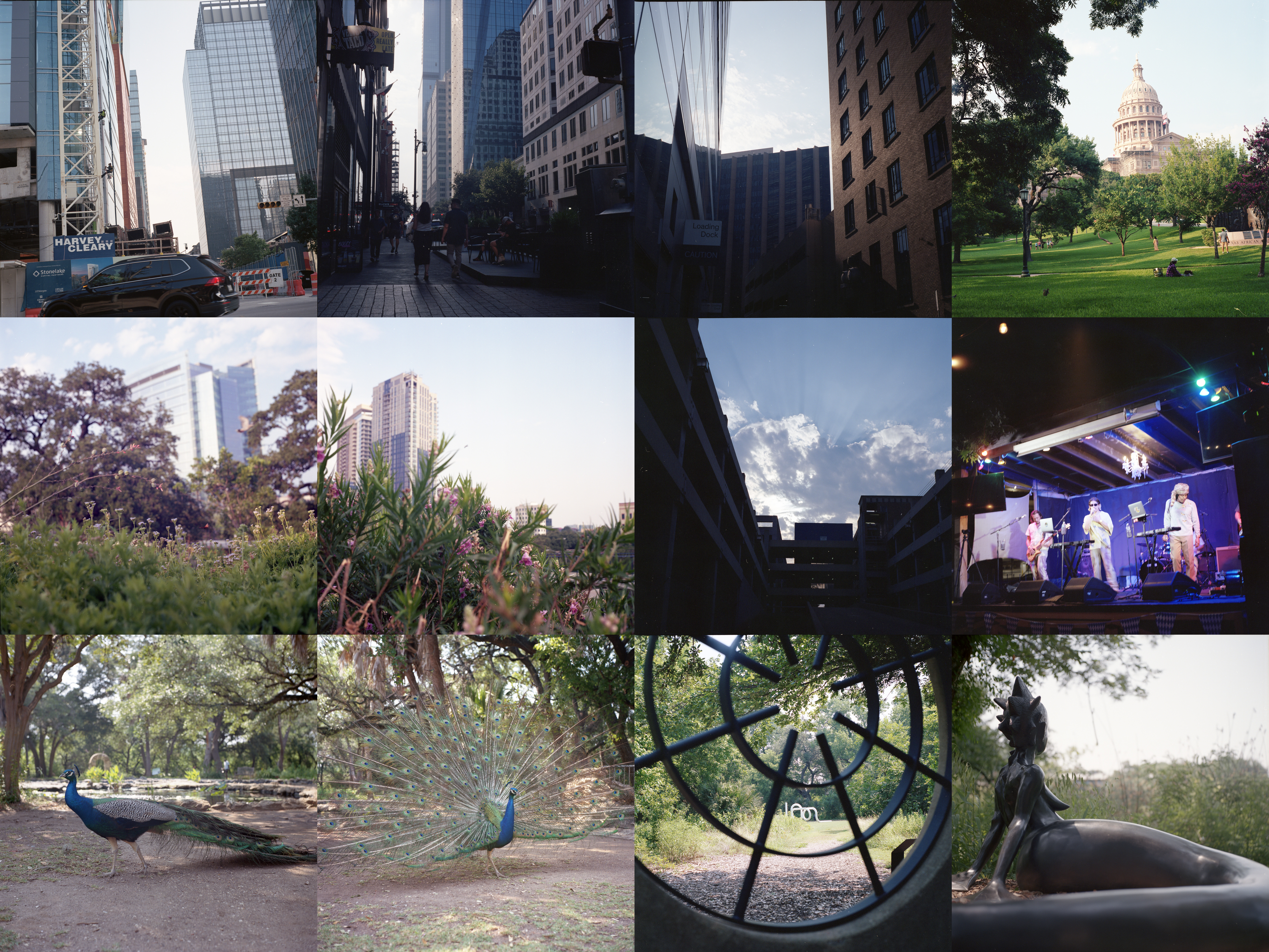
Onto the pictures. The first 7 were taken downtown during a walk on my way to a show where I took exactly one picture. The last 4 were taken at Mayfield Park/The Contemporary at Laguna Gloria which I took pictures of back in July of last year.
The first picture is perhaps my least favorite of the group. To be fair, I’m not fully sure what I was aiming for except to have the car pass through the frame. I definitely would’ve preferred a slower shutter so the car blurred more. That said, that’s not really my biggest problem with the picture which is that the entire picture is on a slant and a relatively large one at that. There’s nothing wrong with pictures taken at skewed angles but it doesn’t really do much for this picture except feel a bit off.
For contrast, I actually do like the second picture a fair bit. Mostly what draws me into this picture is the framing and lighting. These first 8 pictures were taken in the evening to night time ranging from around 5:30pm to 9:30pm. There’s just a tiny bit of that sunset lighting coming in, a bit pinkish orange to the sky while still feeling pretty day heavy. However, that’s contrasted really strongly against the shadowed areas of the picture which are where the content actually lives. Now, what’s more obvious in this picture in comparison to the first one is all the random dust and flecks. It’s just difficult to fully clean these up and while I tried to, it just wasn’t worth the effort.
I’m trying to think if I would prefer this picture at a different exposure and I’m not sure I would. If the shadowed areas were exposed more naturally, the sky would blow out really harshly and could create a really nasty glow on the right side of the picture instead of the pretty tame look as is. Also, to me this picture isn’t about the people. It’s much more about the buildings and light interactions. As a result, I want them to be separated and different.
The third picture is pretty similar to the second one but a bit more straightforward. I’ve said before that I’m a sucker for a good space and this is the type of thing that I’m usually talking about. At first glance there’s nothing there. At a second glance it’s still pretty tame but you catch something worth a look. While mirror finished glass isn’t the best for the world, or wildlife, it does make for striking images at times.
I don’t take pictures of the Texas Capitol very often. That’s largely because I don’t pass by all that often. Honestly, this picture isn’t my favorite. I do like how the Capitol is framed by the various trees. And I like the various people and animals scattered throughout. One thing to note is just how much is in this picture. More than any other on this roll, this picture shows just how large of a space there is to play with when shooting medium format. The lenses fitted to the Yashica Mat 124G are 80mm which is the normal lens equivalent for a 6x6 medium format. If I were shooting 50mm on a 35mm camera, the image I could take from where I was standing probably would’ve covered the Capitol and up to the first set of trees. I was taking this picture from all the way back at the fence leading to the Capitol grounds. One of the biggest things that took adjusting for me was simply how much of my personal field of view was covered in these pictures. It’s honestly a bit overwhelming. The other thing about this picture and a strength of medium format is its capacity to capture many possible images in one and have them all be one thing. There’s the group of ladies posing by a tree. There’s the what might be Indian or other South Asian man with what looks like a camera looking at what I assume is his wife. There’s the lady closer forward with her shoes off just chilling out. There’s the squirrel and tiny bird chilling on the lawn with the ladies in frame or out. There are just so many different possible pictures available if you wanted to crop them out. At original size, each of these 12 pictures is close to 6000 pixels by 6000 pixels. So cropping out sections is really favorable.
Wow, that’s a lot for one picture but I’ve still got 8 more. I’ll talk about this next pair together. These were both taken at Waterloo park to the east of the Capitol. There was actually a concert letting people in while I was passing by that I wasn’t going to so I’m not sure who was playing. I would say both of these pictures are pretty similar. Both in concept and largely in execution. They juxtapose the manicured nature of the park in the foreground against the urban landscape in the back. Both feature birds flying through, though more successfully in the first picture. And both are focused somewhere in the middle of their frames. If I were to pick a favorite between the two it’d be difficult. I like the rolling focus of the first picture and the butterfly crossing. But I like the composition and use of open sky in the second picture. Ultimately, even though they are similar images they’re different pictures. And I think both of them succeed in their ideas in different ways. I might say the first gives the idea of letting nature grow in an urban space. While I might say the second gives the idea that this city I live in isn’t all the same and has more space to grow. Whether we want that or not or whether it’s correct to do so is unimportant. It’s always interesting to play in spaces that are distinctly different from their surroundings because you can do things like this and tell different stories just depending on vantage.
I’m not happy with this next picture. I wanted more out of it and expected more out of it when I took it. Taken for its merits, it’s not bad. I’d perhaps go as far and say that it’s reasonably good even. I just wanted more out of it. I think if I was more patient in waiting for different clouds and the sun to set more I could’ve gotten what I wanted. The colors are flatter than I’d like and I think with even 10 more minutes it would’ve warmed up a decent bit. I was closing in on the start of the show I was going to so I wasn’t just going to wait forever like I might have if I didn’t have any time pressure. In terms of the composition, this is the part I’m most satisfied with. I really like how the angles converge and it feels nice. I do wish it were maybe a stop brighter though in the shadows. It’s a bit too dark for me. And again if the sun were a bit further down in the sky the sky wouldn’t be as bright and the difference between the sky and the parking lot wouldn’t be as strong so I could allow for that without the sky blowing out.
This next picture is of Luna Luna. I really just wanted to take it to see how the camera performed in lower light conditions. Since the widest aperture on the camera is f/3.5, I believe this was taken at 1/8 second, maybe 1/15. It’s not a terrible picture, but it’s not really good either. Clearly at that speed you’d want this to be on a tripod but I’m surprised that it’s not blurrier than it is.
This next pair is of a peacock at Mayfield Park. Originally I was only going to take one picture but I’ve never actually seen a peacock spread out its feathers before in person so I wanted to take a picture of that when it happened shortly after the first picture. Of the two I prefer the first picture. I just like how the peacock frames out the pond and rest of the frame. The second picture is so focused on the peacock that as an actual picture it’s a bit boring even if the moment was cool to see. This pair of pictures is good at showing off just how sharp the taking lens is and honestly it’s pretty good. It’s not the absolute sharpest lens I have or the sharpest pictures I’ve taken, of a peacock specifically at that, but it’s way more than sufficient. The first picture is definitely a bit sharper but unless you zoom in a bit you’d never notice.
This second to last picture is…fine. I like some of the interactions of the first piece acting like a window. Both to section off the second piece and to create a secondary focal point upwards that doesn’t really have anything in it. But I struggle personally to really come away with much to say about it. If I remember correctly when I was framing up this picture there were people in the frame and I was debating whether to include them or not and decided against it. Thinking about it now, maybe it would’ve worked better, especially if they took up another section.
For the last picture I return to Wangechi Mutu’s Water Woman. Until the moment of writing this I haven’t actually referenced those original pictures from last year in comparison to this one. It’s pretty interesting to do so now that I’m looking at them. This time around when I was taking this picture the reeds were much more overgrown than when I took those pictures last year. This created a bit of a conundrum for me when taking this picture and led to this particular angle. Looking at last year’s pictures you can see that the reeds and lake growth have a clear break so you can see the lake past them. That isn’t true in the picture this year. It’s all covered. So instead of taking a 30-40ish degree angle I chose an almost straight on eye level angle. I also took this picture coming off looking at those LomoChrome Turquoise pictures so I wanted to play with two things, a blown out and overexposed sky and as shallow of a depth of field as I could. I think it works out here. The end result is perhaps a bit washed out looking but that’s purposeful. Interestingly, while this is just one picture, it almost feels like a combination of the two pictures I talked about in that post from last year. While the actual composition is more similar to the second of those pictures, the affect is more similar to the first one. It has that feeling of longing and wistfulness which I think I’m attributing more to the soft background than the composition. A couple last things to note, in this picture, the light has made the statue look considerably less black and more gray. Some of this I imagine has to do with the time of day and as a result the angle of the sun. But also, this picture is intentionally brighter than those pictures. Wßhile this picture has a very similar composition style to the second of those pictures from last year, it also shows off how different the size of the field of view is in comparison to 35mm. I think I took this picture crouching maybe a foot and a half away from the tail that’s just out of frame. I believe the pictures from last year are easily 2 to 3 feet away to capture similar sized representations. Lastly, and I’ll wrap up with this, this is taken on Portra 400 as opposed to Fuji 200.
To close off let’s talk about the film itself. As I mentioned and as is titled, this is Portra 400. It’s got a lot of the same qualities as the 35mm version of Portra 400. I think I’d say that the colors are maybe a bit muted in comparison but it’s hard to say since I mostly took daylight pictures with it and I’ve been doing a lot of pushing and low light with 35mm lately. The grain is superb and overall the sharpness of this camera works quite well with the film itself. All in all, it’s been an absolute pleasure to shoot with this camera and there’ll be more coming. Originally I was debating whether I wanted to split these posts up and looking at this one, it’s quite long. That said, I’m not sure if they’ll all be this long given that I did a lot of explaining about the camera and medium format. We’ll see ultimately what I do but that’s it for this one. The next post will actually be another one of these but covering just one event so that’ll be interesting.