Portra 400 (8th roll)
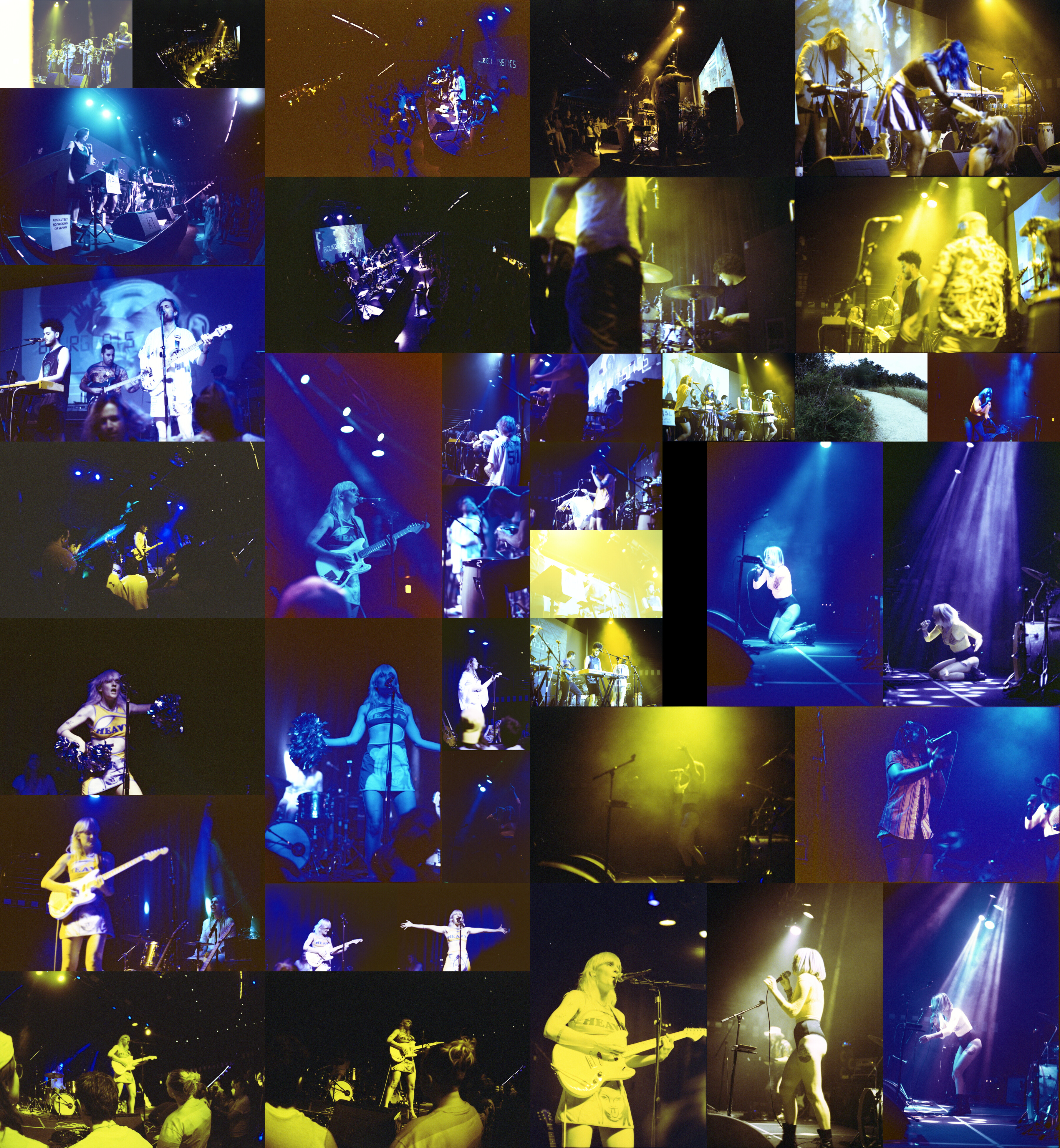
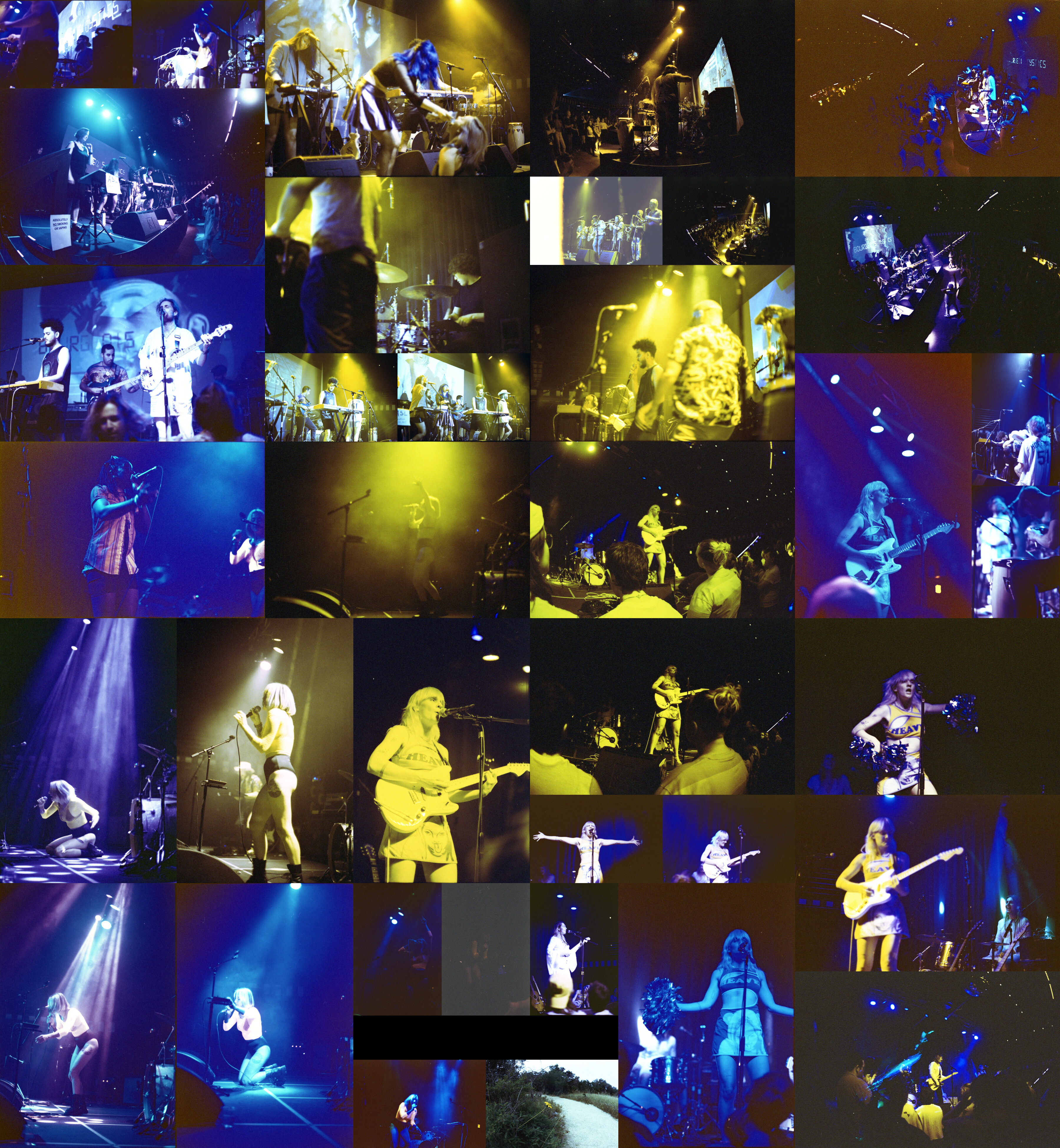
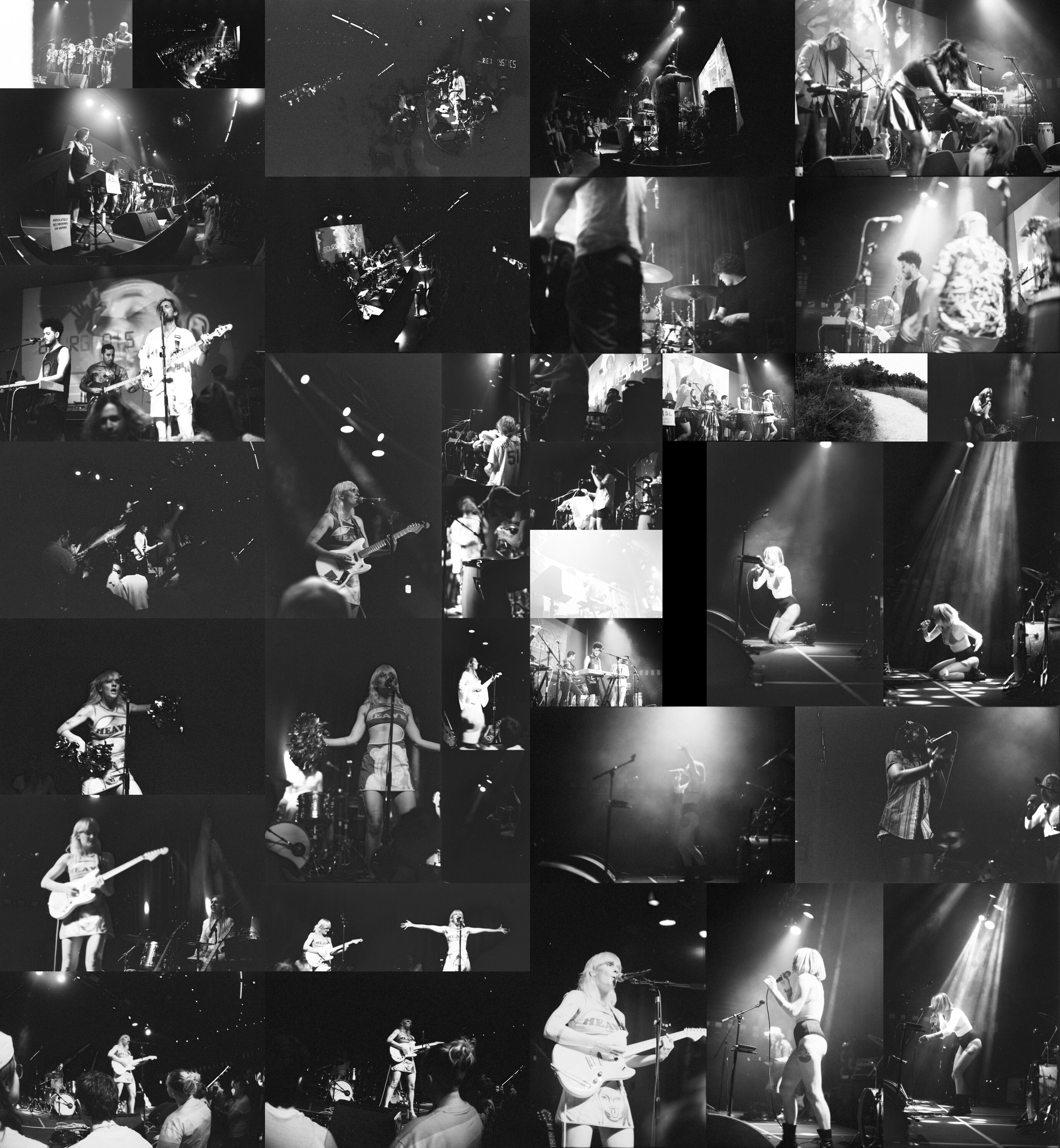
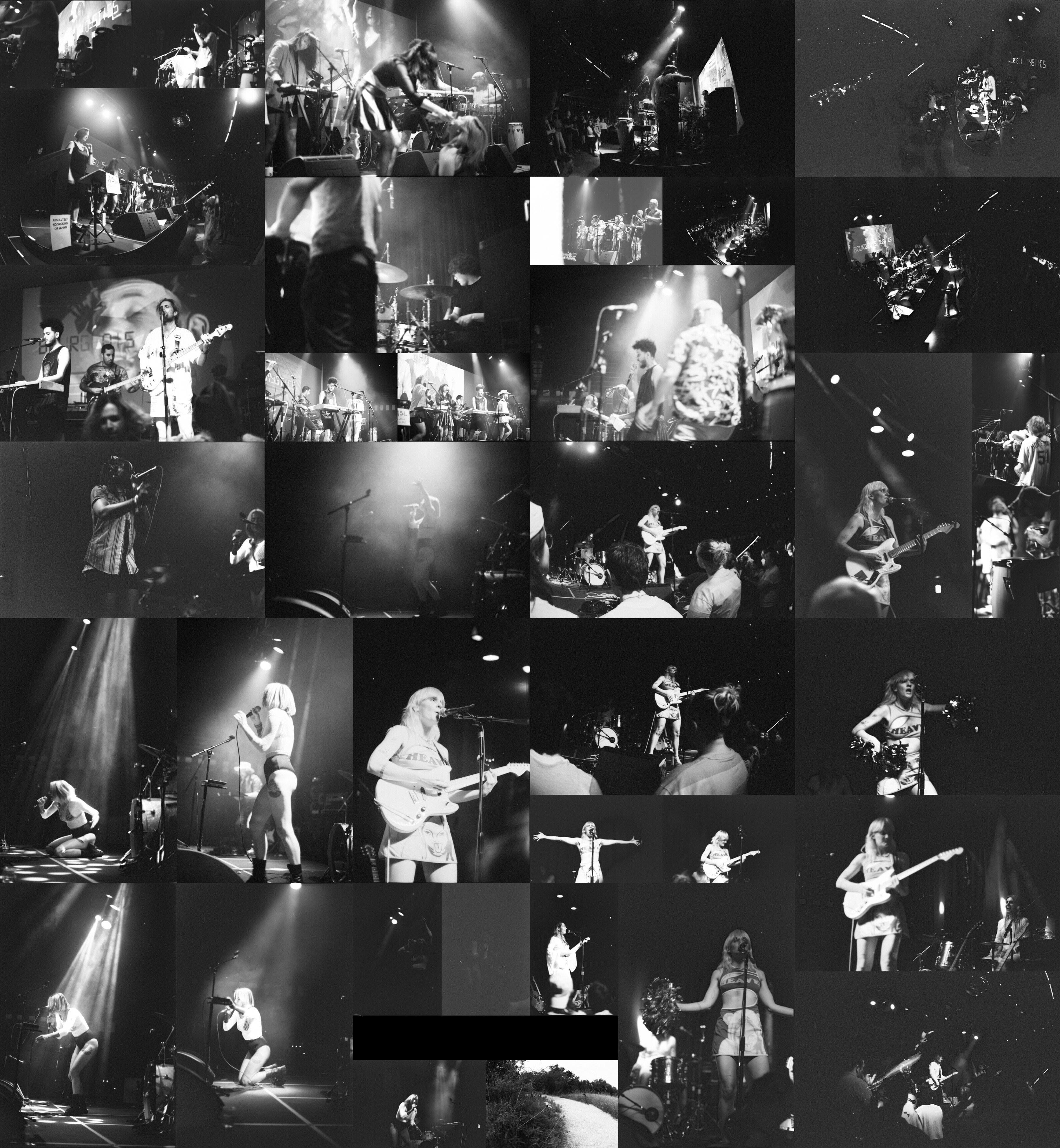
This is a bit of a different roll post. Instead of just one roll collage there’s 4. Two of them are in color and the other two are the same but changed to be black and white. Also, unlike most rolls I didn’t make any specific picture posts. I’ll go over why and as a result, I’ll be taking a really long time talking about this roll and some of these pictures in particular.
As usual, to start off let’s talk about content a bit. This roll covers two shows both at the Parish occurring at the end of May and the middle of June. The first show was the final show of Austin based Bourgeouis Mystics with Cilantro Boombox opening and Lena Luca playing after. The second show covered here is Liza Anne who opened for Alex Lahey (of which there is only one picture on this roll, there are more on another roll).
Next, let’s get this out of the way. The color on this roll is kind of wild. It’s clearly strange and is pretty much either yellow or blue. It looks a lot like the Lomography 800 that I pushed one stop at the end of last year. However, this isn’t Lomography. This is Portra 400. But it’s been pushed 3 stops which is clearly too far. Since the color is so weird, I ended up making two different collages, one focused a bit more on content order, the first one, and one focused more on the end color.
Before talking about any pictures in particular or even the collages themselves, I want to cover how I felt the roll went. Part of the reason why I wanted to push 3 stops is to figure out what would happen. But also, these were taken on the Nikon FM with some of these pictures taken with the fisheye lens which has a widest aperture of 2.8 vs 1.4 for the 50mm. Since I really wanted to try out some fisheye pictures, I wanted to bump the film one more stop for more flexibility. Clearly the colors have suffered but it was interesting nonetheless.
That said, overall I’m relatively happy with this roll. The pictures were actually pretty hard for me to rate and feel confident about. Part of that is definitely because of the color. But I think what’s tricky is just how variable these pictures are. There’s more variety and more experimentation in these pictures than in most rolls so taking the time to tease out my feelings is a bit harder than usual. For the Bourgeouis Mystics show there were a bunch of people on the stage and it made it really difficult to create powerful stories. I think I did an alright job, but most of the ones I ended up actually liking were the ones that focused on 2 or maybe 3 main subjects. The others feel too confusing and too cluttered to properly enjoy.
Moving onto specific pictures, I’ll be noting these based on where they are in the first collage picture. The first picture is the one in the top right. This is maybe my favorite picture of the entire roll. It’s just a bit of a ridiculous scene. While I’d love it if the main action were more in focus, I do still love this picture. It has a kind of triangular composition and the action is just silly. In some ways it reminds me of the Animals on TV picture from the end of last year with the guy on stage breaking a record. But in this case it’s Countess von Boopenstein, yep that’s a stage name, what looks like feeding an audience member fake money. The story behind this group is quite fun so I’m a bit sad this was their last show, I wish I had caught more of them when they were active.
The next picture is the one immediately to the left. I’m just a bit of a sucker for the kind of dark shadowy look. It’s got a very dark clubby vibe. This is one taken with the fisheye and I do like catching the crowd in the picture as well.
Moving on is the picture of Lena Luca on the bottom right, second from the bottom and second from the right in yellow. Similarly to the previous picture, it has a very specific vibe to it which I like. It’s similar to the Mobley picture I took last March but oriented more towards a club look with the smoke and the posing.
The last individual picture is the Liza Anne picture in the second column third down, the blue and red one. Out of all the Liza Anne pictures this is my favorite. Ultimately, it’s because of the colors. The way the light turns blue and the shadows turn red is really interesting and wholly unintended. As an actual picture, it’s pretty pedestrian honestly. For many of my pictures I’m trying to do something specific with timing or space or something else that would be harder for me to do with my phone. This picture isn’t one of those. If it weren’t for the weird colors and how the lighting is set up, look for this picture in the black and white version, it’s honestly a picture that’s just a snapshot that could easily be taken with a phone. For completion, the picture immediately to the left of this one is the picture of Alex Lahey, I’ll talk more about her in a different post.
Now, after all those individual pictures, let’s talk about these collages. As I said up top, the first picture is ordered roughly in content order. The first picture is of Cilantro Boombox which goes into Bourgeouis Mystics then Lena Luca to the bottom right and Liza Anne in the bottom left. The second collage is oriented more in terms of color. It’s still largely in content order, but the left and right sides are flipped and all the majority yellow colored pictures are in the middle with the bluer pictures on the edges.
Why did I make two this time around? Honestly as I was making the first collage, I started wondering about different organizations. It’s one of those things where the feel of the two collages are actually relatively different even though the sum content is the same. Technically they’re slightly different. There are 38 pictures on this roll, each of these collages include 37 pictures and they technically have a picture different between them because of how the shapes of the pictures end up.
I don’t think I would’ve made two collages if the colors weren’t as split as they ended up. Because the only real colors that appear on this roll are blue or yellow, it made sense to see what the collage ended up looking like when grouped by those colors.
Overall, I would say that the collage grouped by color feels a bit more cohesive even if the content spreads out a bit more. Unless you’re being very specific about looking at each picture, the collage as a whole feels like it comes together more. The original collage almost feels as if it’s two separate sections split by the yellow. It just so happens that the yellow pictures do largely form a single block, but it cuts across the collage. Oddly, because each related section includes yellow pictures, this serves to cut the content off as well. This makes it generally quite clear what content goes with what.
Moving on, I do want to talk about the black and white versions. Without color, the pictures in general don’t feel as powerful. I’d even go so far as to categorize different pictures as my favorites. I rarely take pictures in black and white and I rarely go over how I feel about them as a result. But since I made these collages anyways I might as well.
I will say that most of the pictures I liked in color, I do still like in black and white. The picture in the top right is still a fun and interesting one. The Lena Luca picture still has the same effect, even without color. And in some ways is better suited in black and white than in weird yellow.
However, I will say that that Liza Anne picture really shows how pedestrian it is without color. There really isn’t a lot to it and it’s easy to miss and look over. If anything I’d say the picture immediately below it and the one to its left stand out a bit more with their posing and implied timing and action.
It’s entirely possible that you like the black and white versions of these pictures more than the color ones, especially given the odd colors of this roll. I’ll admit that I struggle with it as some pictures are fine in black and white. Some pictures are better even.
However, when looking at these collages I really find myself wanting the color back. Even when the colors are weird and off, I want it. While I understand some of the allure of black and white photography, I really can’t bring myself to devote myself to it. As much as I enjoy the vintage and imperfect quality of film, going to black and white just isn’t something I’m super enthused about. That “timeless” look that black and white can impart just isn’t that interesting to me. I don’t view black and white photography as being inherently more “artistic” or “classic”, I just view it as another choice and one I don’t personally indulge in. This isn’t to say people who like the look are wrong, it’s just not for me.
Before closing this long post, I want to talk about grain for a second. It’s honestly not that bad? It’s not great, but it’s also nowhere near as bad as I expected it to be for a roll pushed 3 stops and at a 3200 ISO equivalent. It’s hard to gauge in the collages given how much I’ve compressed these pictures, but even in this compressed state it’s not terrible. Obviously, some of the darker regions suffer, but I’m shocked that it isn’t worse.
To close, would I push Portra 400 3 stops again? Probably not. The colors are so weird and overall I don’t think the extra stop of flexibility is worth it. However, if I believe it’s correct to do so I might choose to scan that roll in black and white instead of in color. Knowing that the color will be bizarre could be a greenlight to evaluate the roll more strongly in black and white. Only time will tell if I make this decision but I thought it was worth doing at least once and this is what happened. I’ve got more pictures coming up and some pretty fun ones at that.