SXSW - Ava Vegas
Explanation
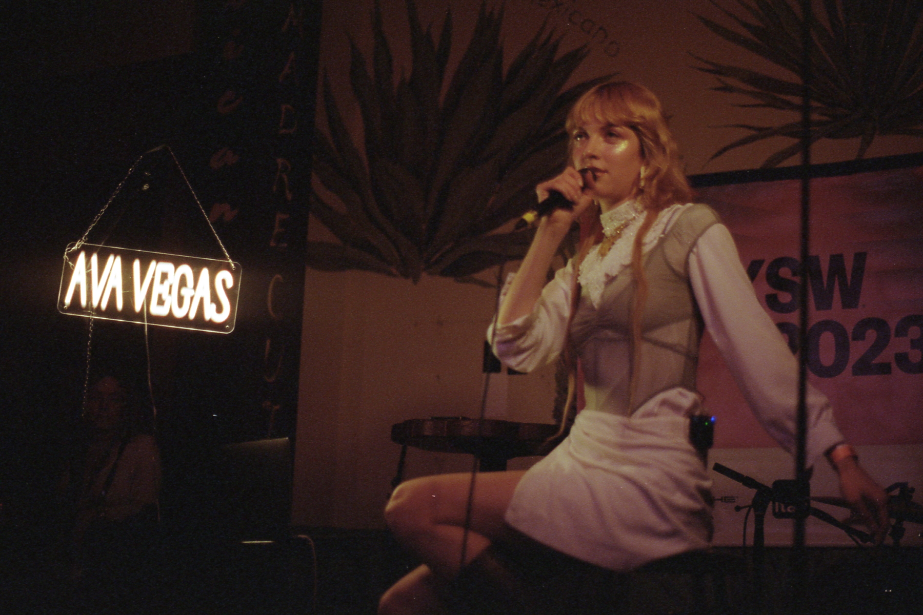
For this post I want to talk about this picture of Ava Vegas at Las Perlas. It's a pretty simple picture so I'll try to keep this post pretty short.As is tradition though, I want to talk about the artist first. Ava Vegas is a pop singer from Berlin who's making her way out to LA. Most of her music is sung in English with some of it in German. In truth, her music isn't particularly interesting or exciting. However, it is well written and there's a lilting and melancholic quality to her singing that is a bit unique. A fair number of her songs have this ebb and flow effect to them that's trying to pull listeners in and hold them. If I were describe the physical shape of her music, it would be an arc. It's not quite circular or cyclical but more of an up and down kind of wave.
Now onto this picture. This maybe isn't my favorite picture I took of Ava, but it's still the one I want to talk about more. I'll point out my personal favorite during the roll post. This picture is another one of those a/b pictures but it's a bit different as well. The two subjects in question here are Ava Vegas herself and the Ava Vegas neon sign. If there's one thing I'm not super satisfied about it's maybe the pose or the interaction Ava has in this picture. It's a bit lifeless and with the focus pulled a bit towards the back of the picture, it's not particularly engaging. It feels dull.
In taking this picture, I know that I was more focused on the sign than her. I wanted to make sure the sign wasn't overblown and I wanted the picture as a result to be darker. Overall I do like the effect that this has. It has a really intimate low light club type feeling which isn't the actual feel of the venue but one I think might fit her music more.
I do think that I could have maybe taken this picture from a slightly more oblique angle. I feel like the distance between the sign and her are a bit too wide. Yes, your eyes survey the entire frame, but I feel like there a bit of a void in between them. The other pretty obvious "issue" is the woman below the sign. One benefit of darkening the picture is that she has less detail than otherwise. However I still feel like she's a bit distracting. At the end of the day, you work with the space that exists and that's what was available at the time.
That's it for this post, more SXSW posts to come.