TV's Daniel (part 1)
Explanation
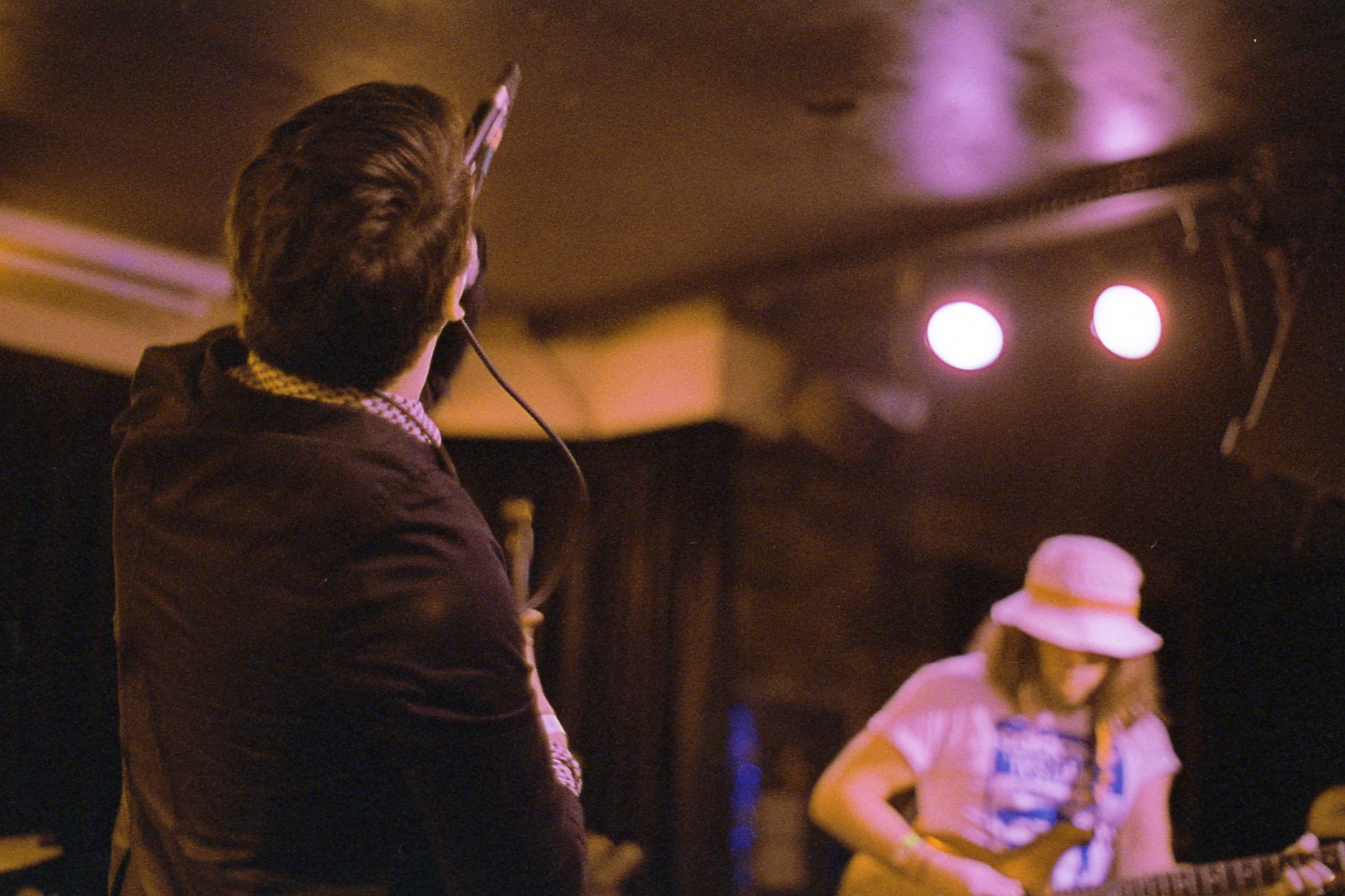
To kick off the second to last roll of 2022 is this picture I took of Austin based TV's Daniel. The eponymous Daniel is on the left of the picture and the main guitarist is to the right.Honestly this picture, while good, is also a good example of a very specific and particular compositional style I used a lot this year. Ultimately this post is more about dissecting that structure and why I went to it as often as I did.
Structurally, this is a composition with two main focus areas separted roughly in the center. Generally, I've structured these pictures with the main focus to the left and the secondary focus to the right. Largely this is because I am standing closer to the left side of the picture making the left side larger. If you look back to the last Katie Toupin post, that picture is also set up in this compositional structure.
Perhaps a more apt comparison would be the Cuffed Up picture from all the way back in the CineStill800T roll post. Unlike the Katie Toupin picture which has a pretty strong light effect on the right side, both this picture and the Cuffed up picture are neutral across the frame in terms of lighting. That said, there's a focus effect here that isn't apparent in that picture. Namely, the focus is quite soft in the background versus a pretty consistent focus through the entire frame for the Cuffed Up picture.
Getting to why I like this structure. I really like pictures that have multiple points of focus. All three of these cases have a reasonable amount of empty space between the two subjects which really solidifies them as the main points. By having two subjects, I can make a denser image that creates relationships instead of just leaning into a single focus. While a single focus can be effective, it ultimately tells a very simplistic when there aren't other elements involved. For example, the Pastel Ghost pictures from the same roll as the Cuffed Up picture make use of light and time to create a narrative even though there's really only one subject.
Additionally, while I tried quite often to add more subjects into a frame, see the Royston Club picture from that same CineStill 800T roll or the Gully Boys pictures from the second Lomography 800 roll, I feel like they often felt cluttered or distracting. In my next post, I'll talk about a couple of pictures of this type that I think worked and why they turned out better.
In general, I find that this structure is really easy to set up and is really effective at creating these types of relations. While some people may swear by specific compositional forms, I think it's important to step back and understand why they make sense and where they make sense.
In relation to the structure I'm defining here, let's talk about the "rule of thirds" which is common when talking about photography and visual design. In some ways the pictures I'm describing line up roughly with this idea. And in fact, I generally line up the left subject just about on the left third. This does break down a bit since the second subject is not really on the right third. To me, it's more important that they stay on the right half more so than they're in a prescriptive right third. Part of this is because I'm not only aiming for the x axis. Instead, I'm aiming for a position where the second subject gets pushed into the frame. By doing so, I can not only create a left/right relation but also a close/far relation, strengthening the overall relation between the two. This also allows me to flip the focus and make the close subject less clear and the far subject clear instead. While I didn't do this much this year, it's an option that I allow myself by thinking in this way instead of in a purely x axis manner.
What I will say on that matter is that setting up the first subject in the first third is more of a matter of ergonomics more than any particular prescription. Moving the first subject further to the right limits the angles with which I can stand and take the pictures I'm intending to do. This is largely because in order to do so, I would have to be shooting more perpendicular to the first subject. If that is done, then I might pull more of the far back in or I might pull the second subject too close and not get the angled structure I'm looking for.
All this to say I'll probably look to refine this idea a bit more in the new year and see if I can more accurately target it. Largely this was one of those structures I felt more than intentionally went for. Going forward, I'd like to be more specific about some of my pictures. Honestly I didn't even realize how many pictures were in this structure until I was reviewing all the pictures I took this year and put that Katie Toupin picture next to that Cuffed Up picture. But that's for another post and this one's done.