St. Louis Art Museum
Explanation
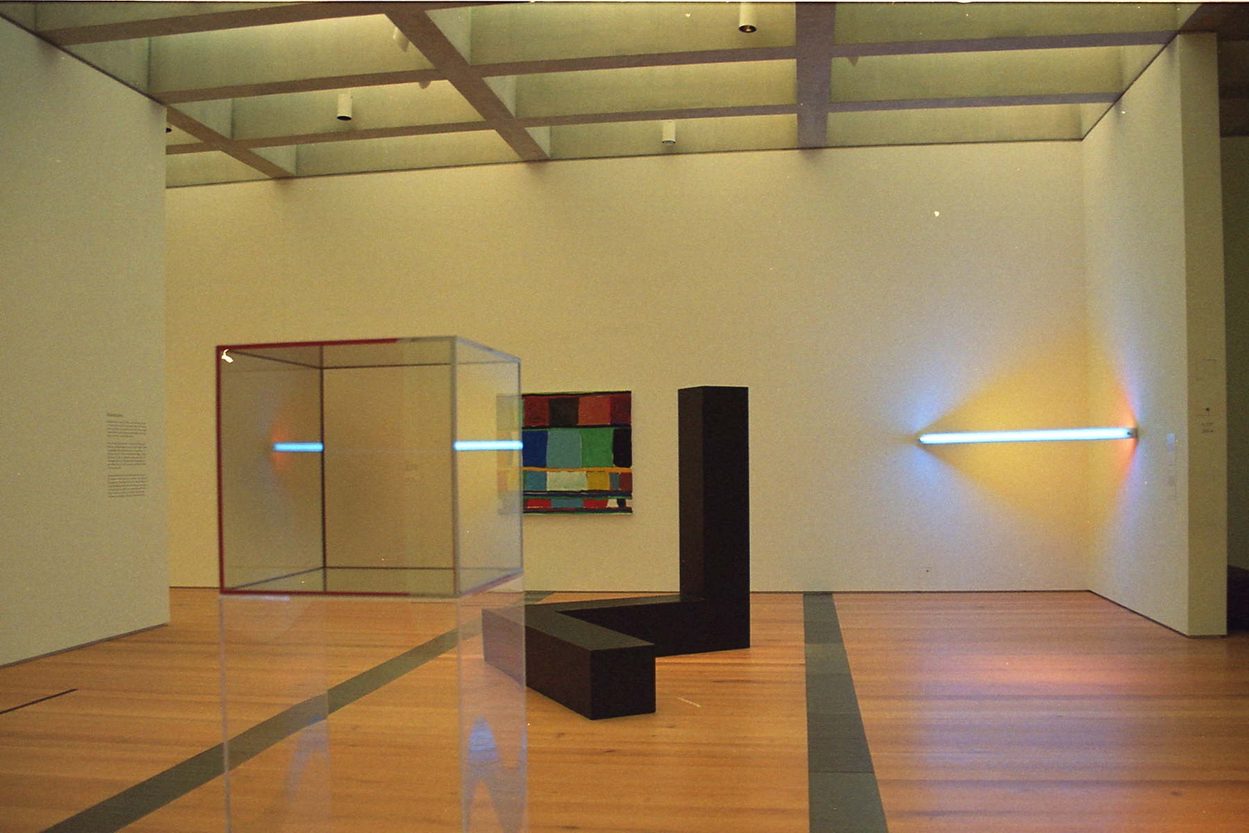
For this post, I want to talk about a set of three pictures of the untitled piece by Dan Flavin that was on exhibit at the St. Louis Art Museum when I visited in mid September.In the first picture is a relatively wide picture of what the piece looks like in person. Altogether, it's a bit unimpressive and besides the fact that it's a lighting piece in a bright gallery, it's altogether pretty unforgettable. Ultimately, in this picture, it's an endcap to a train of pieces leading from the foreground left to the background right. It functions as an anchor point to provide depth to the picture and to guide the eyes.
In the second and third pictures, it's the front and center focus. We'll talk about these pictures independently because they're actually perhaps more different than similar.
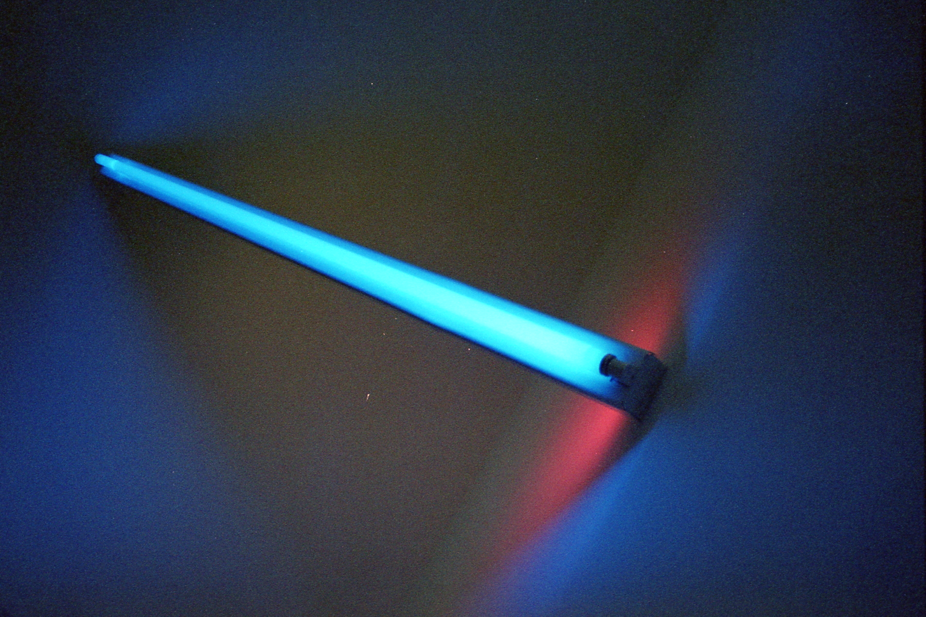
For the second picture, the main focus is the front blue element. The blue largely overwhelms the frame, with a bit of the pink element showing. Largely, though there is yellow in the frame, it almost feels like an afterthought, not particularly standing out. In this way, it almost regresses from the previous picture. While it's relatively clear that there is a yellow element in the previous picture, here it's largely blended out. It's a bit hard to tell if this is because the yellow isn't as visible when the picture is darker, metered so the light itself is middle grey vs the whole frame as before. It may also be because the blue covers the outside and faces out so my brain interprets the yellow as just the color of the wall. Ultimately though, this picture is a composition focused one. It's designed to be off kilter slightly, the angle makes it feel a bit askew, a bit unhinged which in some ways is the point. It's very rock band-esque in that way.
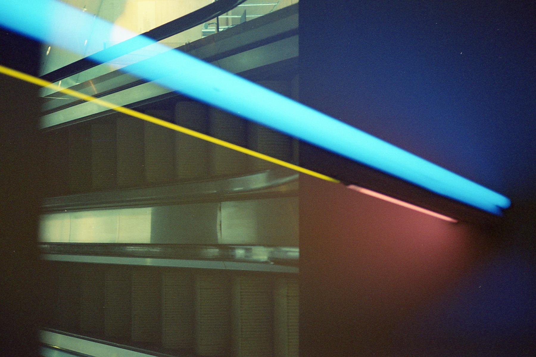
Now for the last picture. To start, let's ignore the escalator that for some reason is super imposed onto the frame and just focus on the rest of the picture. When taken like this, the structure of the artwork becomes obvious. Consisting of three lighting elements, blue, yellow, and pink, this piece is at some level about how light can blend together and at times hide things. Though the yellow element is about twice the length of the pink one, its effect on the previous picture feels almost negligible and ignorable. Unlike the previous picture, this one is not askew even though the light goes through the frame diagonally. To me, this is caused by the piece taking up more of the frame. Also the angle is less extreme.
Let's talk about the elephant in the room though. What's up with the escalator? Honestly I really don't know. My guess is that somehow this portion of the film roll was exposed on a previous picture I took which included an escalator. The reason I find this weird though is because that picture should've been at the front of the roll while this one is pretty close to the end. I really wish it weren't there as this wasn't intentional. I also really want to know what the effect of the yellow element is on this picture and the escalator covers up that portion of the frame. That said, it really couldn't be placed better in a way? Proportionally, it cuts the frame into two sections pretty close to the center line and quite close to where the yellow element ends. I really do want to explore these weird intersecting frames more. However, I want to do them more intentionally instead of as awkward happenstance as done here.
Before closing off this post, I want to talk about the picture that the St. Louis Art Museum has for this piece. The picture is pretty similar to the second picture I took, relatively straight on, metered such that the light is middle grey. Unlike my picture, the yellow doesn't blend away as much. I think this is because it's further out, giving more color context, and is also probably about 1 stop brighter than my picture. One other thing to note, the setup seems to be backwards, with the yellow to the right and the pink to the left. The only way I can understand that is if it's upside down of my picture, it's unclear of course which way is supposed to be up though. Do I think my picture(s) are better or worse than this one? Honestly, I don't think it really matters. I think they all functionally do different things so it's hard to say in any sort of objective terms which one is "better". Their picture is definitely sharper than any of mine but that comes with the territory of film in some regards.
Anyways, that's then end of this post, onto the roll post next followed by a few more rolls. After this, I didn't really take many pictures until well into November so there's a pretty big gap with which to catch up I guess?