Austin Part 1
Explanation
I promised to talk more about Ellsworth Kelly's piece Austin so I'm starting a 2 post mini series on it.To get it out of the way, the next set of pictures were all shot on Lomography 800 film. This roll ended up really exciting and I have a lot of pictures I want to talk about so there will be a lot of posts related to this roll in particular. Additionally, I like a lot of these pictures individually or in pairs so unlike some of the previous posts that covered 4 pictures, most of these posts will be on either one or two specific pictures.
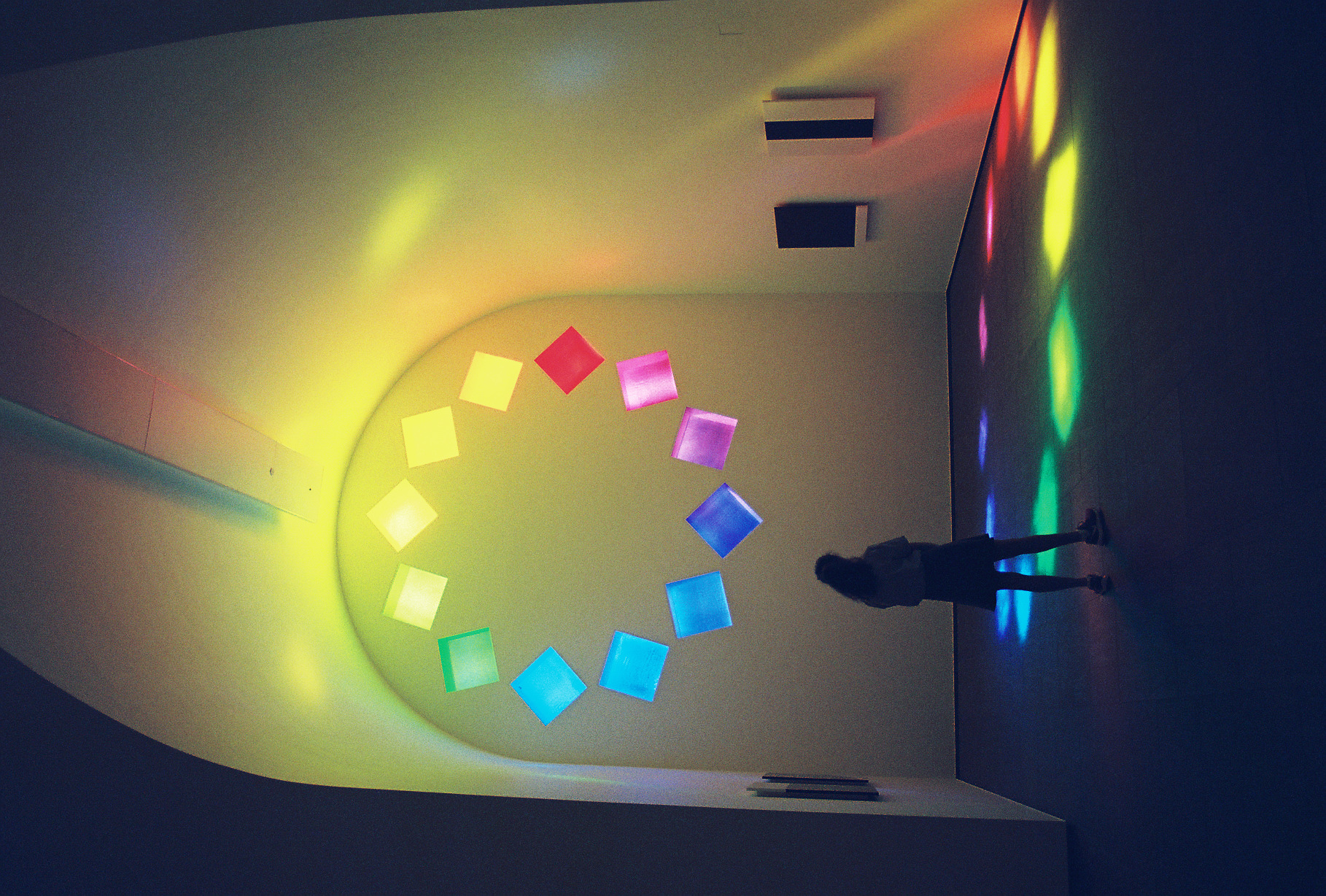
With that out of the way let's talk about this picture. In previous posts, I've talked about what I might call "great" pictures. To me, this is one I would classify in that group. What qualities in this picture lead me to that classification?
First, there's an element of timing and personality to the picture. The young lady is standing in a nice contemplative position a bit off center. While there isn't much detail to her, the intention and structure feels strongly communicated. In terms of timing, it's also not just the fact that someone is in this picture (I tend to not do staged pictures as I'm not particularly interested in them). There's also the lights coming through the window. This picture was taken on June 11th. During the summer months, the east facing window, which is pictured here, only has light shining through it during the morning hours, from 10am when the museum opens until about 11:30am when the lights drift away. Furthermore, at this specific time, this young lady happens to be standing in an off patch of orange light. This is caused by the thickness of the windows. Specifically in this case, there's enough light hitting the far right edge of the orange window to shine an extra area of light down onto the ground.
In terms of color, this is perhaps not the most accurate, though significantly moreso than the LomoChrome Purple I shot before this. However, even though the windows at the top blow out a bit all looking roughtly the same shade of yellow, the light shining onto the ground is clearly visible, expressing the full range of colors.
In terms of composition, this works in a couple ways. As said before with where she's standing a bit off center. But additionally, while it might be preferable to wait until the light is fully aligned if you're taking a straight on picture it's not preferable here. Instead there's a cross angle going on where the picture is being taken from the left while the light is shining down toward the right. There's some negative space but not enough to overwhelm the picture.
Lastly, let's talk about film grain. Usually I don't get too into film grain with these posts and reserve talking about it on full roll posts. However, I think it's important to note here. The grain is a bit strong, but really even. It definitely feels like film or like a vintage photo that might be printed onto posterboard or an old movie poster.
Ultimately, how I determine whether a picture is "great" is whether I could see it appearing in a professionally printed media. Whether that's as a poster, in a magazine, or a brochure, I like thinking about pictures that work on multiple levels and feel like they can express that to a larger audience without much effort. I truly believe that this picture fits that bill.