LomoChrome Metropolis (1st roll)
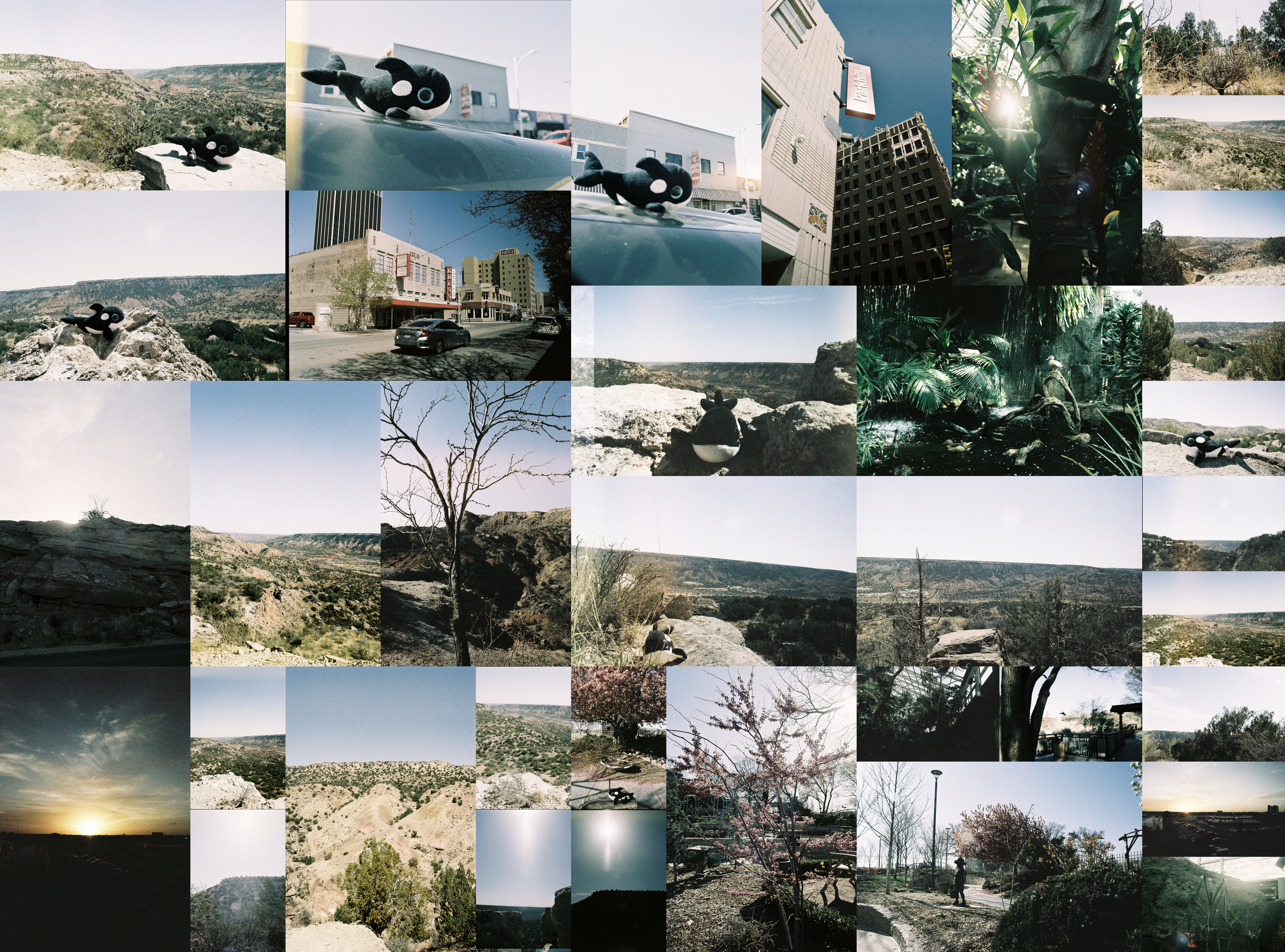
Now for a weird one. Out of these 3 rolls, I would say the Lomography LomoChrome Metropolis was the weirdest to shoot. Even before looking at the pictures, I knew they were gonna turn out a little strange. I’d seen some examples of what this film does and I had some idea that I was in for a strange group of pictures at the end of it.
Even still, I didn’t quite expect it to turn out the way it did. In a weird way, I don’t actually like any of the individual pictures particularly strongly. But as a roll, I really like the look of the resulting collage. I might even go so far as to say this is my favorite collage of them all. Let’s pause that sentiment for a second though.
This was a really weird roll. As I said in the previous post, I actually rate every picture on a different scale before deciding on what’s “worse” and what’s “better”. Or said another way, before I go in and decide which pictures will be bigger in the collage and which are smaller, I look them over for which ones I think have the best qualities. This roll ended up really weird on the first pass, and maybe weirder on the second pass.
On the first pass through I labelled 9 as bad, 18 as ok, and 9 as good. On the second pass, this turned into 18 “worse” and 18 “better”. This is why it looks like the collage has more big images, it does. On the one hand, this roll has fewer good pictures than the previous roll, on the other it has fewer bad too.
When talking about this roll, the first thing, obviously, to note is the colors. The desaturated nature makes each individual picture feel washed out. For the Palo Duro pictures in particular, the harsh sunlight didn’t make that any better. However, for some of the other pictures, this works in its favor. For example the sunset in the bottom left and the city picture with Kress Center City. In both cases, the desaturated look isn’t so much a problem as a distinctive effect.
The other thing to note is in some ways how hard to shoot this film is. This film is an extended range film rated at 100-400 ISO. What this ends up meaning is that effectively you can shoot as if you are anywhere between 100 and 400 ISO and have the picture be roughly the same end exposure. This works well if you want to expose around middle gray but if you want strong lighting contrasts there’s just extra math you have to take into account. Additionally, when you rate the film at different ISOs, it behaves just a bit differently. I’ll need to really try and experiment with this film at different ISOs to tease apart how much I like its extended range. At the moment I feel more annoyed with it than enjoy it. To be fair, I did mostly shoot and meter normally as if I was shooting at whatever ISO I decided to rate the image at. And overall, it worked out. But I do find myself wondering how I want to think about this film.
Enough about shooting this film, let’s talk film grain. This film has a weird film grain. It’s really grainy in darker images and not half bad in brighter ones. I suppose that’s to be expected but it’s really obvious in the darker images. If you look again at that sunset in the bottom left closely, it’s really grainy. In some ways it’s nice, but I don’t know how consistently I’d want that level and type of grain.
Zooming out a bit, let’s get back to why I actually really like this collage. While not many pictures individually stand out, this roll feels really consistent. There’s this level of consistency to the colors that make the overall collage really satisfying. To me it feels like instead of a collage, in a weird way it’s just one big picture. I don’t think it’s just because of the way it’s laid out. Though to be fair, this collage has no gaps, the ratio of horizontal and vertical, small and large, pictures is just perfect to have everything fit with no gaps. Maybe that’s really it, there’s no gaps that catch attention. Hard to say.