CineStill 800T (1st roll)
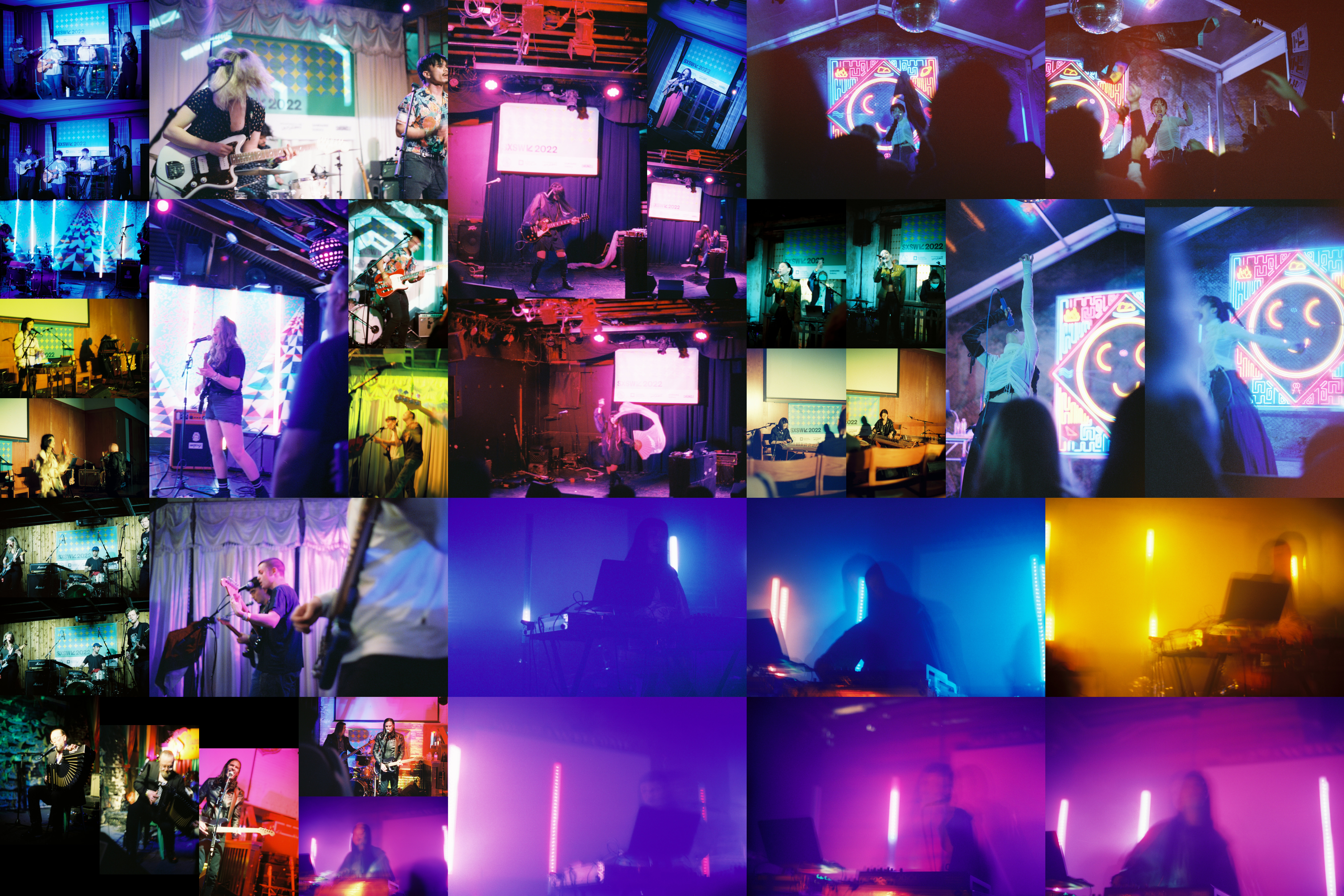
If the Lomography 400 was a surprise, this roll of CineStill 800T was a serious shock. Simultaneously, it was better and worse than the Lomography 400. In aggregate, I took 36 pictures, 15 of which I’ve labelled as “better” to the 21 I’ve labelled as “worse”. Purely numerically, that’s better. 15 to 11 and 21 to 24. However, what really kinda annoys me is how those break down.
Let’s start with the bad. As I mentioned in the Haru Nemuri post, the colors are a problem. Actually looking at the entire roll, it’s really apparent which pictures this affects most. Specifically, look at the entire left column and the set of 4 pictures next to the two vertical pictures of Haru Nemuri. Those pictures fall into one of two categories, overly blue or overly green. Either way, the end result is not appealing at all. Even comparing the Haru Nemuri pictures taken on this roll in comparison to the two you can see on the Lomography roll, it’s very apparent how much blue-r these pictures ended up. While it is likely true that the lighting could have been a bit more blue at Cheer Up Charlie’s vs Elysium, the end result is too divergent to be the main explanation.
Additionally, quite honestly, I had poorer image conception on this roll overall. In a previous post, I talked about “throwaway” pictures. This particular roll has a lot of them. Fortunately, it just so happens that those pictures overlap with the ones with the worst colors. Otherwise, this roll might end up significantly worse than the previous one. I’d also say that in a not insignificant number of pictures, I had poor image execution.
For example, the two pictures of Antti Paalanen that you can see in the bottom left, there’s also a third even worse one, are just poorly executed. I wanted to capture some of the frenetic motion of his accordion playing, but since he was largely a seated and stationary performer, it just led to blurriness. Additionally, I wanted to highlight a small light in the background that turned on when he stomped on a block of wood which was amped to provide a bass line. This lead me to have longer exposures that further exacerbated the blurriness. Other than that, I just didn’t focus the picture well and as a result of focusing on that dim light ended up with poor facial detail.
To cap off the bad, I think overall this wasn’t a very consistently shot roll of film. For the Lomography roll, every act I saw had at least one picture that I liked while here there were quite a few acts that I wasn’t satisfied with at all. This isn’t just about the number of pictures I took per act. In general I only took 2-4 per act, besides a few outliers, Mobley on the Lomography and Pastel Ghost on the CineStill. More specifically, there are 8 acts on the Lomography roll that had at least one picture I deemed “better” compared to 6 on the CineStill. As a function of the pictures taken, this means that the “better” pictures were more tightly clustered on the CineStill than on the Lomography, which depending on your interpretation could be a good or a bad thing.
For the good, I’d say that the pictures here that work tend to work better than on the Lomography. I’d also say that the pictures here that I find “better” surprised me more, both that they ended up that way and how much so they did. I’ve already talked about both Haru Nemuri and Pastel Ghost and especially how surprised I was at the pictures of Pastel Ghost. So let’s instead briefly talk about the other few pictures that get a “better” billing to understand why I think so.
The first one to talk about is up top to the left. The band is Cuffed Up from LA, and quite frankly I just like the energy of this picture. You can’t see her face, but you don’t need to, she’s completely in it. To the right, the other main singer looks almost out of breath, as if exhausted. In the back you can catch the SXSW 2022 banner and the drummer going at it. There’s a clear story of a rock band playing their hearts out and that’s what matters and works here. In this way, it’s quite similar to the Darkbird picture I pointed out in that post.
The picture just below is of Scrounge, a two piece act from the UK. Honestly, this picture is right on the border. On the one hand it works at showing her singing and getting into it. On the other hand, I think the picture would work better if the lighting were darker. Not quite as dark as the worse picture to the left, but just a bit, maybe one stop less would be enough. As it stands, the lighting in the back feels blown out and it’s washing over her too. It’d also be nice if the picture’s focus were a bit sharper, but honestly that doesn’t bother me all that much.
Below that is The Royston Club from Wales. I like this picture because it’s one of a few that really use space to its advantage. You get the focus set in the middle on the main singer. To the front of the picture is the bassist, just a torso, arms and the bass all slightly out of focus but readable. And in the rear of the picture, the other guitarist, a bit hidden behind the main singer but still completely visible. In terms of angle, I really like this picture. Again, I would prefer that the focus were a bit sharper on the main singer, pushing out both the close bassist and the far guitarist a bit more to really sell that intention, but with the main singer being more central, again this isn’t a major issue.
Moving a column to the right and up top is a trio of pictures of Vera Di Lecce from Italy. These are actually an example of the film’s color moderating the actual color. In looking at a short video I took during her last song, the one with the fan, the lighting was almost entirely red. Here in these pictures, it’s more pink and significantly less harsh. This actually works to spotlight her, especially in that picture of the fan. With the red to the left and her in pink fading to blue on the right, there’s a really nice color gradient in that picture that is quite satisfying to look at. Ultimately, the two pictures here that I liked more are ones that mark some of the physicality and beauty of her performance. In the picture of the guitar, you have a woman who isn’t afraid to rock out, in the picture with the fan, you have one not afraid to be feminine and indulge in visual beauty. If I were to nitpick, I would probably again take the pictures one stop darker, in this case so the SXSW 2022 banner in the back isn’t so blown out. I also think that would highlight that spotlight effect a bit more.
In terms of film grain, this one’s perhaps more inconsistent than the Lomography. On the whole, it’s grainier, but again it’s hard for me to really understand where the graininess is most apparent and how to/whether I want to control it.
What things do I want to keep in mind if I shoot this film again?
- Take more images using space. Because most of these are music related, I didn’t get a good chance to see how bokeh would affect the film and colors/grain since I couldn’t get super close.
- Pay attention to shutter speed, especially in regards to darker images to check if that affects the film grain.
- Make sure to write down all the aperture/shutter settings so I don’t have to guess afterwards. (for all film)
- Pay significant attention to lighting conditions, specifically the color of the lighting. Make sure to note down what lighting conditions were.
For those curious, the total set of musicians displayed here are (in general from top to bottom, left to right):
- fuvk
- Cuffed Up
- Vera Di Lecce
- Sofia Campos
- Haru Nemuri
- Scrounge
- Amra
- Haepaary
- The Royston Club
- dal:um
- Bad Bad Hats
- Pastel Ghost
- Antti Paalanen
- Mass Minor