Lomography 400 (1st roll)
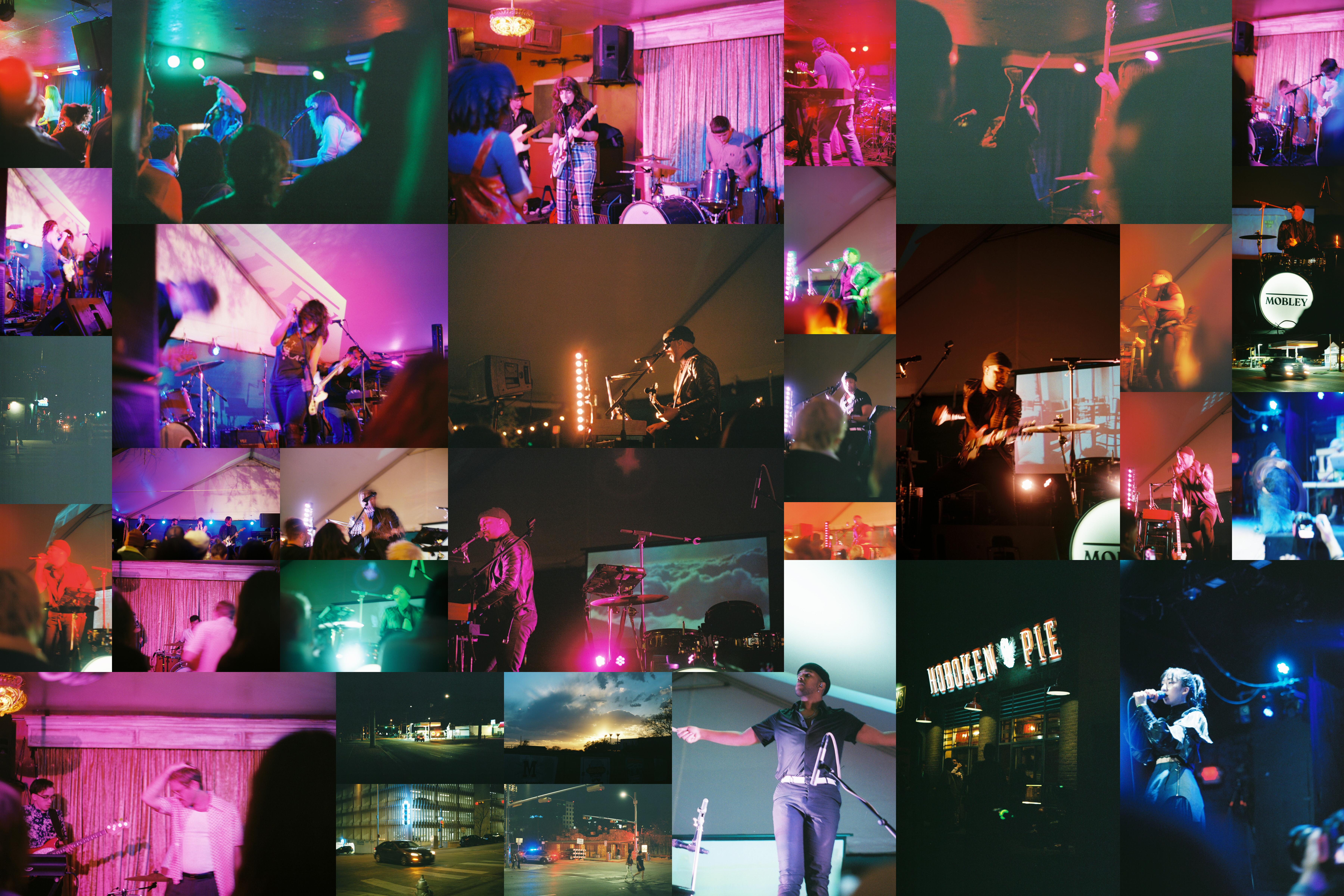
This is a bit of a different kind of post. In the future, I’ll probably limit the home page to just photo posts and have these live a bit more hidden away. Instead of talking about just one or a few pictures, I want to talk about an entire roll of film. To do so, I’ve prepared a collage type image composed of almost all of the pictures I took on the roll, I think I’m missing one in this particular collage. The size of each picture captures how I feel about the individual picture, larger ones I think are better for one reason or another, smaller, worse. Unlike normal posts which are dated when the picture(s) were taken, these posts will be dated on when I’ve gotten the pictures scanned and available to look at.
Before getting into the meat of this post, I want to make a note, mostly to myself about when I’ll use image and when I’ll use picture. In reality, these are completely interchangeable, but I find myself switching them so often that it’s both confusing and bothering me. To that end, I’ll use image to refer to the photographic intent or imaginative construct vs picture which is the actual, specific thing in question. Generally, images are in aggregate and less specific or abstract, pictures are concrete and more specific. Or said a different way, images are about my brain and its conception of things. Pictures are the result of exposing, developing, and scanning film. As a result, when I say image when talking about a specific picture, I’m talking about its concept and/or its execution more than the tangible end result. As a result I’ll generally say picture more often than image. (One last point from the future as I’m editing this in 2023, I think that picture is also a general term. I’ve started to think this way because I realize that paintings can be pictures as can drawings. Photographs are thus the most narrow. But picture is more amenable to my personal taste so I’ll still use picture even though it’s not fully descriptive of the class of picture/image that I’m talking about.)
As I mentioned in that first post about Darkbird, I was actually pretty pleasantly surprised about this roll of film. Since it was my first time shooting color film and I wasn’t really sure what the colors were going to look like, I felt like I was shooting blind. In all honesty, shooting film requires a lot more imagination than shooting digital. Because of that, it really caught me off guard how close most of these images turned out compared to my expectations of them. In broad strokes, I think that generally the non-color aspects of the images all ended up pretty close. By that I mean, focus, timing, motion blurring from longer shutters, etc.
In terms of color, I noted in that earlier post that these images create a stronger, more vibrant, almost neon color effect. Personally, I find that really appealing and in the case of, mostly, music related images, it adds a pop that’s really fun and engaging. It’s definitely not super accurate, but in looking at these pictures I find myself thinking that accuracy isn’t really all that important. Personal or art photography, as opposed to say, scientific photography, is about expression. Accurate colors or spatial interactions aren’t all that important. That said, I think it’s important to keep in mind what the film you’re shooting will do to colors and adapt to it which I didn’t really do at all.
In that vein, what sorts of pictures would I not want to take with this film? Under what circumstances would that sort of neon pop feel detract from the images I’m trying to create? At the moment, I’m not entirely sure. Perhaps certain types of city scapes or if I want a more gritty, desaturated feel. Those are probably questions I’ll answer by shooting more film with different color characteristics.
Let’s move on to film grain. Here’s where I’m really uncertain how I feel. Across the pictures, there’s a pretty wide range of how grainy the pictures feel. It doesn’t seem super consistent, though I think that on the whole the darker pictures tend to be a bit more grainy than the brighter ones. This doesn’t seem universally true though, compare the Hoboken Pie picture in the bottom right to the small Swan Dive picture on the middle left. Both are dark images, but the Swan Dive one is significantly grainier, and grayer. Now, if I remember correctly, the Swan Dive picture was taken with a longer shutter, around 1/15 vs 1/125 or 1/250 for the Hoboken Pie picture. So perhaps the shutter speed had an effect there. This is something I’ll have to pay a bit more attention to, especially if I shoot more of this film specifically.
Before getting to enumerating what things I want to keep more in mind, I want to run through some aggregate stats. On this roll, I took 35 total pictures (out of a possible 36). Of those, I’ve labelled 11 as “better” and 24 as “worse”. That means that I only really liked about a third of the pictures I took. As a general trend, the pictures tended to be better later in the roll. It’s hard to say whether that’s because I was more comfortable or whether I just executed better on those images.
What things do I want to keep in mind if I shoot this film again?
- Take more images in brighter lighting conditions. All of these were taken in lower light/indoor lighting conditions.
- Take more images using space. Because most of these are music related, I didn’t get a good chance to see how bokeh would affect the film and colors/grain since I couldn’t get super close.
- Pay attention to shutter speed, especially in regards to darker images to check if that affects the film grain.
- Make sure to write down all the aperture/shutter settings so I don’t have to guess afterwards. (for all film)
- Try to exploit a strong light differential, besides the Hoboken Pie picture (kinda fake-y) there’s little contrast.
For those curious, the total set of musicians displayed here are (in general from top to bottom, left to right):
- Jane Leo
- Queen Serene
- Megafauna
- Darkbird
- Mobley
- Foxtales
- Haru Nemuri